
Welcome to the third and last part of the Massive Interface Fail Trilogy. In this series of articles I’m discussing the manifold interface design shortcomings in BioWare’s Next-Gen RPG Sci-Fi blockbuster Mass Effect.

- “Ok, Artoo. Now zoom out. NO! Don’t close the galaxy map! Goddamn Artoo, if I only had a healthy hand, I’d smack you!
As previously stated, almost EVERY screen in Mass Effect contains at least one major interface design flaw. In previous parts (Part I here and part II here) we already discussed many parts of the interface – from extremely common screens such as the HUD to more obscure but not better-designed parts like the “Recovered Items” menu. This time, I would like to address the remaining parts of the interface. They are remarkable because they include what seems like the most commonly praised parts of the interface. In reviews of Mass Effect it is often the galaxy map and the conversation menu which receive some favorable mentions. While I do understand why, that doesn’t mean they are well-executed from the standpoint of interface design – sadly. So let us finish this epic saga by taking a closer look at those audience favorites.
Galaxy Map

Ooooh, beautiful. I almost forgot the interface screwup.
So Mass Effect does feature some quite enjoyable pieces of interface design. But this doesn’t mean they aren’t flawed. One of those more enjoyable parts is the galaxy map. Back on your space ship you can access a holographic map of the galaxy to travel between planets. The map looks actually nice. The team used images from the Hubble Space Telescope to construct quite striking 3D nebulae. Of course, scientifically speaking they are criminally inaccurate but why would I criticize the game’s scientific plausibility when it’s already spoiled by bad interface design anyway?
-
Button layout inconsistency (again): So we had inconsequential button layout when dealing with Omni-gel. We even had sub-menus with no cancel buttons. What could BioWare have possibly done worse? Well, this one is my personal favorite. It is actually what started the entire article in the first place because I noticed it from the very first second and it never stopped bugging me, even after my 3rd playtrough or so.
So you enter the galaxy map by pressing the green button (A). In the galaxy map, you can actually zoom further in, also using the green button. There are 4 levels of magnification – galaxy, cluster, star system and individual planet. You zoom in using the green button just like you navigate deeper into other menu structures elsewhere. But pressing the red button (B) doesn’t actually zoom out to the previous level like in other parts of the interface – oh no. Pressing the red button will actually close the entire galaxy map altogether.

Lesson: Spelling out awful button layout choices doesn’t make them good.
This means you lose whatever position you’ve managed to navigate to. This also exposes you to painful seconds of loading times as the game re-loads the ship architecture you didn’t want to see in the first place. And of course re-entering the galaxy map also takes a short loading time. There is a zoom-out button but its the blue one (X). The blue button is used for a lot of things in the game but never to actually exit anything – except for this time.
Compared to the previous failures of the interface, this seems like a minor gripe. However, during my playtroughs it never failed to amaze me how much anger and frustration this arbitrary violation of basic menu navigation conventions was able to summon up. And no, even after tens of hours of play time, I could never get used to it. I don’t think I’m special this way.
-
Missed chances for cross-referencing: And yet, there is still another problem. The galaxy map highlights individual systems that are vital for the main quest. It’s funny how that works exactly against the actual needs of a player like me. I had no problems remembering the 4 planets I had to visit to see the end credits. I had much more troubles keeping track of where the 30+ side-quests take place. I often (more than 30 times to be exact) found myself randomly landing on planets and having to figure out what I’m supposed to do as I go. At least some cross-referencing between my quest log and the galaxy map would have been tremendously helpful. You know, linking Google Maps to your Google Calendar is not very difficult even today. Do you think we will lose this kind of technology in the distant future?
Journal

Mass Effect tells the epic story of humanity’s struggle to recover the ancient, long forgotten technology of “show this address in Google Maps”.
Speaking of quest logs, I must admit that the quest log (call “Journal”) is one of the least broken interfaces in the game. I almost gave it the green light if it wasn’t for the already mentioned flaw.
-
Missed chances for cross-referencing (again): So from within the galaxy map there is no cross-referencing to the journal. Is there such a linkage going the other way around? Of course not! So when browsing through your journal the process works like this: you have to pick out and remember the name of the cluster, star system and planet from the text the journal. I actually recommend writing this down on paper to prevent tedious backtracking in case your short-term memory loses the race with the game’s loading times. Then you have to exit the journal, walk up to the galaxy map, launch it and struggle with it’s interface while you are blindly trying each possible cluster to find the name you are looking for. Because the names of the clusters, systems or planets only pop up when you highlight them with your cursor. Obviously. And whatever you do, remember not to press the red button because you will have to do it all over again. If you are a game designer and this sounds like a reasonable modern RPG experience to you, I would recommend considering a different career – ESPECIALLY if you work for BioWare.
Conversation Menu

Ah, my Shepard. He has a face only his mother could love but a heart of made of gold…nah, just kidding. He’s actually an asshole, too.
The best comes last, right? The conversation menu has been often applauded as being one of the most remarkable things in the game. I must agree that the circular layout is a quite prominent and memorable interface element. So I can understand why people tend to recall it so often. The actual usability of said circular menu is actually noting remarkable. Circular menus have been tried numerous times in the brief history of interface design. While they occasionally have an unexpected feature that can be exploited for some exotic purpose, the benefits rarely outweigh the extra effort associated with integrating them into a layout scheme. In the case of Mass Effect, a regular menu would have done it just as well. The remarkable quality of conversations comes rather from the sharp writing. But it’s much easier to give the weird-looking gizmo all the credit, isn’t it?
-
Not quite consistent menu layout: One of the quite interesting features of the circular menu is that all conversation is spatially structured. So all answers in the upper part are often “good” and all answers in the lower part are often “evil”. Answers on the left tend to investigate and explain certain points while answers on the right tend to lead a conversation to a conclusion. I already mentioned how I find this is actually a remarkable feature I would like to see developed further in other titles.

There is a certain systematic according which the answers are arranged on the circular menu. This is actually a good idea, if only…
But the conversation system stumbles quickly over the very structure it created. So for example, quite often you will find situations where more than one dialog choice investigates something without being morally colored. But the circular menu only allows for one such answer. So the developers chose to randomly ignore the system whenever they see fit. They also chose not to communicate that to the player in any way.

… if only the Mass Effect team was able to maintain consistency. The answers “C-Sec” and “Attitude towards humans” aren’t actually morally colored in this case. No hints that the system has changed.
This inconsistency undermines the entire system. Which is a pity because it was an idea with potential.
-
Missing information (again): And again, you will often find yourself in situations where information is partially hidden from you. So in some cases your diplomatic skills and moral alignment can open up special conversation options. These options are highlighted by color to distinguish them from the “normal” answers. In some cases you may not meet the requirements for a certain answer. In such cases, the answer will be grayed-out.

The red answer is something I can say because I’m an asshole. The blue one is greyed-out because… nobody knows.
In neither case does the game actually communicate what the requirements for a particular answer are. So if you can’t select an answer, you have no clue as to why and what you can do about it. You will never know how to explore that possibility in a future playtrough. On the other hand, as we have already established, the stats screen is quite poor at communicating your moral stats anyway. So even if you knew the moral requirements for an answer, you couldn’t even check them against your current alignment. I guess if you do enough mistakes in interface design, you eventually get into an area of diminishing damage.
Conclusion
And that does it for this epic failure trilogy. I’m sure I missed a lot of flaws. If you have noticed any feel free to point them out in the comments.
As I already mentioned, considering the experience of the company and the magnitude of the game, the state of the interface is outright insulting. I believe many of the mentioned faults can be attributed to a lack of resources – especially time. This lack is quite apparent if you look at other parts of the game. However, at some mistakes don’t seem to have a rational explanation other than incompetence. The real Litmus test will be Mass Effect 2. I assure you I will be here to check whether BioWare actually learned from their mistakes. The outlook right now is not so good. I was able to play a demo very briefly at GamesCom 2009 and sadly, I re-encountered many of the mentioned problems. (EDIT: The follow-up article is here)
I’m pointing out especially Mass Effect because as you saw, the sheer number and seriousness of mistakes is really outstanding. I also point it out because of the extreme contrast to the game’s reputation. Other blockbuster games – like Fallout 3 for example – may not have perfect user interfaces either. But the mistakes are often localized and the interfaces have redeeming qualities otherwise. Mass Effect is the only AAA game I have met with a consistently abysmal quality of interface design.
As such I believe it should be a reminder for aspiring game designers that interface design and information design, two fundamental cornerstones of successful game design, shouldn’t be taken for granted – not even in big-budget productions. They do not come out of nothing. They can’t be downscaled to cut corners. They can’t be covered up by flashy graphics. Even modest success in those disciplines is a never-ending process of thorough research, careful observation and diligent playtesting. This is true whether you are a small, newbie indie game developer or a huge, allegedly experienced studio like BioWare. Like with peace, the price of good design is eternal vigilance.
Note: This is part III of the Mass Effect: Massive Interface Fail trilogy.
Part I is here
Part II is here
The Mass Effect 2 follow-up is here


This trilogy of criticism might seem brutally pedantic to someone who hasn’t played the game, but it’s absolutely right: Mass Effect suffers badly from its shitty interface. I never felt like I fully understood most of the game mechanics. Choosing items, which is usually one of the most satisfying parts of an RPG, was aggravating – especially because the reward for all this painstaking effort was invariably an unnoticeable improvement on a stat that couldn’t be identified anyway. The problem of accidentally closing the galaxy map screen is so bad that I would often do it twice in a row, because my muscle memory was so used to B being “back one level”. Finding a quest destination was infuriating; as a bare minimum, the galaxy map should have had an icon over destinations with sub-quests available, at each level of zoom.
One fault you skimmed over was the lack of explanation of some things. The game never really explained what effect most of the equipment upgrades would have. Is an armour penetration bonus effectively a damage boost, or what?
And the equipment menus… the horror…
The most galling part is that these menus, despite zooming in to only show a few items at a time, are not even easy to read. I played Mass Effect on a standard-definition television and I spent half the time squinting at menu items, even though they each had only a few words of text and took up a tenth of the screen. Outside of menus was just as bad: I did not know what literally half the combat HUD icons looked like until I saw the game on a HD TV.
For all these flaws, Mass Effect is a good game. Aside from the elevators. And some navigation problems. And some ambiguity in combat. And the way it seems designed to be played in less-fun ways, as with the achievements for sticking with particular characters. Actually, scratch all of that: Mass Effect is the alpha build of a good game, after it’s been designed by many talented writers and programmers, but before a single playtester or usability consultant has sat before it.
Mass Effect is the alpha build of a good game
That pretty much nails it! My relationship with the game is very ambivalent. There are things about it I adore, but there are moments when it’s the worst game of all time. I defiantly see the potential. Mass Effect 2 will show, I guess.
I love how after playing over 100 hours of Mass Effect I completely agree with everything in your articles (except for the conversation wheel which I will mention) but the only design flaw that actually hindered my enjoyment of the game was the galaxy maps (B) to exit.
I managed to use my critical thinking skills and quickly adapt to all of the inconsistencies and design flaws in the user interface allowing me to fully enjoy all of the other things that go into a video game like story, combat, character development, and level design.
The one complaint I have about your article is when you said, “In neither case does the game actually communicate what the requirements for a particular answer are. So if you can’t select an answer, you have no clue as to why and what you can do about it.”
Those red and blue “Paragon” and “Renegade” bars on the character screen have the same color as those conversation options. I immediately think, “Maybe if I have more Renegade/Paragon points those things won’t be grayed out.”
At any rate. I learned a lot about UI design from your article, which is what I believe your real motive for writing this was. Thank you.
Thank you for your comment!
See, if that’s true, what are the Intimidate / Charm stats for?
And in any case, it would have been nice to just see what exactly you’re missing so you don’t have to randomly try out permutations.
Magnificent set of posts.
The galaxy map button misconfiguration is the most annoying mistake I’ve ever experienced in any game ever. I must have done it 100 times.
The +150 limit menu is also terrible. You are being asked to make major inventory decisions almost totally in the dark. It feels like a slap in the face that you didn’t deserve.
One annoyance I’d like to add is a downside of the dialogue tree. If you’re on your second playthrough you are often likely to be skipping some of the dialogue, but if you press the button to skip and you are unlucky enough that the dialogue tree pops up at that exact moment, you will often make a dialogue decision that may be totally inappropriate but that you can’t then cancel. A different button to skip would have really helped there.
I’m about to fire up Dragon Age this minute – I will be looking out for similar inconsistencies.
I’m glad there are people out there, who also stumbled across the problems I’ve mentioned. Makes me consider I’m not mad after all.
Good point with accidentally selecting an answer in the dialogue interface. I’ve noticed it too, but wasn’t quite able to put my finger on it. I think the problem is that the menu appears a few seconds before a line is finished so you are more likely to trigger it by accident. One very cool solution would be to introduce a quasi mode – you would need to keep on pushing the stick in a direction AND press a button to select an answer. That way, skipping dialogue and selecting dialogue would be clearly differentiated. Also it would logically fit to the circular menu layout. Generally: quasi modes often make things better.
I was wondering if other BioWare games also suffer from the same problem. Just got Dragon Age as well. Might give it a spin!
This is not the only flaw if you’re replaying the game. Sometimes the spoken dialogue is exactly the same regardless which option you chose. (up, side, down, doesn’t matter)
Yeah but that’s technically not a bug – it’s done intentionally. And yes, you notice it only when replaying the game. And it IS quite disappointing.
[...] last for This Week In Game Criticism, Krystian Majewski has finished his epic (yes, epic) trilogy listing all of the interface design flaws of Mass Effect (which, coincidentally I’m replaying on [...]
Can some of the faults claimed for Mass Effect’s UI be attributed to ME having been designed for consoles?
For example, if I’m sitting on my couch several feet away from a relatively small TV screen, a single small icon is better than a seven-letter word. We can argue whether the icon effectively describes the concept it’s supposed to represent (I agree that it didn’t in ME), but the notion of icon > word seems at least plausible when the typical display environment of consoles gets factored in to the analysis.
The same argument applies to the apparently small number of menu items presented on most item management screens.
It doesn’t, however, apply to issues like having to bounce from locker to locker to optimize gear among party members, or being unable to do so except in particular locations. (I think it’s not a coincidence that BioWare’s latest game, Dragon Age: Origins, has exactly the same two flaws.)
I should add that I play games exclusively on the PC, but my primary interest here is from the standpoint of game design. I’m not here to knock consoles; I’m just curious to hear the degree to which others think the console display question factored into many of the UI implementation choices.
Yeah, I was also wondering if some of it is just problems with platform translation. I haven’t played the PC version so I can’t really tell.
Whether and icon is easier visible from afar than text is difficult to tell. It depends on the icon and the text. Generally, I would say text is more legible than icons. Icons need to be interpreted. This takes time and comes with potential for misunderstanding. Words rely on recognition. It happens quickly and is surprisingly robust (see: captcha). (Disclaimer: I’m talking about reading, not scanning.)
As for the limited number of menus due to small screen size: meh. There are a lot of old and contemporary counter-examples of RPGs capable of displaying longer lists on TV screens. It’s a question of efficient layout.
Either way, the PC/Console transition may offer an explanation but it doesn’t really excuse anything.
I concur with all of the highlighted issues. The UI was the primary reason I couldn’t face a second playthrough. There is one ‘feature’ I am surprised you didn’t mention as it was a show-stopper for me.
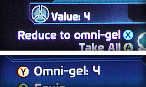
When deleting an object (i.e. converting it to omni-gel) in the equipment interface, the item highlight or cursor would flip back to the top of the list instead of to the previous or next item. This was bad enough to make the vein in my temple throb as this was a required chore. My vein It was further compounded by all of the items in the list being shuffled from one delete to the next and duplicate items not being contiguous, let alone stacked, ending up with:
Storm IV
Banshee III
Hurricane III
Storm III
Hurricane III
Banshee III
Storm III
Storm III
Hurricane II
As a programmer, I was trying to reverse engineer their list-handling algorithm by my expreriences with it. All I could conclude was the obvious fact that the list is sorted in reverse order by numerical suffix. Beyond that I couldn’t imagine how the items were shuffled on delete without intentionally doing so unless they rebuilt the list from scratch with an odd hashing scheme or something.
Thanks Krystian, I’m glad you wrote this piece.
YES! Oh God, yes! It totally slipped my mind. I guess it was amnesia due to rage blackouts. Thanks for pointing out this one!
I am no programmer. But even if so: how does it happen that they are therefor not sorted alphabetically? o.O
I guess this is one more reason why its such a great game, that even with all these UI flaws and more, people for the most part lived with it and finished the game anyway. Like a washed-out book with misplaced pages, bad printing offsets, but containing a great story.
As for the flaws, to add:
1) The Map Screen
a. No waypoints – most objectives would require you to go around steep “mountains”. You have no choice but to place a marker, and when you get there, go to the map screen again and move the marker on the next destination. Rise and repeat.
b. Y button – yes, it just takes me to the journal, not to the exact quest at hand where the cursor was located, which is what anyone would expect.
c. Topography mess – why not just a smooth gradient map instead of a predetermined height map? If a color in the map is made of 50% shade of blue, I expect the entire surface area to have that same level, not an average of the heights around it.
2) HUD, The Minimap
a. Lack of detail – when in the Mako, you have to rely on making a marker from the map screen. Otherwise your only frame of reference is what direction you are facing, especially when the mission locations/landmarks are far from each other. This makes the minimap almost useless. I had to go back to the map screen from time to time just to re-orient myself.
b. Zoom – Can I? At least it would make the above design flaw more palatable if I could zoom out and see the mission markers or landmarks.
c. Ally Color-coding – which ally is which?
3) Main Menu -The option menu is under the extras menu? Ok I may not have been playing games that long to know what is the common convention for that anyway.
4) Save & Load Screen – Lack of information. Who is the character in this save/load selection? What is his/her level? Giving the last played and time played values is nice and all for a linear playthrough, but what happens when I try to replay scenes and make alternate choices? This isn’t helped by the save/load image not being a thumbnail view either.
5) Character Creation, Choosing an existing ID – After playing finishing mass effect the first time, I replayed the last scene, and making alternate choices to get the whole experience. When I finally wanted to start a new game and wanted to use my existing character, I get half a dozen entries with the same name and level. The only difference: The “time played” value. What good does that do when the final scene takes about the same amount of time to finish no matter what choices you make? The Alliance database must be bugged as hell. Those entries aren’t called an “ID” for nothing.
Phew… and you know what? I still love this game! So bittersweet!
Wow, some excellent points you’ve got here. I remember also struggling with the save system. This is especially infuriating because the autosave is practically useless – save points are WAY to far apart. So save management is delegated to the player and the interface isn’t really up to the task. Recipe for murder.
Yeah, the Mako. Jesus, I didn’t even start there. It’s just so FUBAR, it’s daunting to start with a proper critique there. But I agree, the points you’ve mentioned are also things that struck me. I think the most confusing thing about the Mako was – as you pointed out – the general sense of disorientation. Where am I? Where do I have to go? Was I already here before?
what about “why the hell did I even enter this thing the feels like I’m driving a gravity-defying rubber ball?”
I played the PC version of the game and it suffers of the same flaws, not much differences.
There’s one thing I don’t agree with you, it’s about the weapons stats; your playstyle seems to have influenced a bit your judgement there. Just an example of why the overheat and precision stats are useful, the sniper gameplay: you shoot one guy and then 5 mobs start running toward you, with your maxed damage sniper rifle, you shoot 3 times before overheat, kill 2 and miss once because you are under pressure, with a sniper rifle with a bit lower damage but better precision/overheat, you shoot 4 times and kill 4.
Despite its flaws, the game was a big success, I think one of the reasons is because ME is not a true RPG but an hybrid RPG/shooter and so Bioware managed to attract people from both crowds.
The thing is some cornerstones are bigger than others, a RPG with perfect interface and informations presentation but with boring story, stupid gameplay and dumb AI is unlikely to sell well.
I don’t want to lower the interface design, ME would have sell more with a better interface and more people would buy ME2 too but as I write this, I realized that in all Bioware games I played, I had some troubles with part of their interfaces but I replayed them more than once while I never finished some other games I don’t remember having bad interface.
Yeah, you are right. I have rarely been using sniper rifles. The stats didn’t play any significant role for the other weapons. It may have been a smart solution to show certain stats contextually. But in the scenario you’ve mentioned – how can you know if the damage stats are enough to kill a guy with one shot?
I don’t think that better interface design will always sell more copies. But it interface design is important if you want to design a good product. People will buy a lot of flawed products for various reasons. And in the end, in there were a competitor to Mass Effect with a better interface, it could become a sales factor after all.
Also very annoying with the galaxy map was that even when you did see the names of each top-level destination, the actual planet(s) inside weren’t listed on the top menu. I think an ideal interface here would show a flag pointing to each destination with the cluster name, smaller flags for each mission-related planet within underneath, with a contextual info box that would include the info from your journal about those missions.
I just saw something I never noticed while playing myself, just now, looking at your screenshots — the mini-map from the in-person mode is still displayed on top of the galaxy map, despite being completely pointless at that moment! You just have to assume that no actual interface designer ever even looked at the game’s UI.
The location-map/mini-map has a ton of problems you didn’t even bring up. The icons on the location maps are just as bad as everywhere else. Transition points (elevators and stairs) aren’t marked with obviously useful info like “this is a staircase that goes up.” (I seem to recall you can’t flip between different maps of the same area, like if you want to figure out the full path to take through the Citadel, either.) Interacting with quest items doesn’t mark them on your map — so you can’t compare your Citadel map with a guide to see which Keepers you may have missed, because the ones you’ve found aren’t marked anywhere! And the directional checkpoint marker is a total patch — instead of just letting you select known locations and actually guiding you there, it just puts a dot on the map and gives you a useless arrow showing which way it is (even though you often have to go around corners and through wrong-direction passages to get there.) At minimum in “friendly” locations like the Citadel, why not just produce an arrow that walks you from checkpoint to checkpoint to get where you’re going, or even use in-world clues like having things light up on the path to show you the way to go?
Anyway, great series, a very thorough and effective breakdown of these interface problems. I deeply enjoyed ME despite these problems so I’m still hopeful that the sequel will fix up some of the worst parts.
Haha, yeah the radar is great. I believe the Galaxy Map is not a “real” interface but some sort of hack of the game engine.
Thanks for bringing up the minimap problems. To be honest I haven’t even used it too often or simply didn’t make any notes. I guess it was so screwed up that I didn’t feel like it was worth spending time on that screen. So I’m grateful you guys can help me out. It seems like there is some serious concerns. I might take a second look and summarize your input in an errata.
The Keepers thing is annoying but a problem that comes up in many games. Collectibles are treated very poorly on a regular basis. Especially when it comes whether they show up on the map and whether you can tell if you already collected them. I’ve got a post in the oven about that. Coming soon!
I have not yet looked at the collectibles article, but a tip for that would be Far Cry 2. It handles part of the collectibles very well, but parts of it are just neglected.
Good call. I haven’t played Far Cry 2 for too long but from what I’ve seen, especially the collectibles really surprised me. I’m looking forward to review this one.
[...] Crackdown and God of War II. With the possible exception of Mass Effect (which seems to have subsequently come under fire), these games were at the time admired but widely faulted, and ultimately overlooked when the [...]
[...] Crackdown and God of War II. With the possible exception of Mass Effect (which seems to have subsequently come under fire), these games were at the time admired but widely faulted, and ultimately overlooked when the [...]
The galaxy map was the biggest fail in Mass Effect in my opinion. I could write an essay on that.
First of all, why on earth would you make it 2D? Let’s take the scenes one by one:
Scene 1 – the Galaxy Scene
They could have easily done a 3D map using the same 2D image like in the NASA Planet Quest App http://planetquest.jpl.nasa.gov/SIMGuide2Galaxy_launch_page.html
Give the user the same control to rotate, pan, and zoom the scene.
The Transition between scenes: When you select the location you want to go to from the Galaxy Scene, simply zooming a bit and then switching to the next scene isn’t enough. I think it would have looked really cool if it was done this way:
Right when you choose the location you want to go to(like Noveria, for example), the game takes control of the scene(meaning the user can’t move, rotate, etc anymore) and zooms in the chosen location(not a full zoom, just enough that you can see the next scene in relation to the galaxy scene), and then highlights the structure of the next scene. It can either be a cube (sector) or an irregular shape (like a nebula – saw that a lot of main regions in ME are nebulae). I think the user must know how big is one scene in relation to the next one at all times.
Scene 2 – again it would have looked incredible in 3D.
Scene 3 – the System
The system Scene looks pretty good, I really liked it. Would have looked great in 3D. Another thing that bothered me was diversity. Way too many Sun-like stars in all the Systems visited. G-type stars in the Milky Way have a very low percentage compared to let’s say M-type stars. The planets in Mass Effect were not all habitable, but there were terrestrial planets in almost if not all systems. I’m willing to bet rocky, desert, icy planets exist in most M,K,F,G,A – type stars. I’m not willing to bet earth-type planets exist though, just terrestrial ones
Also it would have been nice to see a binary system(ternary might be a bit much to ask, but binary systems are pretty common in the Milky Way).
Scene 4 – Planet scene
I liked this one and I’m not saying “It would have been looked better in 3D”
It might or it might not have, it can go either way. Maybe a non-controllable rotation of the planet would have looked better. I mean you enter the scene, get all the info on it in the panel, but you can also see it rotating, it’s not a static picture.
Totally missed your comment here.
Well actually the interface is 3D – it is displayed with 3D technology. Merely the navigation is 2D. To be honest I think I’m fine with they way they did it. Sure it’s super-unrealistic and super-unscientific but it does the job well.
You and I we both know what a pain in the ass it is to create a realistic star map. It is an interface challenge in itself.
But I do agree that it would have been a good idea to convey some sense of the scale relationships from one zoom level to another. It would be using realism to make the game appear even more epic.
Great series of articles (keep it up!).
I’m currently re-playing Mass Effect right now and all these GUI problems came flooding back to me.
Still a good game, but there is so much room for improvement.
Great series of articles, I recently replayed Mass Effect while waiting for the sequel to come out, and wrote some similar thoughts about my problems with the game and the UI in particular in these posts:
http://www.sinistersoups.com/2010/01/i-hated-mass-effect-i-will-buy-mass-effect-2/
http://www.sinistersoups.com/2010/01/final-thoughts-mass-effect/
It’s interesting to me that while the entire interface is terrible, different parts stick out as particularly bad to different people. For instance, I never had a problem with the B/X buttons in the Galaxy Map. It never even crossed my mind that anyone would find it confusing, since I thought of B as “Exit” not necessarily as “Go Back a Layer.”
Of course, I can tell I’m in the minority there, I’ve had friends in real life point the problem out to me recently (when they saw that it’s reversed in Mass Effect 2) and then here in your post and in the comment.
For me, the most annoying issues were the way the list shoots you back to the top when turning things to omni-gel, and the fact that the X button is used both to skip dialogue and select dialogue choices. In fact, the latter was probably my single biggest problem with the interface when I first played the game a few years ago, I hate the fact that I can accidentally choose something I don’t want when skipping through dialogue, which I will do since I can read faster than a VA can speak.
By the way, I was born in Warsaw too, though now I live in the U.S. and work as a game programmer.
Thanks! I just read your articles. I agree with you. Although the fact that you didn’t mind the map button layout is strange. Must do more research.
Your articles made me actually regret that I did not mention the two things in my review. But of course, the Omi-gel top-of-the-list-jump was infuriating. This was one of the reason why, by the time I had fairly good equipment, I started just throwing EVERYTHING away. It was quicker than selective management and only marginally less effective.
The dialogue skipping is something that started to bug me only by the time I got to the second playtrough. This one is again really puzzling. One should expect skipping dialogue to be one of the most-used functions during game development. They should have noticed that. :/
Anyway, cool blog. Will put it in my RSS reader! ^_^
Yeah, I think it’s strange that I didn’t mind the map layout either, since I seem to be the only one
And thanks! I’ll definitely be keeping up with this site as well, I love this kind of in-depth analysis.
You could prevent the accidental skipping of dialogue choice by keeping the stick to the top so that it points to a non-existing option. Still it was a pain that you have to use a workaround for a simple task like that.
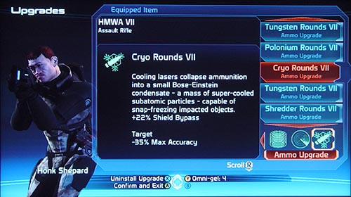
Hey Krystian, I loved this, but your impact is significantly diluted by all the spelling errors. For instance, you spelled Shepard three different ways, even though the correct spelling is right there in your screenshot.
Are you planning on doing a ME2 review as well? I would greatly look forward to it.
Oh yeah. You’re right. I guess I took some liberties with the name in the first part. That’s because… uh… you see I was refering to the first name and I just so happen to call my character “Sheppard Shepard” and “Shephard Shepard” in two of my playtroughs.
Fixed that now, thanks for pointing it out. I wonder why so many people read these now. Is that because of ME2?
And yeah, I will at some point look into ME2 but I have a huge backlog to take care of first. On the other hand I’m tempted to check it out. We’ll see how that plays out. ^_^
Yup, I’d bet you’re getting more hits because of searches for ME2.
I don’t remember how I found it.. I think I might have been searching for some GUI reference material from ME1.
well.. I came here because I looked at a German blog where the author references this site as one of his favourites
“Loose for lose” doesn’t make him look very good, either. Dint relay in spall chick nixed tame!
Nice one – “Loose for lose” isn’t covered by spellchecking, you know. I don’t really understand what your problem is, DensityDuck. You mean you can actually TELL that English is not my mother tongue? *GASP*
I played the PC version and while it is a good port it has all those same problems you mentioned. What’s even worse is that in ME2 things are even worse (PC). Looking forward to your review of that.
The interface in ME1 may be hopelessly rickety at times but ME2 actually made it *worse* in several places, not better. The spacebar-now-might-do-absolutely-anything-depending-on-where-you’re-standing paradigm has got me killed in a firefight several times now. My golden rule of sequel interface design: no matter how many innovations you have, no matter how much the old interface was buggy, at least give people the option to use the old control scheme they’re used to if they want it! Even the option to remap the keys to the old ones doesn’t work in ME2 because they inexplicably tied several of them together.
Really, there are a disturbing number of subtle signs of dumbing-down, or worse, perhaps designer inattention to detail, in ME2, despite certain other improvements.
The weird melding of controls didn’t bode well from the start, as if they imagined people had become too dumb since the last game to cope with more than two action buttons, “shoot” and “do something that isn’t shooting.”
The various volatile barrels and things that can be shot at, previously of several different types, now all seem to be generically labelled “explosive.” This, I cannot fathom; surely it took more effort to *remove* the different types of splodey barrel from the code and replace them with a generic one than simply to leave them the way they were.
Your companions can no longer be talked to outside of combat or major scripted events, which for some reason *really* ticks me off – I actually really miss their quite large number of relevant observations, coloured by their character, for just about every place you could take them, though there’s still the odd scripted one here or there.
The map no longer shows where things you need to do or people you need to talk to are, and you can’t mark them either, so there’s a lot more clueless stumbling around using the minimap’s old as the hills and still as annoying as ever “it’s somewhere over there, no idea how far” arrangement.
The skills, journal and upgrades menus can no longer be accessed quickly by keystroke; you’ve got to go into the escape menu and navigate to them every time.
The addition of “heatsink” magazines, while somewhat original in that it’s an inversion of the usual “energy magazine” concept for a waste energy sink, is flawed – the original game had overheating to force you to use strategy in a firefight, to make sure you couldn’t use superior firepower alone to force your way through, but without the disadvantage of making the game unwinnable if you suddenly got stuck with no ammo left and a boss room between you and the only remaining provisions. Regressing to the old finite-ammo model maintains the restriction on firepower, without improvement, but restores this infuriating design flaw, which was then presumably crudely fixed by having magically regenerating neat piles of new magazines in major battle areas, like Archangel’s HQ. That they could be spent magazines from the same battle that have had time to cool down, I can accept; that they’ve stacked themselves neatly back in the bookcase, I can’t. Which is all daft because there’s no reason whatsoever why they couldn’t have combined both, and kept it physically plausible; an overheated weapon should slowly cool down, and so should an ejected heatsink, so replacing it with a new cold heatsink could be useful mid-fight but more like another “power” option if you could only carry a few heatsinks with you, and you would still have the option to just wait for the gun to cool on its own, ME1 style, if you ran out.
To be fair, some things have improved. The planet scanning thing is way more sensible than landing on the surface and driving around randomly until you find apparently the one small chunk of minerals on the entire planet by sheer chance, though of course it also *removes* the fun of driving around exploring the planet (yes, the mako was about as wieldy as a scalextric car, and you’d seldom find anything except the odd boulder or crashed probe but dammit, you were *exploring an alien planet* – that’s what square-jawed space heroes *do* between battles!). Again, I would have preferred a compromise, which would also have been more realistic; scan for something from orbit, send down the probe, and then drive to the probe from the nearest suitable landing area. You could always send down another crewmember to do the driving and wait on the ship if you really couldn’t stomach all that offroading.
Oh, and the elevator now serves every floor on the ship, which is way more sensible than the half-elevator, half-stairs idea. Seriously, nobody would ever build that.
What really annoyed me the most was the fact that there’s no way to check if you’ve visited a system or planet before or not besides perhaps checking out the text on accomplished assignments. Really annoying when you play something else for a few weeks and then come back to ME.
Does ME2 fix that?
Afaik it won’t allow you to visit a “non-important” location again. The only things you can revisit are hubs like The Citadel or other big stations.
I normally gloss over typos pretty quickly, especially on a blog. In this case, I thought I’d help out my Polish brother, and point out you’re incorrectly using “loose” in the place of “lose”.
Your article is great though. You nailed all the problems bang on!
Ok, fine, when you put it this nicely… You are right and I apologize for the error. To be honest that’s one spelling mistake I wasn’t quite aware of. So this article was also a learning experience for me.
ME is the only game where the interface was so bad it actually lowered my opinion of the game. Still loved it though.
But the worst part about the ME interface is that my friend worked at Bioware (but joined late in developement) and repeatedly requested to improve/fix the interface for them but was just told ‘no’ because it was already done.
[...] Majewski’s thorough drubbing of Mass Effect’s user interface (Part 1, Part 2, and Part 3). A must-read for anyone interested in making [...]
one thing that needs to be taken into account is that by way of a game being an RPG, it automatically qualifies as a complication because RPGs are complicated, right? and smart people play them, right?
the designers completely overlook the fact that information, however complicated can only be truly understood and managed well if presented simply. the designer gets caught up in a cycle that ends up complicating an interface to the point where the end user has to labour with every instance of information.
the more complicated things are presented visually, the more everything refers to an above average intelligence being able to parse and laboriously navigate. so the end user feels rewarded for being able to perform even the simplest of functions.
the average end user, obviously does not see these little things critically. maybe the overly complicated presentation and pointless micromanagement is the reason a lot of people consider ME1 a RPG superior to ME2. it is not the gameplay that influences their opinion of the game, it is the tedium of the interface.
Aha. So you would also expect people, who like reading to prefer books that are printed in an illegible way? Would you expect racing drivers to prefer slow cars that break down often?
On the contrary. The more you are invested in the subject matter, the more precise and distraction-free tools you seek out.
Now there are cases where an obtrusive interface can be the whole point of the experience. Games like “Uplink” or “Street Rod” come to mind. I have written about this phenomenon here.
http://gamedesignreviews.com/reviews/street-rod-game-design-and-usability/
But this is not one of them. What we have in Mass Effect 1 is the result of neglect, not deliberate design.
i will try an say it more plainly.
it is not entirely about neglect. it is also about inflicting pressure on ones own self and trying to accomplish too much because of it. if you try to observe how design behaves in the developing world, you will notice that designers become overburdened with all the fancy tools at their disposal. as a result, the end product is a nice shiny black plastic bag that just happens to be full of random junk to someone with a critical eye, but to the average consumer – it looks perfectly fine. to me, there is a similar phenomenon at work here. only in the form of an extremely popular game produced by people who are claimed by many to be gods of the genre.
ergo, a vast majority just may consider ME1 to be a superior game simply because of its convoluted interface. now, this does not in any way imply that the design is deliberate. it is simply performed with oversight to a lot of details and without the application of actual context.
“Now there are cases where an obtrusive interface can be the whole point of the experience.”
i have not read your article yet but – in such cases, the entire experience revolves around an obtuse interface. which makes sense because the experience remains contextual to the object that generated it. there is no disconnect. it doesn’t give a right signal, then turns left all of a sudden.
Ah, maybe I should break it into parts so it’ll fit then.
This article was, for the most part, laughable.
I had to get that negativity out of my system. Seriously though, it’s a very well written (mostly) and coherent article from a language standpoint (indeed, better than anything I ever wrote in English class), but the whole thing reads like…I don’t know, like the author is the laziest, privileged, self-entitled SOB in the world.
There’s absolutely no way I can write this and not be accused of being a fan boy, so I won’t bother to argue that point.
Are all the things the author listed actual flaws with the interface? Yep, no doubt about that. Are they as mind-numbingly, earth-shatteringly crucial as he spent three pages droning on about? Not even remotely.
Blind re-using of generic interface elements:
He actually starts out pretty reasonably when talking about character creation. Sliders were definitely not a good choice for collections of presets for the reasons listed, but “Finding a certain preset again after you flipped through some alternatives is often just impossible”? Hyperbole doesn’t suit the argument.
(Bad) Styling obscuring function:
The apparent function the author is arguing for is the ability to “compare the three health bars with each other”, though he never makes it clear exactly WHY one would need to do that. No, really, why would one need to compare the health bars of squad members when all that matters is how much health they have as individuals? If Kaidan is near death, then he is near death regardless of what percentage Shepard’s health is at. The player’s decision on what to do in that scenario will never be altered depending on how Shepard’s health compares to the dying squad mate. And since the “comparing health bars” greivance is rendered moot, the rest of the paragraph is void. But damn, does the author hate italics. Maybe italics murdered his parents or something.
Poor choice of icons:
Agreed. No reasonable person would instantly recognize that icon as representing a grenade. And yes, there was no need to add all that noise onto the medi-gel icon when a simple cross gets the message across on its own. As for legibility, I guess the author would have to agree to disagree with any other player who has passable eyesight or who owns a television/monitor from 1993 onwards.
Poor success feedback:
I had trouble picking out the actual problem being complained about in this paragraph. “There is no way to bring [that information] back up or read it in a log of messages.” And…where’s the problem? You already know that you gained some amount of XP/loot, even if you didn’t actually read the pop-up (just the act of something on the side of your screen popping up alerts you that you’ve been rewarded in some capacity). You know, that pop-up doesn’t specifically list exactly what loot you receive. You actually have to go into the menu to check that, but I don’t see the author complaining about that. “Players need to SEE that they get better.” Agreed, and they can see it every single time they open the squad menu. If it turns out the author has ADD and needs a reminder of his progress every half second during combat, then I apologize profusely for my insensitivity.
“If you manage to pick up that your character has leveled up…” I know that feeling, bro. I remember the first time I played the game, back when I was deaf and couldn’t hear the multi-toned level-up chime. I was also blind too, so I couldn’t see the Squad sub-menu button flashing in that “Hey, you’ve leveled up, dummy!” way that it likes to do.
Missing Information:
Nothing in this paragraph made sense. I don’t like saying that because it makes me feel like I’m tossing out a half-baked, lazy counter, but when the argument I’m trying to counter doesn’t make any valid points in the first place, there’s not much I can do. All I was able to get from this paragraph is that the author believes that much of the information in the level-up screen is presented without context. That’s my only guess, since he decided to give only one, specific example. “So you get information like that upgrading a certain skill “Regenerates 5 health per sec”. This seems like good info but it’s only useful if you also know what you current rate of health regeneration is and whether the improvement increases you rate by that amount or replaces it.” I’ll make it easy for you: your current rate of health regeneration is zero until you level up certain skills or apply certain armor mods. We know this, not only out of common sense (though that’s a big part of it), but because at the very beginning of the game, we can observe the fact that Shepard and Kaidan’s health bars do not regenerate in early combat. And the improvement increases your current regen rate; it does not replace it. That part is PURELY common sense, since the game never once suggests that various health regen bonuses don’t stack (again, simple observations).
Inconsistent use of visualizations vs. quantifications:
“So in the HUD, you don’t actually see the number of health points, just percentage bars.” Not sure I agree with this criticism. A percentage bar on the in-combat HUD is wonderful for “eye-balling” how close to death you are. But I’d also like to know how many health points I actually have, which is what the out-of-combat menu is for. I don’t see why we should have both read-outs look the same just for consistency’s sake. “…what is a “Paragon” anyway?” I have a beter question for the author: what is a dictionary? “The number of experience points lacks punctuation for number formating. Proper number formating is imperative in such long numbers – especially when you use fonts that have such a great disparity in character width.” Agreed, absolutely. Reading those particular numbers can get bothersome.
Not all team members available:
Yes, this was definitely a pain, but it was manageable, granted that may be beside the point. “This prevents you from using the information in the stat screen to make an informed decision about which members to choose for the away team.” The flaw with that argument is that you don’t need the stat screen to make an informed decision. Liara is the full biotic, the player will know this after she has been with the team for five minutes. If you’re about to drop onto an uncharted world and you suspect you might need someone with Electronics skills (assuming the player doesn’t fill that role himself), then you’ll be choosing between Kaidan, Garrus, or Tali. I wasn’t looking at the stat screen as I typed that, I simply have a general knowledge of my squad mates. If you don’t, then you’re not paying attention.
Loss of functionality by merging functions:
Yep, agree with the author here.
Under-use of visual aids:
“Recognizing an item as an item you saw previously is almost impossible given the amount of different gear.” Under-use of visual aids was unfortunate, but if you can’t recognize words, that’s a different problem altogether, and a personal one at that.
Missing information (again):
Yes, I agree that weapon and armor stats should definitely have changed and reflected the bonuses that installed mods granted, but YOU know what mods you put in your weapon, so why care that much? If the author’s grievance is that the lack of changes in the weapon stats left him wondering if anything changed at all, then he’s questioning the game’s coding, which is an entirely different subject.
Menu convention violations:
I agree with what the author MEANT to say about the upgrade system. In my opinion, he explained it poorly and made it sound like upgrading was a permanent thing that couldn’t be reversed (that is not the case). But I know what he was thinking, and I agree, the upgrade menu was probably the weakest part of the game’s interface. However…
“So you can only say “Yes, I want to transfer the upgrades” and “No, I don’t want to transfer the upgrades but I still want the new weapon”. There is no “No, I don’t want the new weapon, I was just browsing and accidentally pushed a button…” Blaming the game for one’s own mistake is nothing short of foolish. If I hit a button, whether deliberately or not, it’s my own fault. To correct the problem by switching back to the original weapon, the difference between having an “I made a mistake button” button and not having one is literally one button press. One. Button. Press. And concerning upgraded weapons not being highlighted, that’s yet another trifling non-issue that the author is blowing up into a crisis. If you left upgrades in weapons that you’re no longer using, that is, again, your own fault. Reaming a game for not anticipating every mistake the user is bound to make is childish.
Over-reliance on (bad) iconography:
Someone’s really worked up about those icons, huh? Alrighty, well, we can clearly see that first one is the medi-gel icon. Yeah, there’s no point in the other icon for the same item to look different, but they both have the cross and get the message through, so who cares? I’m not even asking that podantically, I genuinely want to know who cared about this aside from the author? Anyone? I see we’re talking about the grenade icon again, nothing new to report there. The omni-gel icon…yeah, I can see some minor confusion arising from that. The credits icon is clearly three coins. I mean, it’s coins. Like, money coins. Currency, if you will. How that can be misconstrued is beyond me, but any reason to complain, right? And since any player who isn’t brain dead WILL figure out what those icons mean after the first time they use omni-gel or a grenade, really, all we’re left with in this paragraph that holds any shred of merit as a complaint is the lack of number formatting for credits.
Not all team members available (again):
This was a valid complaint the first time the author mentioned it. Repeating it serves no purpose other than to sound whiny and draw attention to the irony that “redundancy” is a word that appears frequently in his very own ranting. “Finally because of all those restrictions you will find yourself sticking to the same 3 characters though the entire game…” That’s quite the assumption. Not sure I even needed to point out ridiculous it is, but hell, it’s done.
Unpolished underlying mechanics:
Skipping the first argument since the author admits that it has nothing at all to do with the interface. “…each of your 3 characters NEEDS to be equipped with 4 weapons…” <— blatant lie. In fact, unless the player really wants to change things up for whatever reason, each squad mate needs only one weapon, and the game goes out of its way via the level-up stats to strongly hint to you what weapon is best suited to each character. Protip: Wrex, the huge guy, the one who likes to get up close and personal with the enemy, the one who leans towards health increasing skills and biotic barriers; he wants a shotgun. I never had to worry about what pistol, assault rifle, or sniper rifle Wrex was carrying, because he never needed to use them. But ya know what, if you REALLY wanted him to use a pistol, you could pour his level-up points into pistol training and equip him with one of those instead.
Underuse of visual aids (again):
Yep, not being able to see what a piece of armor would look like before you bought it was disappointing, as was having to highlight something to see its price.
Missing information (again):
Again, no argument from me on this one.
Small menus (again):
Agreed.
Button layout inconsistency (again):
Agreed, but unlike the last few points, this is hardly something to get worked up over. Would it be better if Y was always the button to reduce to omni-gel and never X (or always X and never Y)? Absolutely, but it’s damn sure not something to cry about.
Missing information (again):
Most of this paragraph made sense, until this line: “…you can’t tell if…characters can actually wear it.” I don’t know, man, I’m fairly certain one can tell what species each squad member is, and Shepard I’m almost positive is human. All that leaves is armor proficiency (light, medium, or heavy), which is spelled out pretty explicitely in the Squad menu. Oh, I’m not saying you even have to check the Squad menu every time, I’m actually saying that, after the first few looks, you should bloody well know what level of armor the squad mates you’re using can wear. Asking the player to use the most basic short-term memory recall should not be considered a sin.
Unpolished underlying mechanics (again):
Ignored for irrelevance (again)
Button layout inconsistency (again):
Sooo, I think the author’s complaint is that Bioware chose certain buttons to perform certain functions in the galaxy map, and he didn’t like the ones they chose…somehow, having B zoom out and X exit the map would have been much better, because it would be consistent with the other menus in which B zooms out and X…does a lot of different things. Huh, feels like the consistency argument falls flat there. “This means you lose whatever position you’ve managed to navigate to…” Managed to navigate to. Managed. As if it’s an effort to navigate the map. I remember when I “managed” to press the shift key so I could make those quotation marks. That was hell. I myself actually did press the B button on the map a few times on my first playthrough when trying to zoom out. And ya know what? I learned from it. I didn’t continue to press it expecting it to do something different.
Missed chances for cross-referencing:
Missed chances for cross-referencing (again):
The author really didn’t need two paragraphs (complete with subtitles) to make the same point. To the point itself, yes, cross-referencing definitely would have been very nice. Having said that, it is not at all difficult to flip through your Journal and keep a cluster and planet name in your mind for all of two seconds while you navigate the map to your destination. I know it sounds like I’m making excuses for Bioware, but I can’t word this any other way. Cross-referencing was a miss on their part, but the work-around takes seconds. This isn’t Fable II. The menus don’t take minutes to load. Stop being lazy.
“The remarkable quality of conversations comes rather from the sharp writing. But it’s much easier to give the weird-looking gizmo all the credit, isn’t it?” I don’t actually know anyone, not a single person, who credits the quality of the conversations in Mass Effect to the menu layout. I think only an idiot would do that.
Not quite consistent menu layout:
This paragraph just baffled me. I can only gather from the mess of an argument that the author is misinterpreting the word “consistency” to mean “must be exactly the same all the time, every time”. Why exactly do the investigative options on the left HAVE to be morally colored? “The answers “C-Sec” and “Attitude towards humans” aren’t actually morally colored in this case. No hints that the system has changed.” No hint, except, ya know, for basic reading comprehension.
Missing information (again):
Another jumble of words that don’t form a coherent argument. “The red answer is something I can say because I’m an asshole. The blue one is greyed-out because… nobody knows.” Protip: the blue one is greyed out for the same reason the red one isn’t; because you’re an asshole. It would also be correct to say that the blue one is greyed out because you weren’t a nice enough guy. It’s nothing more complicated than that. This actually isn’t an interface issue so much as it is the author’s failure to understand a perfectly clear game mechanic.
Conclusion:
I began writing this after reading part of the third page, and figured I should read the whole thing in order to give honest feedback. In doing so, I stumbled across a few things that the author actually got right, but the vast majority of this article was a testament to the lazy and the entitled, those for whom the idea of thinking for themselves, using basic short-term memory, etc., is just so terrifying they would rather bitch and moan at a developer on every minute detail. And that’s what almost all the greivances in this article were, with few exceptions: minute. The author built them up to be so world crushing, when most of them were nothing, and the few he made valid arguments for were inconveniences at worst.
I’m certainly not saying that we shouldn’t critisize when we perceive a fault, but try to keep things in perspective and realize that getting hung up on inconveniences is a poor excuse not to enjoy a game.
You completely misunderstood the purpose of theses articles. They weren’t made to bash the game but to try to give an objective and professional point of view on the user interface and how well it was made.
You seem to have wrote all this with a player mindset and not as a developper. As a player, I can understand you disagree with some things and don’t care about others but the thing is as a developper, it’s important to understand the differences between players and to provide to all of them a clean, accessible, informative and intuitive user interface.
I enjoyed the game and replayed it a lot (which has nothing to do with the articles) but as a developper making UI in another field of work, I know that “inconveniences” are really annoying to not noticed for some or others people. As the goal is to make the UI for everyone, thoses “inconveniences” have to be pointed and dealt with and that’s the purpose of theses articles for Mass Effect.
Yes, I did approach this from the mindset of a player. I will absolutely yield the point that, while from a player standpoint, inconveniences can be ignored, but from a developer standpoint, they should be scrutinized.
But professionals should be held accountable for the things they write, and the point of my response was that the majority of the author’s grievances were false–that is, stemming from misunderstandings or non-facts. The only reason I agreed with him on some points (aside from genuinely agreeing with him) is because it would have been underhanded of me to point out all the things in the article that were wrong while ignoring the things he did right.