Welcome to the second chapter of the Massive Interface Fail Trilogy. In this series of articles I’m discussing the manifold interface design shortcomings in BioWare’s Next-Gen RPG Sci-Fi blockbuster Mass Effect.
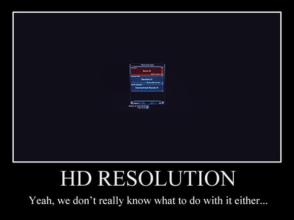
Ok, I admit I haxxored this one to drive the point home. But from here on only genuine screenshots, honestly.
As previously stated, almost EVERY screen in Mass Effect contains at least one major interface design flaw. In the fist chapter we discussed the first superficial parts of the interface such as character generation and the in-game HUD. We also briefly dipped into the more hard-core parts of the interface by taking a look at the character management screen. Today, we shall tackle all the parts of the interface that deal with items, because it’s exactly here where the Mass Effect team made their most severe mistakes.
Equipment
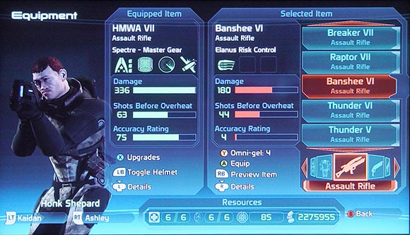
Uh-oh! Complicated interface in Mass Effect. I have a bad feeling…
And with that, welcome to the biggest interface flaw of the entire game and quite possibly the worst game interface ever. It may look inconspicuous but there is a lot that went wrong here.
-
Loss of functionality by merging functions: Flipping through the menus in Mass Effect you might start wondering if you missed something. And then it dawns upon you. There actually is no “Inventory” menu. There is just an “Equip” menu. BioWare decided to limit all items you have to deal with only to actual equipment. So there are no healing items, there are no stat-boosting items, no ammunition and no actual… you know… objects. They explained such a radical change by introducing quite far-fetched concepts like “Medi-Gel” and “Omni-Gel”. The advantage is that the game got superficially simpler. They even could get rid of the inventory screen. The disadvantage is that the remaining interface, especially the equipment screen is burdened with quite a few functions. As you probably guess by now, it handles them poorly.
So for example, you can’t browse trough all the items you have. Items are always sorted by different categories. The kind of categories that appear are dependent on the actual character you want to equip. So you can’t see the “Bio-Amps” you have if you don’t have a character in your team that can equip them. Ironically, especially if you don’t want to use said items, you want to be able to access them in order to discard them. This is what happens when you blindly dump functions on interfaces that were made with different goals in mind.
-
Small menus: One problem with the interface that immediately becomes apparent when you start using it is that the number of items that can be displayed in the list on the right is laughably inadequate to manage the huge arsenal of weaponry you will acquire throughout the game.
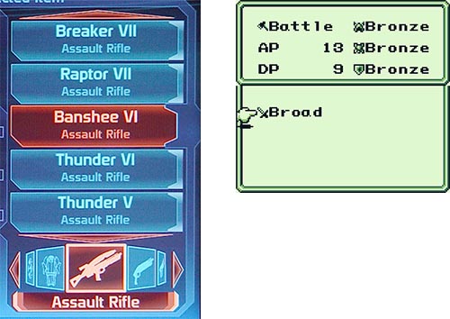
17 years ago, Mystic Quest on Game Boy showed 8 items in the equipment screen (2 colums x 4 items each). Mass Effect, with 90 times the amount of screen pixels manages to show only 5.
As you can see, the list can only hold 5 items at a time. The maximum number of items you can carry (more on that later) is 150. This means that you will need to scroll A LOT. This also means that it will be harder to keep track of the items you have as you will never have them on-screen at the same time. And of course BioWare seems to be blissfully oblivious of that shortcoming because they haven’t even made an attempt at counter-measures such as combining duplicates of items into one entry. So to add insult to injury you will also find yourself scrolling trough lists of identical items. You know, the kinds of list where you don’t actually see if the you are still scrolling because nothing changes.
Of course, the items are sorted into categories but consider that even an ancient RPG like Mystic Quest that worked on the tiny Game Boy screen could hold almost twice the amount of items. And that was on the equipment screen. The inventory screen was 4 times that size. This is the HD-Generation. The screen hast 90 TIMES (!!!) the amount of pixels of a Game Boy screen. I would expect them to be capable to show at last the same amount of information certainly not less and certainly not that little.
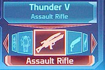
Oh wow! There is an Assault Rifle in the list of my Assault Rifles. What a surprise!
One of the problems seems to be that the actual items take up too much space. Note how each item consists of a box with two lines of text. The first line indicates the name of the item. The second line indicates the category. You might remember that we already established that the items are sorted into categories anyway. Using an extra line to indicate the category of each item is redundant information that takes away precious and urgently needed space. But this is not the only problem with the menu.
-
Under-use of visual aids: There is a certain RPG convention I really like. It is the use of icons in item menus. Tinkering with inventory already has something very playful, maybe even pedantic. I found that using cute, small icons follows up on that sentiment and greatly enhances the experience. It also facilitates visual scanning of the list, helps recognizing the function of items at first glance and helps to identify items more easily. On top of that, it can be used in the same line as the name of an item so it doesn’t take up vertical space. It doesn’t take up much space anyway.
Mass Effect successfully gets rid of that convention and bears full brunt of the consequences. Performing even the most basic act of item management is accompanied by a tedious slowness. So identifying a given item takes more time. Recognizing an item as an item you saw previously is almost impossible given the amount of different gear. Purging unwanted items form a longer list to make room is so difficult, you stop caring at some point and use a hit-or-miss strategy. You start realizing how much of those acts are actually based on visual cues rather than reading the captions. Thank you Mass Effect for teaching us that.
-
Missing information (again): Concentrating on other parts of the interface there are some mistakes I have already mentioned. So yet again, you get great information on how certain pieces of equipment give you bonuses in shields or tech cooldown time. You just can’t see the final result.

Even though you can install upgrades into weapons (like I did here) the weapon’s stats fail to reflect the improvements.
In this case, there is even a weird mistake-in-mistake construction. Each weapon can be boosted by installing attachments and upgrades. However the improvements are not made visible in the weapon’s stats ON THE VERY SAME SCREEN. So for example if a particular weapon has a weakness like a tendency to overheat, you can’t tell if installing upgrades can actually offset that weakness to make this weapon overall better than another one in your inventory. This actually undermines the whole idea of installing upgrades.
-
Menu convention violations: Speaking of upgrading weapons. That part of the interface is a real highlight. You press the blue button (X) to upgrade a weapon. From there on you are presented with a list of upgrades and one or more slots you can put the upgrades in. You press (X) again to select an upgrade from a list. You press the green button (A) to confirm and exit the upgrade sub-menu. In the previous menu the green button (A) was used to selecting items, now it’s the blue one. But never mind that because it gets even better. There is no cancel.
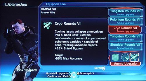
“Do or do not, there is no try”. Or actually, there is no “do not” either. It’s just “Confirm and Exit”. Also: note how the text refers to weapon stats (”Shield Bypass”) that aren’t displayed anywhere else.
So if you accidentally screw up the setup you can’t take it back. Also, you can’t just get into the weapon to check if all the slots are filled without opening up potential to accidentally change something. There seems to be no reason for it, too. Usually you would press the red button (B) for canceling. This button is unassigned in the weapon upgrade sub-menu. And here I was thinking “OK” and “Cancel” were pretty established and reasonable interface design conventions.
But then they manage to top even that. When you switch weapon the game asks you if you want to re-equip the upgrades from the old weapon on the new weapon. Seems like a good idea if only the developers hadn’t forgot a “Cancel” button here as well. So you can only say “Yes, I want to transfer the upgrades” and “No, I don’t want to transfer the upgrades but I still want the new weapon”. There is no “No, I don’t want the new weapon, I was just browsing and accidentally pushed a button, OH MY GOD WHAT HAVE I DONE!”. To add even more insult to injury, weapons with installed upgrades aren’t highlighted in the inventory menu. So you can’t tell if you forgot any upgrades on a weapon you de-equipped. If I was paranoid, I would start suspecting this is a setup. But nah… just wait for the shop screen.
-
Over-reliance on (bad) iconography: Even if they didn’t use icons in the item menu, there are some places where BioWare seemed to have thought it was a good idea to use them after all. Note how there is a panel labeled “Resources” at the bottom on the screen. It treats you with an array of 4 different icons.

Fun experiment to try at home: Let somebody guess what all the icons mean.
This is what happened to the rest of the items you would normally be able to manage in an RPG. So the first icon represents “Medi-Gel”, the number of healing charges you have. Note how the icon successfully manages to capture the idea of healing but somehow fails to faithfully reference the icon from the HUD. In the HUD the Medi-Gel icon has some circuitry attached to it. I don’t even want to start contemplating of the reasoning behind this.
The next icon is the grenade icon which is the same as in the HUD. Which means just as bad.
The third icon represents “Omni-gel” which is the Sci-Fi future version of “garbage”. When you throw away an item it turns into Omni-Gel which in turn can be used at various points in the game. The icon doesn’t look like anything. But then again, Omni-Gel is a difficult concept to swallow anyway. What kills me is that you can turn object into Omni-gel on THIS VERY SAME SCREEN using the yellow button (Y). The game actually spells it out for you but forgets to re-use the Omni-Gel icon giving up it’s only chance to make players associate that obscure concept with the cryptic icon. But keep in mind that the yellow button (Y) is used. It will come back to haunt us later.
Finally, the last icon is supposed to be money. Conventions like “Credits” or at least some reference to contemporary currency symbols (¥€$) are successfully avoided abandoning all hope for understanding. Oh yeah and again, number formatting is missing.
Icons are a compact but sometimes difficult way of communicating things. That’s why it’s often a good idea to have at least one place in your interface that provides a translation, a legend a Rosetta Stone for users to learn the vocabulary of the visual language you use. This would have been a great place.
-
Not all team members available (again): Just as previously in the stats screen, you can equip different characters by cycling trough them with the shoulder buttons. Just as previously you are limited to the characters in your team. So if you buy a weapon in a shop meant for some other character, you can’t actually re-equip that character and sell his old gear right away. No, you have to wait until you are back on the ship. Actually, you can’t really equip characters on the ship either because your main characters walks around alone when on the ship, so you can equip only him. There is a workaround which includes walking to a certain place on the ship and use the lockers of the different characters to show up their equipment screen. But that workaround doesn’t support shoulder button cycling so if you want to compare or exchange gear between characters you need to exit the screen, physically walk up to a different but identical-looking locker and use it again.
So if you switch characters on your team you will find yourself forgetting some good piece of equipment on a character that is suddenly unavailable for the entire duration of the mission. You will also find yourself throwing away gear because of inventory size restrictions, hoping that it isn’t better than the current gear of a character on your ship. You can’t really tell after all. Finally because of all those restrictions you will find yourself sticking to the same 3 characters though the entire game, successfully rendering the ability to customize the members of your team to the specific need of a missions obsolete.

This is the menu where you select characters for the away team. I haven’t mentioned it because it really has only one flaw: it is redundant.
And you know what? The game even gives you achievements for doing so. At least they are consequent, I guess.
-
Unpolished underlying mechanics: And because this article is already so incredibly long anyway, I’d like to point out a problem that has less to do with the actual interface. As you can see, the weapons have 3 different stats represented by 3 different bars.
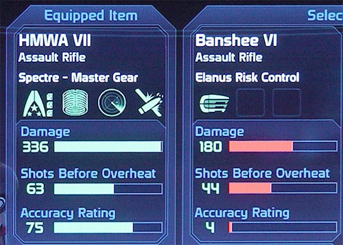
Weapon stats. Remember that Mystic Quest screenshot from above? It had only one weapon stat: Attack Power. That was honest. This is not.
The bars even change color when you compare the weapon currently equipped with another weapon from a menu. This is all fine with the exception that only one of the three values is actually relevant for gameplay – the firepower of the weapon. The second stat indicates how fast a weapon overheats which rarely makes a difference when comparing weapons. Weapons of the same strength tend to have very similar overheat stats. The third stats is accuracy which is a fuzzy term and never played a role during my many playtroughs. So as previously mentioned in my Sword of Mana review, all that fumbling around with gear is all quite pointless as the combat system isn’t deep enough to support this level of detail in customization. You will never find some unique way of fighting enemies, just stronger weapons.
Also, the sheer amount of gear you need to mess around with is troublesome as well. For example each of your 3 characters NEEDS to be equipped with 4 weapons. That’s 12 choices you need to do every time. You can’t leave a weapon out, you are required to make a decision there. You can choose to ignore certain weapons and refuse to change them but that seems to be silly as the game clearly expects you to make a decision. Also, you don’t want to be caught in a situation where you have to rely on that weapon after all. But in the end, you will still mostly stick to just one weapon making the entire process quite unsatisfying. Most often than not, you will replace a weapon with a better version without even firing a single shot.
Considering the shallow combat mechanics, the weird and annoying 150 item inventory restriction and the various limitations of the equipment interface, it should have been obvious to the developers that simplifying the equipment system would have benefited the game. If my Simple-RPG-Theory is right, it would also have been more in-line with the intentions. Failing to recognize that is quite simply bad game design and would have been just barely excusable in a company with little experience or a low-budget. It’s not excusable in the case of a company like BioWare and a game like Mass Effect.
Shop Menu
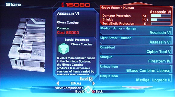
- “80 thousand? We could almost buy our own interface for that!”
- “But who’s going to design it, kid! You?”
- “You bet I could. I’m not such a bad interface designer myself!”
Sadly, the equipment screen is not the only part of the interface that deals with items. There are also a few other opportunities where things could have gone wrong. And of course they did. One of those opportunities is the shop screen where you purchase new gear. Now, I admit that compared to equipment screen, there are less problems here. But then again the equipment screens sets pretty abyssal standards.
-
Small menus (again): So again, the game presents a menu of items for browsing. The size of the menu has been kicked up to a mind-blowing 7.

7 Items in the shop list. Still one less than on the GameBoy 17 years ago. Note the now even more redundant 2 lines of text per item.
That’s almost acceptable. But not quite. One funny thing is that the horizontal size of the menu would allow putting the name and the category of an item in the same line. But no, the interface designers chose to stick to 2 lines of text per item because it worked so well in the past, didn’t it? At least spelling out the information is justified here, but…
-
Underuse of visual aids (again): …but it also becomes blatantly obvious (again) that the written word is too slow to process and filter that kind of information. Figuring out what you are about to buy is a real pain. And I love how there is a huge rendered image of each product on the left, but products tend to actually look the same: like a gray anonymous box.
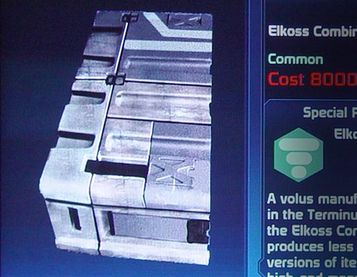
“Dessine-moi une Human Heavy Armor Assassin IV s’il vous plaît.”
I guess the actual appearance of the item is left to the player’s imagination, quite like in the Petite Prince. Interesting strategy, I wonder if it also works for in-game graphics. It could do wonders to budgets.
What’s far less interesting is how the interface shows how much items cost only if you actually select an item. It also fails to visually highlight items in the list (I heard red is a good color) that are too expensive for you to buy anyway.
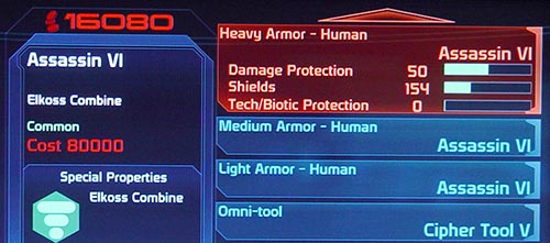
As you can see, with only 16080 credits in my pocket I can’t buy this armor. Neither can I buy any of the other items in the list. Yet the game fails to communicate that. You have to highlight each individual item to even see it’s price. This can’t be good for business.
Instead, you are forced to go through each individual item in the entire shop to discover and remember for yourself whether you can buy it or not.
-
Missing information (again): And as we are speaking of missing information – you know what you normally buy gear for in RPGs? That’s right, to put in onto your characters. So you usually need some information on how a particular piece of equipment works when compared to the stuff your characters are already wearing. It took me some time to find that pressing the blue button (X) show up such information, but I admit that it’s actually spelled out and so it’s my fault. However, just when I thought BioWare got one thing right, they managed to screw things up the very last second.
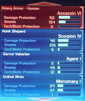
Here we have the game suggesting I should try to put that costly HUMAN armor on my ALIEN team members, Wrex and Garrus. It also fails to show my other two human team members waiting back on the ship. Waiting for that armor… but the armor never comes…
So there is a mode that shows the equipment of other characters compared to the selected one in the shop. But it is (again) only limited to characters in your party and completely ignores other characters on the ship. Also, remember how the equipment screen facilitates comparisons between items by highlighting superior / inferior stats trough coloring the percentage bars? For some reason, it’s gone here. Also, I’m pretty sure the effects of equipment upgrades are ignored yet again. But that’s not even the worst thing. The worst thing is how that mode fails to communicate whether the character actually CAN equip said item. So the game will actually encourage you to buy the expensive human combat armor for your alien team members only to prohibit you to actually equip it after the purchase was made. Really classy.
Also missing is other basic information like the number of copies of a particular items you already own. So the game won’t prevent you from accidentally buying items you already own but didn’t have the time to equip yet.
You know, it’s 2009. This is not the first time people made shop screens for an RPG. Just some basic research into RPGs would have revealed how this can be done effectively. No need to re-invent the wheel every time. It is a mystery to me how you can have such blatant oversights in a modern game of this magnitude.
Recovered Items Menu

Ok, so there you have the real screenshot.
So let us move to the final piece of interface that deals with items. This one is a real keeper, too. You see, in Mass Effect, you don’t actually pick up any loot. Instead it is magically and invisibly transferred into your inventory when you kill baddies. I find this is a quite unsatisfying idea that has the same problems as the too short HUD feedback on gaining experience points (see previous chapter), but nevermind. When the combat is over you may find yourself accessing the menu only to be greeted with a small dialog box that shows you what you found. The very same box also appears when you get loot from chests or space-chests or whatever. The real tragedy comes when you hit the magic number of 150 items in your inventory. The game then makes you use that tiny dialog to sift through the items and discard unwanted ones. You can’t actually proceed until you’re done. This would be just annoying but yet again, bad interface design is here to REALLY make sure this will be as painful and tedious as possible.
-
Small menus (again): After the luxury of a 7-item menu, you are brought down back down to earth by having to work with a 4-item peephole. And you thought the 5-item menu over at the equipment screen was a pain. This one doesn’t even have categories. The number of lines per item was kicked up to 3 and I’m still unable to figure out what the 3rd line actually tries to tell. But the real insult is how that menu is embedded into a black sea of empty screen real estate that could have been used SO WELL to do some actual interface design. If there is an image that portrays the misery and dullness of incompetence in today’s interface design it would be this screenshot… I should make a de-motivational poster out of this.
-
Button layout inconsistency (again): But let us also not forget the little, less visible things. Things like the fact that you can (and have to) turn items into “Omni-gel” by pressing blue button (X). Here is a test if you paid attention: what button changed items into Omni-gel back in the equipment screen?
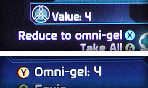
Above: Reduce to Omni-gel on the Recovered Items screen.
Below: The same function on the equipment screen.
Besides the inconsistent button layout and spelling (is it “Omni-gel” or “omni-gel”?), I love how differently yet equally unsuccessfully the Omni-gel value of the item is represented.That’s right, it was the yellow button (Y). You see, BioWare interface designers would have failed this test. Consistency is over-rated. It makes the world so damn user-friendly.
-
Missing information (again): And of course this poor excuse for interface design doesn’t even begin providing you the kind of information you actually need to make the decision you are supposed to make. So you have to decide whether to pick up a new item or not but you don’t actually see if you already own said item. When it is gear (which it mostly is) you can’t tell if it is better than you current gear or even if your characters can actually wear it. You can’t even see the new gear’s stats. But hey, you can make an arbitrary decision, right? You just have to live with the fact that it is probably the wrong one.
-
Unpolished underlying mechanics (again): Which brings me to the final question. Why? Why are we even having this screen? Why is there so much gear when all you get are just dull, linear improvements? Why, oh why is there a 150 item limit? Is it technology? Is the Xbox 360, one of the most powerful consoles of the new millennium not capable to process the bizarre quantum rocket science of saving more than 150 items in a game save? Must be. Oh wait, no. Almost every JRPG can do that since the invention of game saves back on the NES. So in that case it must be actually a deliberate feature of the game designers to realistically portray the inventory restrictions associated with interstellar travel. Along with other realistic concepts like “Omni-gel” and the fact that characters gain experience from idly waiting back on your ship.
Whatever the reason is, the result is a major game design flaw. One that, amplified bye the horrid interface, breaks the entire experience of managing your gear beyond repair.
End of part II
That’s it for now. I think after those stinkers we need a short break. I hope you join me the next time when I present to you the finale. We will be discussing the shortcomings of even the most loved parts of the interface like the galaxy map or the conversation menu. Until then, I encourage you to comment on the topics already discussed.
Note: This is part II of the Mass Effect: Massive Interface Fail trilogy.
Part I is here
Part III is here
The Mass Effect 2 follow-up is here


quick icon guess: the rightmost one should be… Vicotin?
(will read your monster posts in detail later)
Haha, making the screenshots I also thought about pills on that one. ^_^
I thought it was experience since it was a large number….
Hey Till! Nice to see you here.
It’s quite reassuring that I’m not the only person having the problems. So I’m not insane. Or we both are. Also funny that the PC version seems to have the same problems even though the interface does look very different. So it’s not just a lousy console port.
As with your comment on the 150-items: I agree with you. There are games where inventory restriction can actually enhance the experience by introducing strategic challenges. They force you to micro-manage and prioritize resources. On the top of my mind – Resident Evil 4 is an excellent example. But I think we both agree that Mass Effect isn’t that kind of game and it’s the interface’s fault.
And yes, writing about is is QUITE therapeutic.
@insane?
i hope not, because i believe i find myself in the same boat; these things always piss me off greatly, and i cannot fathom how other people can stomach them. thanks for skewering mass effect so well, it is a very cathartic read for people like me.
I have to agree with you on this, although ME remains a really great and awesome game for me. But, let’s face the truth, everything that you wrote about is true. It is a little easier for PC users I think, but still…
I wanted to add something to the 150 items restriction. If you already have, let’s say 149 items in inventory and you get 4 new ones, you HAVE TO reduce 3 of them to omni -gel, because you just can’t pick them and THEN decide which to get rid of (by the way, I think Bioware forgot to incorporate simple “throw away unwanted item” but I could be wrong here), or god forbid, click non-existing “cancel” button. So if I actually get 2 or 3 items that are better than I currently have, I can’t use them for anything else but omni-gel, and I can’t return for those items later, when I have more room in the inventory . Real slick.
I bought mass effect to play thru before I play though ME 2. I completed a long chain of events and was rewarded with lots of great items at the climax. Problem? Oh I suddenly and inexplicably ran out of room and had to turn seven of them (over half) to omni-gel.
This is the worst video game experience I’ve ever encountered. Unfortunately I quick-saved after the items were put into my inventory. I’m considering throwing the game away at this point.
Great game design.
Well Tali’s bits. I just went through Eden Prime, Citadel, and half of Bring Down the Sky too broke to buy her something nice… and only now I find out what “Recovered Items” popup with no cancel button really is! My oversight..
And I didn’t expect to need fourth items for characters to swap. Then again, another symptom of the console-itis plague, plus lazy.
(On PC it’s become standard to download the Fans Own Laboriously Created UI Mod for X game. well, even if Bioware didn’t make the UI, some doofy license protection issue makes it difficult to mod. Anyway, fortunately some things can be “fixed” even if it breaks immersion.)
Personally I won’t complain about cost though, some simple console games in the 80’s cost $50. A lot with inflation.
Awesome game so far!
had to say-now I guess that ‘Recovered’ popup’s automatic. I’d have to mod consoles for some of these games, but they’re great for the Chill/GF/Wii factor. Thanks for the heads-up on some of these things!
[...] – Krystian Majewski’s thorough drubbing of Mass Effect’s user interface (Part 1, Part 2, and Part 3). A must-read for anyone interested in making [...]
[...] Mass Effect: Massive Interface Fail Part Two [...]
Awesome read and a real eye opener for a Mass Effect fan like myself. Interested to see if you’re doing a similar review for the two sequels.
I’m working on a ME2 article right now. But it’s going to be far less crushing.
I hope so, lol. Sequels are supposed to see improvements.
Hey Krystian,
I’m really enjoying your series so far! As a game developer, I’m actually learning quite a bit from you in terms of UI design philosophies.
One thing I thought I’d weigh in on is your point regarding the store screen, and how the item descriptions take up two lines, rather than one (ie. the “Heavy Armor – Human” and “Assassin VI”).
I actually think the designers were just in their decision here in that localization of the game might cause issues when it comes to fitting all that information on a single line. Translating those terms accurately to any given language might result in overflow, causing the words to run together. Having to do case-by-case language programming just makes zero sense, so while I’m sure they could have found a more efficient way to display this information, I’m not sure a single line would have made things better for everyone.
Just my two-cents! Keep up the great work!
Cheers,
Ryan
After posting on the ME2 review, I thought I’d offer some insight here. First and foremost I agree that the interface is terrible, but here’s a few things that might help.
The third line in the items recovered screen is the manufacturer. Essentially this is a second form of teiring items because for some reason leveling them 1-10 wasn’t enough. If you spend the time looking for and reading the licences or have played the game way to much you’ll get an idea of which “brands” have higher damage, accuracy, and shots. Long story short, you get an idea of its stats even though the item recovery screen doesn’t show you them. All this is for naught though because the spectre gear is better than everything.
Also in regards to the party, not everyone can use every weapon. Liara for one can only really use a pistol. This saves time when equiping them and also relieves worrying some that you just discarded a gun that might help someone else. Now the downside to this is you ofcourse need to put that person in your party to see what guns they are trained with.
Finally, this one is just a matter of opinion and doesn’t have much todo with the interface. I don’t think you should completely dismiss the shots fired and accuracy stat. Once again these are for naught when you get the better than everything else spectre gear but till you get there, on higher difficulties, these stats are invaluable. I can’t stand a sniper rifle with less than 70 accuracy. It just has too much sway for me. I know this is more a gameplay thing than anything else though so feel free to ignore this last part.