I wrote my Mass Effect Massive Interface Fail trilogy in 2009. To my surprise, it has become one of the most popular posts on this blog. I was shocked seeing some people even use it as a teaching resource for UI/UX design in games. The recent mention by Kirk Hamilton on the Kotaku blog brought the posts back into spotlight and demonstrated that even after over 2 years, the topic is still relevant.
“ASSUMING DIRECT CONTR… wait a minute! This feels different! Bob, have you been messing with the interface? It totally feels like a shooter now. I can’t roleplay a believeable character this way… OH SNAP, I GIVE UP!!”
So with Mass Effect 3 being almost upon us, I decided to finally take a look the interface of Mass Effect 2 in hope to bring closure to the drama caused by the initial article. If you are looking for another crushing takedown, you might be a little disappointed. After my first paytroughs of Mass Effect 2, I felt like a lot of my former complaints were take taken care of. Yet, there was a strange emptiness about the game. So let’s jump in and systematically compare the problems I had in Mass Effect 1 with how Mass Effect 2 turned out.
Character Customization
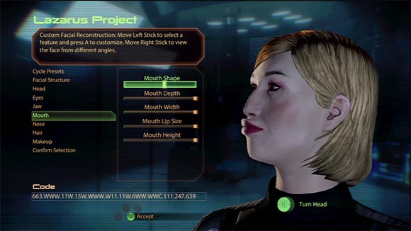
My secret Asari seduction technique: the duckface.
How about we begin at the beginning of the game – the character customization screen. In the previous game, I criticized that it relied too much on generic interface elements which don’t really allow any other approach than blind trial and error.
In Mass Effect 2, nothing changed. We still have the same useless sliders for every facial feature. None of the sliders has distinct markings so it’s equally difficult to return to a previous setting after changes have been made. There are no thumbnails or previews to give you an idea of what options will do.
I noticed that there is a weird code on the bottom left of the screen. Apparently it’s some sort of a password system that records the facial features to pass it on to others. A cool idea undermined by the fact that there is no interface to input the code in a convenient manner. At least not on the consoles.
But at least they haven’t broken anything, right? Well, it turns out that some more interface catastrophes managed to creep in. Take a look at what kind of wonderful decision you are confronted with by the end of the process:
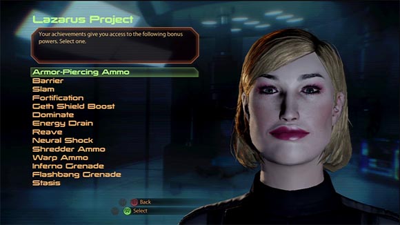
Welcome to Unique Squard Member Power roulette!
You have to pick one of 14 different special powers. None of them is explained in ANY WAY. How the hell are you supposed to know what a “Reave” or “Dominate” is? And even if you did know, how are you supposed to judge the usefulness of things like “Armor-Piercing Ammo” before you even fought a single enemy? You could just as well roll a dice. Simply a baffling mistake, especially since:
- All the other screens have plenty of descriptions.
- There is enough room at the top for a description.
- You can make the same choice later in the game and that interface actually shows descriptions.
Luckily the choice is reversible. But as mentioned before, those bits of interface are especially important because they introduce new players to the game. All this interface does is to make them feel stupid and lost. Luckily, the game will catch up with them soon.
Result: STILL FAIL
Nothing has changed. If anything, even more mistakes crept in.
HUD
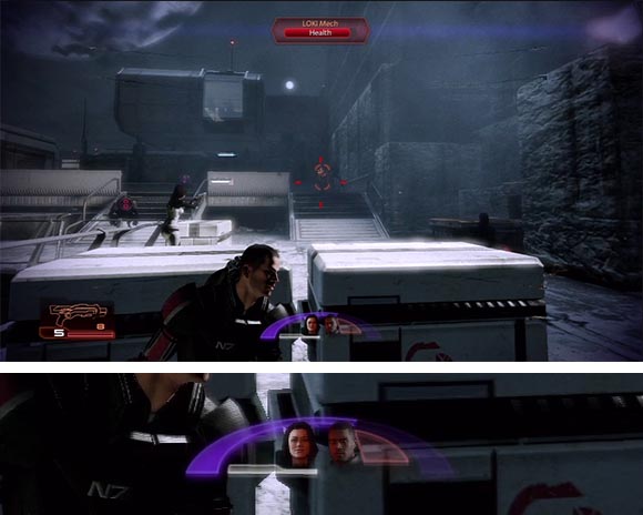
I think I found Shepard’s missing character arc. It was there all along.
Ah, that felt like in the good old times, let us look at the HUD. The previous critique was misleading styling of health bars, unreadable and incomprehensible icons and poor success feedback when getting loot and experience points. How much has changed?
Surprisingly, a lot actually! There is much less interface in general, as if Bioware was self-conscious about it. Parts of the interface tend to even disappear when “not needed”. For example, there is a larger, arc-shaped health bar in the center now. It usually does a fair job at communicating Shepard’s health. But there is still some confusion because it disappears when you are at full health. So it’s sometimes easy to confuse “almost no health” and “full health”. Not exactly the kind of things you want to confuse.
I think I know that kind of thinking lead to this. There are some people who really want to make on-screen interfaces as minimalistic as possible to go for that cinematic feel. Some even claim that it improves immersion. However, I don’t see how the techno-futuristic world of Mass Effect is hurt by interfaces. In fact, Bioware actually shows flashy, über-complicated interfaces during the loading screens? Why are they seen as an aesthetic asset during loading times but as an aesthetic burden during gameplay?
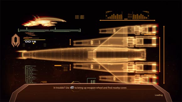
UI breaks immersion unless in the loading screen – then UI helps preserving it. And is it just me or does this fake UI look so much richer than everything else Mass Effect has to offer?
Back to the health bar, there are also some minor problems with shields being displayed by the same arc bar. So at first the bar shows shields and once those are down it switches to health. There is some color coding to show what is what. And it does an ok job once you learn that. But it’s just another unnecessary detail you need to deal with. Why not just show two separate arcs for shields and health? Or split the arc into two like in Torchlight?
In any case, the health meter is not that important anymore as the game uses that shooter trope of showing red, veiny edges around the viewport when the player gets low on health. They are particularly ugly and disruptive in Mass Effect 2. But they do a good job at smoothing out the shortcomings of the arc health bar. After all, there are games which manage only with the red edges. Keep throwing stuff at the wall, Bioware. Eventually something sticks.
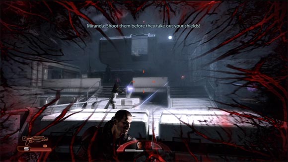
Woah, take it easy, space cowboy. I think my screen is having an erection.
Things get very murky when it comes down to your teammates. There are two icons inside your health arc that show the faces of your mates. There are different shapes around them that probably mean something. After two playthroughs I still haven’t figured out exactly how they work. I actually looked up in the manual and in GameFAQs and it was equally vague there. I’m pretty sure the white bar underneath the portraits indicates how far their power has recharged. I’m guessing that the triangle next to each portrait has to do with the health but it’s inconsistent with the color-coding of all the other health bars in the game. For some team members it’s white when the they are fine and it turns red when they get hit. But red means healthy in the other health bars. Other team members start out with a purple triangle instead of a white one. One could suspect it indicates a biotic barrier as in does in other health bars but that isn’t true either. Miranda is a biotic and she has a white triangle.

Why is Jacob’s health triangle purple while Miranda’s is white? Both are biotics. Or wait a minute, is it because Jacob is black?
But, you know what? I just don’t care anymore. Because I can’t even heal my teammates anyway. So it’s no longer important how much health they have. The only thing that counts is to clearly separate my status from the one of my teammates. That’s something the interface manages to pull of.
This also explains why there are no icons for grenades and healing. You just don’t have this ability anymore. I guess that’s a way to fix things.
On a more positive note, there is now an “index card” appearing in the lower right corner elaborating in great detail when you get a new quest, some kind of points or simply loot. It isn’t the most elegant solution but it does a good job at pointing our your rewards. I especially like the fact that each category of rewards is presented on a separate card. If there are multiple rewards they are stacked on top of each other and shown one by one. So it’s harder to miss something when you hit the jackpot. Also, each card has a large, juicy image so with time, you learn not to even read the fine print. The only thing I still miss is a way to review a history of all the cards you got in case you actually do miss something. But otherwise, it works and feels satisfying.
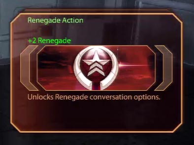
Oh Bioware, don’t encourage his bad behavior! Reward “index cards” are one of the major interface improvements.
Overall the combat system got much simpler except in one regard. Enemies now have all these different kinds of health bars and suddenly they all matter. So they now have health, armor, barriers and shields. The latter are not to be confused with anti-ballistic shields which are defenses some enemies can errect on the battlefied. Each type of health needs a special kind of attack and some attacks are completely ineffective against certain kinds of health. Needless to say, it can be very confusing. Luckily, the interface actually addresses that problem.

Big help, but unreliable. I’m attacking a mech, who is protected by armor and standing on an unreachable balcony. The circle menu highlights the powers (1) and (2) in red to show that they won’t work on an armored enemy. Oddly, the interface doesn’t indicate a problem with the charge ability (3) even though it would be ineffective due to the balcony.
When selecting the different powers from the wheel interface, the kinds of powers that would be ineffective are marked red. There is even a small tooltip explaining why. This is something I actually really liked about the interface. Sadly, there is still one nitpick. In case of the Charge ability of the Vanguard class, it doesn’t show you if the attack will succeed. Granted, that specific attack is a bit different. It succeeds depending on how far out an enemy is and what obstacles are in the way. Still, it felt like a small missed opportunity there.
In general, the new HUD is ok. It still comes apart when you take a closer looks at some of the more obscure parts. But the most basic things work well. And there are some nice highlights too. One thing that should make us wary is that a lot of abilities you had in the previous game were removed. Let’s see if this is something that crops up elsewhere.
Result: IMPROVED
Still not perfect but works fine.
Character Management
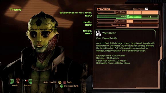
Psst, put on your best pokerface, Thane. Maybe they don’t notice that the UI hasn’t really changed here.
Let us move on to the Character Management Screen. My previous critique was missing information to make informed decisions about the growth of your squad. The available information was inconsistently represented and not all team members were available. So what changed?
Turns out, not much. The Character Management screen is almost the same. You select boxes to upgrade your powers. The descriptions in the boxes often reference values you can’t look up anywhere. There is still no overview of how all the effects that you got stack up.
But oddly, that part of the interface feels less broken now. And it’s not because they fixed it. It’s because again, they simplified the underlying system. For starters there are dramatically fewer abilities to chose from and each has fewer boxes to fill in. In Mass Effect 1, your main character had 13 Talents, each with 12 upgrades. A whopping 156 boxes allowing for over 106 trillion (!!!) different setups. No wonder you needed context badly to make a decision. In Mass Effect 2, your main character has 7 Powers and just 4 upgrades each. So it’s down to just 28 boxes that allow for just over 16 thousand permutations. A reduction of complexity by a factor of 6,5 billion! And it’s even less for supporting characters. So yeah, the choices you make are much simpler and clearer now.
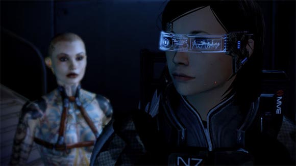
-”Shepard, what does the scouter say about the number of my power level permutations?”
-”It’s less than two hundred fifty-siiiiiiiiiiiiiix!!!”
Not only that, most of the abilities you level up are actual attacks, so there is much less talk about base character stats. You are not developing a character as much as you are upgrading individual combat abilities.
But to be fair, some of the available information is slightly more consistent now. Health and Experience Points are just plain numerical values – no more weird fractions anymore. They even don’t go higher than quadruple digits so they are well readable. Experience points shows how much points are left for the next level up, so you don’t have to do the math in your head. Even the descriptions of the individual upgrades seem to be a bit more detailed.
On the other hand, some old problems mistakes are still there. The weird arc-shaped Paragon / Renegaede bars are still there and still don’t display numerical values unlike what you get on the HUD. You still can’t see the base stats or how all the boosts and upgrades stack up. And you still can only manage the characters in your team.
So the most dramatic change is not so much the actual interface but again, the reduction of the complexity of the underlying system. And that’s a double-edged sword. On the one hand, it fixes a lot of the problems that cropped up in the previous interface. Individual upgrades seem more meaningful now. You can actually feel the difference in-game every time you upgrade. There is less need for context information. Because subsequent upgrades are more expensive and there is a reward for upgrading all the way, there is even a nice dilemma of spending your points immediately vs. saving them up for later.
The downside is that there is less potential for actual character development. None of the powers refer to anything that happens outside of combat anymore (except for a Paragon/Renegade bonus in one case). Mass Effect 1 had at least some choices for “Charm” and “Intimidate”. In Mass Effect 2, an engineer can’t even improve his hacking skills. It has all become very close to a multi-player shooter with customizeable loadouts. Technically, there is nothing really wrong with it. It’s just shallow for an RPG.
Result: MEH
Minor fixes. The only reason it works better now is because the underlying system has been radically simplified.
Equipment
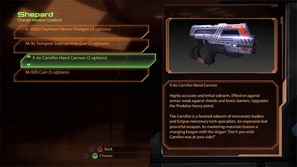
Break up and dumb down – the weapon equipment screen gives you an menu with 8 entries when there are just two guns in the game.
But before we totally drift into the discussion of gameplay choices, let us look at other interfaces. The Equipment screen is where things really went bad in Mass Effect 1. That interface screen suffered from some major problems because it was trying to do too much at once. The menus were too small to be able to manage the huge amount of gear you got. There was a lot of useless information junk and no visual aids to help you sort things out. Information about the effects of weapon upgrades was missing. There were horrible button layouts and bad icons. And equipping team members outside of your party was a pain in the ass. What changed?
EVERYTHING. The functions of that one screen were separated into 3 different screens. One of them dealing just with equipping weapons. It uses a generic screen layout which is something I will comment on later. In this case, the interface does a fair job at first. It shows a reasonable amount of list items. You can easily equip the entire team on your ship now. There are even multiple locations for doing so. And if that’s too tedious, characters will actually automatically equip new weapons you pick up. The downside is that you can only change weapons at designated spots. Luckily, there often is such a spot right after you picked up a weapon, just in case you want to undo the automatic changes.
Each weapon has a sleek illustration now. Perhaps the most dramatic change is that each weapon actually FEELS very different in the game. I really liked that part.
But as with the HUD and Abilities, there are much less weapons to chose from now. For example, in Mass Effect 1 there were 16 different pistol lines, each having up to 10 weapon levels. This resulted in over 120 different pistols to chose from! And you could have multiple copies of each one. Mass Effect 2 only has 2 – yes TWO pistols in the ENTIRE GAME! (3 if you buy the Firepower Pack DLC).
So you never even notice the fact that there is actually even less information to make informed decisions now. All stats are gone. What you get is very vague descriptions. Here are some excerpts from 3 different weapons:
-
“…effective at penetrating shields, armor and biotic barriers.”
-
“…This dramatically improves its armor-piercing capabilities”
-
“effective against armor; weak against shields and biotic barriers.”
So when you are about to fight armored enemies, which one should you pick? The answer is: it depends on the kind of upgrades you’ve got. But the description doesn’t get updated as you upgrade and there is no way to even review your upgrades from the equipment screen.
Choosing a weapon is less of a pain now. But that’s not an achievement of an improved interface, that’s only because there hardly are any choices now. You can have pistol number 1 or pistol number 2. I mean, as far as choices go, you can’t go any simpler than two. Now that I think of it, for that kind of choice there is even too much interface now. Why having a separate menu with 8 entries if you could pick your pistol with a single checkbox – “check here for the advanced pistol”. If Mass Effect 2 had even one-tenth of the number of weapons from Mass Effect 1, the interface would be laughably inadequate because there is even less information now to base decisions on.
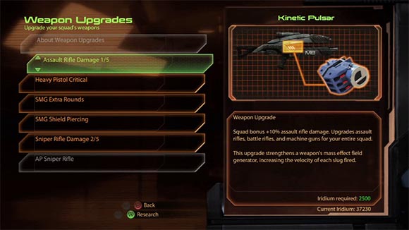
I wish real-life research was so simple.
But let us move on to weapon upgrades. They are performed on the upgrade research screen now. As on the previous screen, this also uses the generic interface layout. It works ok at first too.
Again, things are simpler now (noticed a theme there?). Weapons are not upgraded individually but improved in general. There is no strategic thinking behind the upgrades. The weapons just get better. The only strategy is which upgrade to perform first. Again, there are still no icons but also no junk information either. The information on current weapon stats don’t exist here either. Just the improvement in percent. At least the upgrades all have shiny pictures. And what I really liked was that unavailable upgrades are just grayed out in the menu. It really helped to get to the bottom line.
And the bottom line isn’t always that clear. Sometimes an upgrade can’t be installed due the lack of resources and other times because a different upgrade needs to be researched first. The layout doesn’t do a good job at highlighting exactly what you need exactly to install an upgrade. If resources are missing they turn red in the description. But if another upgrade is required, it’s not highlighted. Resources are displayed on the bottom of the description. Required upgrades dependencies are at the very top. Considering the comments online, I think many people got the wrong idea that you need a lot of resources to upgrade your weapons. I myself also started to play the planet scanning mini-game frequently on my first play-trough. It took me some time to realize that it wasn’t a lack of resources that was preventing me from upgrading.
It is difficult to compare this part of the interface to Mass Effect 1 because weapon upgrades work so differently now. As with other systems, this part has been also radically simplified. There is a general lack of direction in the upgrades now. The number of upgrades is low, you never need to scroll the list. Almost all of them are variations of “it has moar power now”. There is no sense that you can modify a weapon to be more adept at being used in a certain way. There is no way to really offset a problem with a certain weapon either. You are not even tinkering with any stats. You just press A and things improve somewhere somehow.
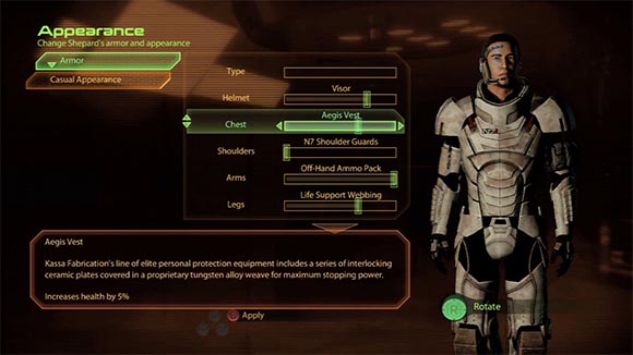
Mixing aesthetic choices and gameplay decisions. Or perhaps it’s just a bug and the pink armor was supposed to give you charm bonus?
Finally, the somewhat awkward armor screen. This one is a custom interface. Custom-built to fail. It consists entirely of those wonderful sliders we’ve been introduced at the beginning. So you switch a piece of armor by sliding a slider. The slider tells nothing about how many options for that particular piece you have. You just have to try them all every damn time.
Which is not often, mind you. The stations where you can change your armor are pretty rare. Actually, there is some weird mix-up going on here. Because in the same menu, you can customize purely cosmetic appearance of your character. So right underneath your armor pieces, you can also chose the color of your armor. At some point it’s hard to tell if an option is cosmetic or actually improves your stats. My mind was blown by the end of my second playthrough when I accidentally discovered a helmet with a boost on charisma.
And again, there is a lot of missing information. Effects of boost are speculative as your current stats and how the different boosts stack up isn’t shown. The description of items is often too long for the little description box so you need to scroll. Stat effects are often at the bottom of the description so you are forced to scroll every time to get to the good part.
But again, things are simpler as only Shepard’s armor can be customized. So all this confusion about who can wear what is gone. Due to all the little issues and the weird mix-up with aesthetics, this part of the game feels like some sort of an afterthought or last-minute addition. On the other hand, this is really the only place where you can customize your equipment in a meaningful way now.
In summary a greatly convoluted interface of Mass Effect 1 was broken up into 3 individual screens. They work ok for what they need to do. The massive simplification of the underlying system dramatically lessens the impact of any problems and successfully masks that no real improvement has happened.
Result: KINDA IMPROVED
In a baby/bathwater kind of way.
Shop Menu
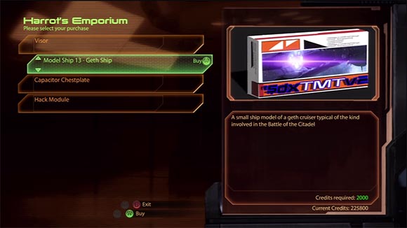
An RPG shop in the terminal stage of turning into a shooter – Half of the inventory are fish, space hamsters and model ships. He’s dead, Jim.
Let us turn our attention to the shopping screen. Usually an area to check out some loot and to yearn for the epicness within. The problem with the Mass Effect 1 shops was that there was too little room to show the entire inventory comfortably. There were no visual aids to help sorting out the merchandise, especially in regard for what you can afford. Most notably, a comparison screen failed to show if a certain item was an improvement or even something that could be used by your various squad members. Are things better now?
At first sight, yes. Again, it’s a variation of that one generic layout we’ve starting to see quite often in this review now. The menu is slightly larger, and quite adequate for the low number of items that are available. Each item has the same neat illustrations the other screes showed. There are no comparison screens because you can’t actually buy anything that REPLACES something you already have. You can only buy upgrades. You can only buy them once, too. There simply is no way of purchasing a wrong thing. On the other hand, you can’t sell anything either. Not even all the resources you collect. But I really want to stress out how items, that are too expensive are actually grayed out. A very simple function that made me happy. Welcome to the 90ies Bioware!
But this is actually when I began to really second-guess what is going on here. In all cases, underlying systems have been massively scaled down. It’s here at the shops where it becomes blatantly obvious. There just is nothing to buy anymore. So they filled the shops with useless junk like model ships for your desk and fish for your aquarium. Even with this crap, the stores never really feel full. Every now and then you get an upgrade and you just immediately buy it even when you aren’t really sure what it does. You even buy all the useless junk because it’s super cheap. My parents always told me that this is what communism feels like.
There is just no excitement that you usually get from an RPG store. Remember how in Diablo they even made a lottery out of buying loot that was specifically not identified it. That was shopping that made your heart pound. Now in Mass Effect 2 there is this vapid, lobotomized husk of an item store. Sure it works. But it that’s not hard if you are not doing anything.
Result: KINDA IMPROVED
In a baby/bathwater kind of way.
Galaxy Map
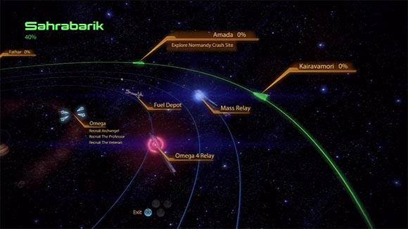
Spaaaaaace! Not sure if genuine improvement or if space just makes me feel warm and fuzzy inside.
I feel like this is analysis is going to a very dark place. Let us look at something not related to combat. The Galaxy Screen in Mass Effect 1 was beautiful but it had two fatal flaws. One was a button layout inconsistent with other screens that would frequently cause you to close the entire map instead of zooming out. The other one was a lack cross-referencing with your journal. So there was a lot of searching involved if you wanted to go to a specific place to do a mission. Has it improved?
Yes it did! Both problems were fixed. The X and B buttons exchanged their functions. There are labels now that show you what missions are available at each location. The lables do have a tendency to overlap each other and feel oddly wobbly when you tilt the camera. Some labels such as the resource-rich planets from the Shadow Broker DLC have the tendency to never go away. But overall, this is as close to a clean getaway you can hope for with Mass Effect interfaces.
Except that there are no clean getaways. Let us quickly address the issue of fuel. It’s a new concept in Mass Effect 2. You need to buy fuel to travel between systems within a cluster. It’s one of the things you didn’t have to do in Mass Effect 1 – why now all of a sudden? It’s implemented in a half-hearted kind of way too. You buy fuel together with probes at the fuel depots. But there is no actual store screen. You just “touch” the fuel dept in space which allows you buy the fuel and probes by pressing the corresponding buttons on the controller. What is really odd is that it says “buy” but there are no price tags on the items. For a long time, I was under the impression that the fuel and probes were free. I was shocked to find out on the Wiki that fuel costs 1 credit per unit and probes cost 100 credits per 5 probes.
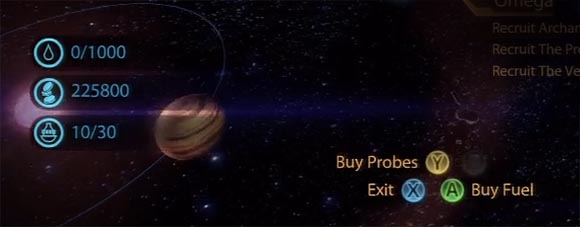
The very definition of after-thought: A shop with no price tags. Your money balance is tucked BETWEEN your fuel gauge and your probe count. And look, the crappy icons are back!
The real pointlessness of the fuel system becomes evident when you actually run out of fuel. Mind you, it’s something that is very difficult to achieve. The star systems are mostly so close together that you can get there and back on one tank with no problem. If you actually run out of fuel… you just automatically jump back to your the nearest depot and lose some minerals. What were the thinking?
I have a theory. One of the clues is on the very same screen. If you pay close attention, the way you fly from planet to planet is different now. In Mass Effect 1, you were controlling a cursor. If you selected a location, the ship would automatically fly to your cursor. In Mass Effect 2, you control the actual ship (except for in the galaxy view). Why would the developers change a perfectly working system?
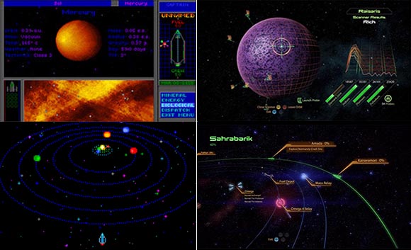
“Mass Effect! Bioware never told you. I am your father. And I must say you are not exactly doing a great job. Try harder and together we shall rule the galaxy!” (left: Star Control 2, right: Mass Effect 2)
I think these were all attempts at making Mass Effect 2 more like Star Control 2 – a wonderful, 20 years old space exploration RPG where you needed to manage resources like fuel and your ship’s upgrades to reach out to ever distant star systems in a search for valuable materials. As mentioned in my previous review, Mass Effect 1 already had some resemblance of Star Control 2. Mass Effect 2 tries desperately to mimic it right down to planet scanning mini-game and fails horribly. Star systems in Mass Effect 2 are never so far away that careful fuel management becomes an issue. The spaceship you control feels lifeless because it has no inertia and isn’t affected by gravity as in Star Control 2. The planet scanning mini-game is incredibly boring. It’s doesn’t really vary from planet to planet like Star Control 2. The materials you collect feel far less precious than the materials in Star Control 2 because they hardly ever feed back into your ability to explore further. Finally, the planet probing mini-game doesn’t have any dangers or obstacles. In Star Control 2, there were planetary hazards that created a risk/reward mechanic. You tried to get the most resources without losing your shuttle. You had to replace shuttles only when you pushed your luck too hard and they were expensive. None of that is present in Mass Effect 2. You always have to replace probes no matter how well you do. There is no risk or strategy involved with probing planets.
Despite this huge faut-pas, the new galaxy map is more usable than ever. The only gripes I had with it were improved. The failed attempt at copying Star Control 2 is a nuisance but it hardly ever interferes with the task at hand.
Result: IMPROVED
Perhaps not perfect but works fine.
Leftovers
We have been over the most important parts of the interface. Let us get the less important screens out of the way before we wrap up. I decided to put them together into one category because this article is already running long.
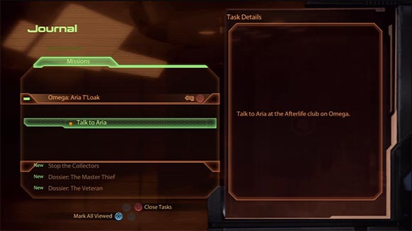
Scumbag Journal: Didn’t have to change because map picked up the slack.
The Journal screen hasn’t really changed. My critique was the lack of cross-references with the map. They are still absent but the map screen picked up the slack. In fact, the map does such a good job at telling you where to go next, I hardly ever used the journal screen. It has it’s use for some of the more obscure assignments.
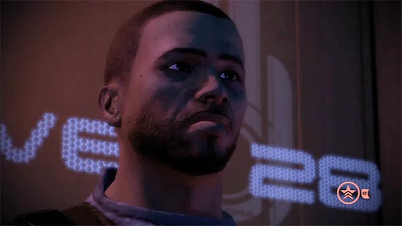
This guy is about to dislike the new interrupt system a lot!
The conversation menu hasn’t changed much either. My critique was the inconsistent use of Paragon/Renegade and Investigate/Finish layout scheme. Also, in cases where conversation options not available, they lacked information as to why they were not available. The layout hasn’t changed. The extra information isn’t there either. But as with the almost every other interface, the conversations have become simpler now. What I mean is that there are fewer instances of not being able to pick a conversation due to missing requirements. I’m guessing this is an effect of not being able to upgrade your “charm” and “intimidate” levels anymore. I did enjoy the ability to interrupt a conversation, though – a good way to make the conversations even more dynamic and cinematic.
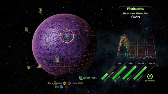
Ah, the Jar Jar Binks of Mass Effect 2. Surprisingly, not really broken. Just terribly boring and unsatisfying.
The planet scanning screen is a new one and a pet peeve of many players. I already commented on the shortcomings of the mini-game. The actual screen seems do to it’s job (of boring the player to death). There is a small issue with the bars that represent the different resources. You continue getting resources even if the bar is filled up. The Normandy doesn’t seem to have a limited capacity. This makes the bar display ill-chosen and a little misleading. The bar should have been tied to the next research item. But this doesn’t cause any serious problems.
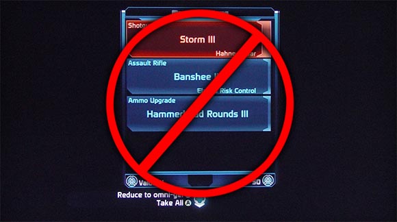
Possibly the BIGGEST improvement of Mass Effect 2. But at what price…
Speaking of unlimited capacity, I was relieved to see that one big problem Mass Effect 1 had was completely removed. You no longer have to sort out useless equipment due to inventory size restrictions. That’s one screen I won’t be missing.
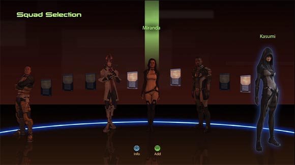
Selecting a team is not quite as useless as before. Not getting achievements for ignoring it helps too.
The squad selection menu has been updated somewhat. There is no longer that useless squad strength statistic. Instead, you can review the individual powers of your team members before selecting them. That’s actually useful and when playing on Insanity, I even changed up my team a bit according to what kind of enemies I was expecting. One detail that is still missing there is the amount of skill points an individual team member has stored up. Depending on how long you haven’t used a character, the information can be hopelessly outdated. Also, every time you start a mission, you go trough a sequence of Squad Selection, Character Management and Weapon Selection. There is no way to go back in that sequence when you screw up. Luckily, this is somewhat alleviated by the ability to re-start an ongoing mission which makes you go trough that sequence again.
Result: KINDA IMPROVED
No big changes but a few, small improvements every now and then.
Standard Interface
Let us move on to some general observations. One thing that struck me when reviewing the interface was the over-reliance on a very specific interface layout. You know which one I mean.
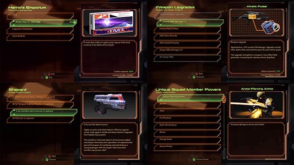
The only problem with standard is that it’s never the deluxe version.
The same interface is used for vastly different tasks: equipping weapons, researching, shopping, selecting unique squad member powers, selecting team members during the suicide mission, reading log book entries on missions, reading messages on your ship – you name it. There are two problems with this approach.
One is that while that standard interface is not particularly bad in for all those tasks, it’s never really good either. There are numerous instances of awkward workarounds to make the square peg fit into a round hole. The research screen needed a description of every research category. So there is a menu item called “About…” in every sub-category among the actual upgrades. The same research screen has a summary of required resources in the bottom right corner. But there is no space to add the other requirements for researching an item. When the screen is used as a summary of all the traits of a character imported from Mass Effect 1, the buttons are awkwardly re-purposed to static bullet-points. And I assume that one of the reasons for why weapon stats are missing everywhere is that it would have been to much effort to add this functionality on that screen.
The second problem with the standard screen is that it creates this feeling of bland sameness. There is never really anything exciting or meaningful about using those interfaces. In the world of games, interfaces go a long way to create realities. The galaxy map is a good example. Traveling from planet to planet could have been easily solved with the standard interface as well. But the way it it works right now creates an impression (albeit a somewhat flawed one) of actually travelling through the galaxy. It does so much more than simply moving the Normandy from location to location. It actually creates the entire Galaxy and makes it palatable. By doing so, it fulfills a crucial part of the Mass Effect narrative. The standard interface does no such things. Every time it is used, the potential to make more parts of the game real and meaningful is lost. And it is used a lot more often than it should have been.
Conclusion
In my review if the Mass Effect 1 interface I speculated how Bioware was attempting to
“[...] make an RPG that could be also enjoyed by the typical Halo player.”
It seems like in many ways, Mass Effect 2 delivers on that premise. It’s a Pyrrhic victory only achieved by reducing RPG mainstays such as character development or equipment management to a bare minimum. What remains is barely more than yet another cover shooter.
If there are no problems with the interface in Mass Effect 2, it’s because large portions of it are no longer meaningful or even needed. It still sticks around so you can press some buttons and have the illusion of choice. But in reality, most of the game would work just as well without the menus and buttons. Shooters like Call of Duty or Gears of War have a similar overall complexity and do fine without weapon selection menus or team member status bars. At times, it seems almost as if Bioware realized this themselves. The HUD appears and disappears as if it were caught in some kind of Schrödinger situation – half dead, half alive. Other screens are replaced with generic, lifeless standard screens. If there are original interfaces, they are often the same as in Mass Effect 1. If they work now, it’s not because the interface became smarter, it’s because the game became dumber.
That’s not to say that there are no improvements. The “index card” success feedback, the fixed galaxy map, the lack of item discards are certainly welcome and urgently needed changes. On a technical level, the improvements certainly outweigh any problems that may have crept in.
Sadly, this success feels hollow. Sure, Mass Effect 1 certainly was way too complex. But in a way, this was the game’s greatest asset. In hindsight the part I enjoyed about Mass Effect 1 was the grand vision it failed to achieve. Mass Effect 2 didn’t upscale it’s efforts, it downscaled it’s ambitions.
This is not only apparent in the game’s interface and gameplay but also in the less cohesive plot. Others have already discussed this great detail, but I’m planning to take a microscopic look at the lackluster storytelling in some individual levels before sequel hits. As for the third part of the Mass Effect trilogy, I’m concerned that’s when the series will hit rock bottom and become yet another Gears of War for the Brohan / Jersey Shore crowd. In this regard, it would become a series about the downfall of humanity indeed.
Note: This article refers to the Massive Interface Fail trilogy.
Part I is here
Part II is here
Part III is here


Alright, sending this to my teachers- great post
Wow, I got linked here from Kotaku and I have to say, I enjoyed reading all 4 parts of this. You don’t just have opinions, you use objective facts and images to make your points, and because of that they are even stronger. I absolutely love articles like this that break down games and go into detail about WHY something is messed up, usually with a playful, but critical tone. I laughed the entire time I was reading each flaw, because I noticed and was frustrated by the exact same things.
Other than the obvious ridiculous inventory, the BIGGEST problem with ME1 I had was the galaxy map not explaining where you had already explored, which was fixed with ME2’s percentages. I had to draw my own version of the map on a piece of paper and manually cross off the places I had been. It’s a huge pet peeve of mine in game design – If I have to write something down outside of the game in order to keep track of something in-game, that’s a huge flaw and completely takes me out of the experience.
One thing you mentioned you liked was the conversation interrupters in ME2. I have to respectfully disagree with that. I liked the idea of making the conversations more cinematic but there is one HUGE underlying problem that I’m surprised you didn’t pick up on, and it has to do with how morality systems are handled in general – the good/bad axis is usually way too extreme leaning on the evil side. The “good” choice can usually be taken as a neutral choice, or something that most people would do in that situation. The “bad” choice on the other hand is often comically evil, or so over the top that it’s ridiculous.
The best example I can think of is when the reporter is interviewing you on the citadel. In the first game, she ran a rather libeling story about your character, so when she tries to interview you again, you have the option of a “renegade” interrupting action. I clicked it the first time, assuming he’d start screaming at her and telling her off. Instead, I watched Shepard PUNCH her in the face! If I’m role-playing a character who’s just kindof a renengade, bad-ass good guy, ala Han Solo, would he punch a woman in the face like that? It took me completely off guard, and because of that, I stopped using the renegade options. They were just too over the top. It goes back to what you said about more detail – all you need is a one word explanation next to the icon saying “punch.” Otherwise, it’s a gamble as to how severe the action will be. Am I gonna tell her off and make a snarky comment or am I going to commit assault and battery on an unarmed woman? Sometimes it would be just straight up murdering a character, such as the one where you push the guy out of the window of the tower in Ilium.
The good option is usually just being nice, or preventing violence. The equivalent extreme would be something like cutting off your own arm to give to an infected civilian. It should have been more like giving up a very powerful gun for a ransom demand in order to save an NPC. Problem: The good option was too easy or just “nice,” but the evil option was just so over-the-top. You’ll notice this in many games with a morality system (like Fallout series, which I love), and it really breaks the mechanic for me.
Just a minor thing, but the dumbed-down stores in ME2 really made the game feel so empty. After you completed all the missions and bought everything in a hub world, visiting them again felt like you were just walking through a painting – so unrealistic since nothing ever changed. No one even walks around, everyone’s a statue. At least in Fallout people move, even though people don’t even do anything.
Anyway, curious to what you think about all this, good article! You should do one for the fallout series, if you haven’t already. I’d love to read that.
Wow, thanks for that long comment!
The reporter punching thing is a running-gag from Mass Effect 1. Back then you had a Renegade conversation option that would punch her. It’s probably less problematic when playing FemShep.
But what you mention is a common problem with good/evil morality systems – it’s often difficult to roleplay an in-between character without coming off as a bi-polar lunatic. And of course, the game writers are inclined to give you extreme options to create possibilities for more drama.
A similar problem occurs with the romances. There is never really a way to interact with those characters in a non-romantic way. In Mass Effect 2, it irked me most with Subject Zero. She seemed like a character that needed an honest friend more than she needed a lover. But there never is an option to do that. (see here for an in-depth analysis http://www.youtube.com/watch?v=iqcJ8g59bKo )
And there is another problem with Jack. It seems like she is the kind of character that would like in you if you were Renegade and didn’t like you if you were Paragon. But that’s not how it works. Selecting Renegade choices when interacting with her is detrimental for the relationship as with the other characters.
I haven’t mentioned all this because it’s more a problem of writing than a problem of interface. But on the other hand, everything is connected. I think L.A. Noire also had a lot of similar problems and it could have been solved by both: Writing and UI.
Well, thank YOU for the long article, it’s fun to read.
Ya it was probably beyond the scope of this, but I would say that the morality thing is both a design and writing aspect, because you’re right, it doesn’t make sense to flip out at people with a gun and save orphan puppies in the same minute.
Again, I’m probably going way off topic but it’s fun. I think that morality systems have not quite been done right yet. The ones that remind you that what you’re doing is good or bad are the most flawed, because it breaks down all your actions into black or white and +/-. The fable series seems to have done this well. They just gave you choices, and you decided whether or not it was moral. On the contrary, sometimes it’s just shoehorned in. Fallout: NV implemented a much better and much more realistic reputation system, where your actions would cause certain people to like/dislike you. But for some stupid reason they kept the morality system in, even though it literally does nothing. It makes the story way less ambiguous, and leans you toward the “good” ending, since everything you do basically gives you “good” points. It would have reinforced the “wasteland” aspect if no one really cared about good or bad, they just survived, and morality was mostly ambiguous.
That brings me to the fact that most of the time, the “good” ending is the one that’s “right” anyway, or at least the ending that the designers and writers had in mind. It seems like the “evil” stuff is just thrown in there for fun. Who would legitimately role play as Shepard being all evil, it wouldn’t even make sense for the story. What kind of hero is that? Or in Fallout 3, the whole story revolves around purifying water for everyone (only later finding out you can poison it). Why would a truly evil person give a crap about that?
I would love to read a really technical breakdown of this, maybe for ME3? Or just one comparing them among different games. Thanks for the reply!
I would like to point out, for the character creation part, you don’t get to pick a bonus power on your first play through. You have to have completed a character’s loyalty mission on another save for their power to show up on that list. Assuming you paid any attention to that character on their mission you should know what those powers do. Now to finish reading the article
Good catch! A friend commented on this as well. It’s actually tied to the achievements. That’s something ME1 also had. What’s really weird is that I had this screen on my first play-trough. Could it be that it checks for ME1 achievements if you import a character?
In any case, I don’t think you can rely on player’s memory here. There are a lot of characters in that game and some of them just won’t see too much combat. For example, you can unlock Samara’s/Morinth’s loyalty power without ever having her in combat with you.
I haven’t played me2 in quite some time and after picking up the game last night I do have to agree that while I remembered most, it would have been nice to have a brief description for each.
I think that is a bug. I’ve seen people get the screen with new characters and no achievements and other with achievements never see it. I have only played imported characters and never saw the screen my first time around.
Excellent article, sir, as were the three concerning the first game. Like Rio above I also found my way here from today’s Kotaku post, so these were all brand new to me and certainly a pleasant discovery.
I, too, found myself frequently frustrated by the inventory–excuse me, equipment–system in ME. It was so bad that I created an Excel spreadsheet to keep track of my upgrades and make loot selloffs in the Normandy’s hold quicker. As a commenter in one of your previous ME articles said, however, if a player has to keep track of details such as this on his or her own using pencil and paper or a laptop, something has gone horribly wrong in the design process.
That said, I was also disappointed to see the lobotomization (”dumbing down” doesn’t do justice to what occurred) of the equipment system in ME2. BioWare clearly knew it had to be fixed, but effectively removing it entirely was in my view too harsh a solution. Baby with the bath water indeed! I agree that the screens (armor excepted) are much cleaner than in the first game, so surely they could have supported more weapon and upgrade options, no?
But now we’re just about a week (in the States, at least) away from ME3. Have you had a chance to try out the demo? I’m keen to hear your take on it, but I can certainly understand you waiting until the game is fully released. (I’d like to make a couple of comments on its UI presentation as well, but I’m loathe to do so without knowing your spoilers policy. Guidance please?)
In any event, I’ve boomarked this blog and plan to visit often. Please keep up the good work.
Personally, I’m immune to Spoliers. But a lot people do mind them. So if you want to comment on ME3, just write a spoiler warning on top and off you go.
I played the demo once. The interface seemed a bit more thought-out. I saw some tech trees in the Mult-Player that seemed like somebody put some effort into them. I wasn’t so happy about the visual design. There were some inconsistencies that I don’t remember anymore. I wasn’t really paying attention and you couldn’t see most if the UI anyway. What I’m concerned with is that it seemed to go even more down the Gears of War path. That’s why I mentioned this at the end of the article.
What did you think?
Very well, then, (non-plot related) demo spoilers to follow. Please note that I’ve played the demo only on XBox 360.
I take your point about the descent towards Gears of Effect, but from what I can see in the demo I want to say that BioWare has pulled up and out of that dive in time. To begin with, the very first decision the player makes in the single-player demo is to choose from Action (i.e. Gears of War), RPG, and Story. Delving into RPG mode, I noticed the following:
–Apart from backstory questions, character creation is unchanged from prior versions. The demo (full game as well?) has no bonus power selection.
–More depth in the Squad screen. You mentioned the improved power/skill tree layout, but what I really like is the fact that BioWare has finally told us what all the numbers add up to! As you’ve seen, when a power is expanded, a set of horizontal meters appears at bottom right showing the power’s stats (recharge speed, damage, force, etc.). If I’m considering taking a rank that offers “Increase recharge speed by 25%” as its benefit, I see the Recharge Speed meter extend and the recharge time in seconds decrease accordingly. It took three games, but at least now I’m able to make informed leveling decisions without having to resort to handwritten notes and a calculator.
That said, Paragon/Renegade is effectively unchanged from prior versions, although it’s now easier to see where the 20% gradients are. XP no longer appears as a number but is instead represented in a progress bar at top right. As the game uses the same 1000 XP-per-level mechanic as ME2, I suppose this is as good a means as any of conveying this information. I personally don’t like this dumbed-down XP system, but it doesn’t appear to be as bad as it was in ME2 in that XP is awarded on the fly (by grabbing first aid kits in the demo, hopefully more options will present themselves in the full game), allowing leveling without having to wait for the end of the mission.
–Improved HUD. I found many positive changes from ME2 here and even a throwback or two (in a good way) to ME. To start with, shields/barrier and health are not displayed separately and not overlayed, but are also visible at all times. The “take-cover-and-heal-in-seconds” mechanic returns, but only to a point. The health bar is divided into 20% segments. Take damage, and health will regenerate in only the segment that has anything left in it. Medi-gel can be used to recoup the rest as well as revive fallen squadmates (First Aid is back!).
Squadmates are represented by their heads underneath the health bar as in ME2, but their power recharge status is crystal clear this time around. Like ME2, it is possible to hotkey a squadmate power to D-pad left and right. The chosen power’s power wheel icon appears next to the squadmate’s head. While that squadmate is recharging, the “filling the tank” animation from the power wheel runs. “Garrus, Overload, please–OK, I see, about three more seconds. Got it.” I believe this is so much better than that white whatever-the-hell-it-was in ME2.
The index card (as you aptly put it) notification system returns, but as near as I can tell, there is still no log/review functionality.
–Improved environment interaction. One thing that drove me nuts about ME2 was the environment object highlighting: that damned thin-bordered, medium-blue reticule. Many times I would see the “Press A” notification at the top of the screen but have to stop and play Where’s Waldo for 20 seconds to figure out just what the hell I was supposed to press A for, never mind get close enough to do so. Well, that’s thankfully gone, replaced by brightly-colored, thick arcs more reminiscient of the object highlighting in ME. Doors, consoles, loot, upgrades–they all show up clear as day when sweeping an area looking for stuff.
Yes, that’s right, upgrades! In addition to Spare Parts @ 3,750, it’s possible to pick up pistol scopes, armor pieces, etc. Unfortunately, there doesn’t appear to be a workbench in the demo, and I haven’t really played multiplayer so I don’t have a feel for how the upgrade/inventory system works. The fact that the upgrades are tangible, however, and will able to be moved around among equipment and squadmates helps in my view restores some of the RPG feel lost in ME2.
I also noticed, however, that bypassing a door is no longer a mini-game, at least in the demo. Shepard simply puts his or her omni-tool on the door, a few seconds pass, and the door is open. While the mini-games in ME2 certainly weren’t the greatest, it would be a shame if BioWare abandoned this concept entirely for ME3.
Finally, it appears resources presented on the pause screen have been reduced to two: credits, using the same old “vicodin” icon and medi-gel, represented by the well-known cross.
Well, there’s my two cents (dollars/euros/quid). I’m sure there will be enough things to complain (and perhaps even rave!) about once the full game is available, but I think the demo has shown if nothing else that BioWare strove to find a balance between the previous two games. I’m looking forward to playing it, and I’m hopeful that I won’t need the aforementioned notepad or calculator at my side to do so.
Wow, that’s an amazing write-up!
I noticed the weapon upgrades but yeah, I haven’t commented on it because there were no details yet on how they will get applied.
I noticed the new health bar and I agree, that’s something I actually really liked.
I haven’t noticed that they are showing how the stat boosts stack up. This could be REALLY awesome!
Perhaps this is positive fallout from the extra time they invested into Multiplayer customization. You actually managed to make me second-guess my pessimism. Well done!
As far as the resource bars on the planet scanning screen go, I think they’re capped at 25,000 units because no upgrade (with the exception of the Med Lab Dermal Regenerator/renegade makeover device @ 50,000) costs more than 25,000 of a particular resource.
After reading through all four of your articles, I now know what to complain about specifically. I always had an underlying distaste for Mass Effect 1’s layout, but I forgave it because, well, I enjoyed the game itself. Personally, my only gripe with Mass Effect 2’s layout is how boring it is. It’s much more fluid, but there’s nothing to it. It’s that same, monotonously amber screen for everything. It’s really unappealing to the eye.
My question to you is did you enjoy the games themselves?
Ha, that’s a good question. Nobody asked me that yet. People usually assume I hate both games.
There is not a simple answer there either. Both games have a lot of things about them which I really liked. I really loved the Shadow Broker DLC in ME2. I thought the combat was polished and engaging. The way I think about the games changes over time as well. In hindsight, I appreciate ME1’s story, cinematic feel and consistent “production design” a lot more than I did initially. I documented some of this on Game Design Scrapbook:
http://gamedesignreviews.com/scrapbook/closing-thoughts-mass-effect/
http://gamedesignreviews.com/scrapbook/the-design-of-the-aliens-in-mass-effect/
http://gamedesignreviews.com/scrapbook/how-to-have-fun-in-mass-effect/
http://gamedesignreviews.com/scrapbook/mass-effect-2-first-impressions/
But I’m generally a sucker for Science Fiction. I grew up with it and it’s something I’m very interested in. I feel the same about games. That’s why I write so much about it. Not to prove how much they suck. I want to help other people (and myself) to realize how to learn from them to make them better, more engaging and more meaningful.
Some interesting points definitely, but you REALLY need to start working on the way you communicate in those posts.
Some of the points you make and especially how you make them, sounds more like trolling than a proper analysis.
And when you start doing that and making joke with ugly character faces, your credibility instantly drop massively.
I have been working in the games industry for more than 7 Years now, and believe me, if you want to be taken seriously when you express your opinion, you need to do it with more professionalism.
Cheers
Thank you for your honest opinion.
I have been writing this blog since 6 years now. My first job in the games industry was 9 years ago. I developed my first game over 20 years ago. Over the time I’ve realized that good ideas are worth nothing if they can’t reach people. A super-detailed analysis like this will bore most people to tears if it’s not laced with humor. And believe me, I tried.
If it scares away professionals – that’s probably for the better. There are great conferences which tackle the subject matter in a “neutral” manner. I’m not writing because I want a job somewhere. I’m not writing because this blog is making any cent. I’m expressing my personal observations, insights and opinions. They are sometimes disruptive. They are supposed to sound disruptive.
But I’m still working on my voice. For example, if I were to rewrite the original Mass Effect 1 trilogy I would probably refrain from lashing out at Bioware. So I’m open to feedback. So if there is anything you found particularly out of place with this article, please do let me know what and why.
Great analysis – I love ME1 and 2, and I’ll likely show up at midnight to pick up ME3, but the interface flaws are pretty glaring. Overall, I think ME2 did improve a lot, but I’m hoping they’ll provide more depth and customization for equipment and upgrades in the new one.
One thing about the morality system I do like is that the renegade and paragon meters are separate and don’t cancel each other out (at least they haven’t seemed to in my playthroughs). Still wish I had more information most of the time, but I’m always really irritated by games that require one extreme or the other, particularly when certain options are tied to them. I can punch Conrad, AND save the kid who wants to be a merc, dammit.
I also think I might be the only person who kinda likes the mini-game. I know it’s boring as hell, and there are so many ways to improve it. I guess I’m just thankful they got rid of the mako.
Great article, I love this sort of in-depth analysis, and I totally agree with most of it. I actually wrote a similar (though not as in-depth) post on the galaxy map:
http://www.thatgamesux.com/mass-effect-2s-galaxy-map-offers-information-when-you-need-it/
Now that ME3 is out, it’s funny to me how the weapon upgrade system has gone back and forth from the disaster of ME1 to being absent in ME2, and now somewhere in the middle for the third. And it’s also surprising how ridiculous that armor screen is.
Have you had a chance to play through Mass Effect 3? I’m curious what your first thoughts are on that.
Again, great stuff!
[...] see, there is nothing indicating what to press to go back one step in this screenshot.See here and here for a breakdown of the 360 UI, though the guy seems to know something about design, most of his [...]
Wow. Kind of late to the party here… but this is awful. No explanation of what the bonus powers do, and this sucks because you haven’t even fought a single enemy yet? False. Those bonus powers are unlocked through squadmate loyalty. If you’ve never played the game, they aren’t available to you. So, in order to have them available you need to have played the game, and unlocked that ability on another character. Descriptions would be nice, but your critism is negated by your obvious lack of knowledge.
Knowing team mate health doesn’t matter because you can’t heal them anyway? Seriously, did you play the game or just look at screen shots to write this? Unity, revives fallen squad members and restores health. I suppose all the medical kits in the game were there for no reason?
I saw your original post when Kotaku linked it earlier this year, you should have written this while ME2 was still fresh for you because you’re completely off base on the few criticisms I managed to read before deciding you didn’t know enough to finish reading.
This is true and others pointed it out already. And those are actually unlocked by the character-specific Achievements. An interesting but somewhat ill-conceived feature that was introduced back in Mass Effect 1 to tie player abilities to X-Box achievements. It is entirely likely to obtain those without even knowing what they do. Not to mention situations where you continue playing on somebody else’s account.
In any case, if you think having a description here would have been just “nice”, I recommend reading some more. You obviously are new to actual Interface Design and there is a lot to be learned.
Yes, the Unity command eventually heals team members. But only if you install the Trauma Module update. However, this is a significant departure from Mass Effect 1, where you could use so-called “Medi-Gel” to specifically heal team members. This worked only on members, which were alive. So knowing how much more damage they can take was a strategically important information. In Mass Effect 2, there is no longer such a thing. Hence it’s no longer that important how much health a team member has. You can either heal them with Unity ability while they are still alive or revive them with the same Unity ability after they died.
See, I criticize a game you thought was awesome and now you’re trying to convince yourself that my points don’t matter by holding on to bits of gamer trivia so you can talk to on me. While doing so, you forget the big picture. Not only are these details irrelevant. Even if you were right, you would actually not disprove my point. On the contrary. You would have delivered more arguments on why that part of the interface is inadequate.
The next time you comment, better ask yourself: Are you really addressing a point in the author’s argument? Or are you actually just trying to prove that they know less about a game than you do? I didn’t write this because I know EVERYTHING about Mass Effect. I’m pretty sure I’m actually an average player. That’s not what this article is about.
[...] est le point commun entre The Elder Scrolls V : Skyrim, Mass Effect, Street Fighter IV, Worms ou encoreDiablo 3 ? Ce sont tous de grands jeux acclamés par les [...]