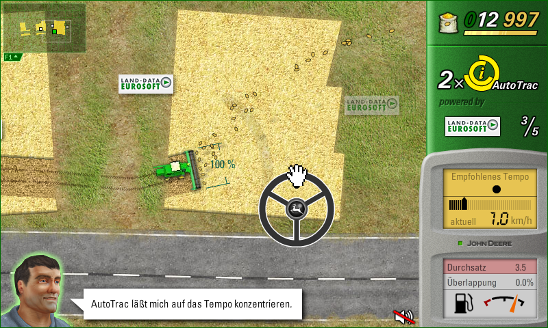
After reconsidering the score calculation, I figured that the HUD I already streamlined recently must be updated again to show the relevant data, so the player can actually work towards better performance during the level.
…and I ended up with an almost complete redesign. Again.
I did a lot of shifting around the elements, creating icons to label the numbers, and only arrived at this rendition after a good deal of, well, let’s not say struggle, but definitely efforts. Good thing, then, that I’m actually more satisfied with the result this time:
- All the numerical data are chunked together on the sidebar to the right. Not being overlays results in improved readability, too.
- Permanent overlays on the game world view are reduced to a minimum:
- The minimap is semi-transparent and can be hidden. Which also slightly adds to a techy feel which is entirely desired as it’s about precision farming.
- The portrait, back in the lower-left corner, lends itself for speech bubble style messages. And it works well there because the guy looks up into the field. In the upper left he would have to look down.
- The gas meter (which I did implement as an overlay in the mean time, but didn’t show here) makes perfect sense to be on the instrument panel.
- The “AutoTrac powered by LDE” layout works a lot better than my previous attempt at visually hinting at the way one earns the auto pilot feature.
- Again, language proved to be simply more concise than icons.
There are other details and thoughts behind all the stuff, but I also want to keep this post brief.
Oh and here’s a somewhat important bit. My client and I have now decided on a release date for Harvest Mania: mid November. Stay tuned.


