
Yeah I’m still at it. Last time I showed an updated HUD, although it was adjusted again during implementation and is about to be changed yet again. Today I’ll talk about the other manifestation of the score system: the Score Sheet.

Redesigning the Score Sheet
Problems
Firstly, the previous version of the Score Sheet was pretty crowded and thus overwhelming. The sub-scores are meant to add up to give the final score, but this formula is nowhere communicated properly. The graph explanation was squeezed into the page margin.

Don’t look at me! I’m hideous!
Secondly, Efficiency (”Effizienz”) and Mood (”Stimmung”) are rather abstract scores, despite the graph showing the work course. Abstract because it’s hard or impossible for the player to know how to improve.
The last of the big problems regards the balancing. All sub-scores were absolute numbers in independent aspects, i.e. each has a set maximum and the player gets a percentage of it depending on his performance in that aspect. This lead to the loophole that one could ignore/sacrifice some aspects, optimize others and still get a high-score. The intention of the game, however, is to optimize all work aspects.
Solutions
First I decided to go for a two page design, with the front giving an overview, providing context, and the back providing details and further explanations.

The front.
Apart from the basic data (driver name, field name, date) that fills the space on the one hand and evokes the evaluation report on the other hand, there’s now only two sub-scores. The upper one is the harvested crop as tracked in the HUD, the lower one is a multiplier representing the work quality. Work quality is further defined by four sub-aspects that are explained on the back side, suggested by the hyperlink.
The “math calculation” layout and the multiplier now communicate clearly how things are connected: the final score is your income (”what”) influenced by the work quality (”how”). It should become apparent that an unbalanced, singular focus purely on the income can and will affect the bottom line. And it should give an idea of what aspects do influence the multiplier. In order to find out how to improve those aspects, you’d than check out the backside.

The back. Please ignore the synthetic (debug) values being shown in the graph. Real world player data looks less uniform, of course.
As you can see here, there’s a table showing the work quality aspects. Each of the aspect features an evaluation number (center column) and the resulting factor (right column) that will contribute to the overall multiplier. For the first two (cutter usage and driving overlaps), the percentages are directly translated to the factor. The last two (throughput optimization and stress handling) use the German grading system to make the internal values less abstract. How the internal values, readable off the graph in the bottom, are translated to the grades, is shown through tooltips on the graph.
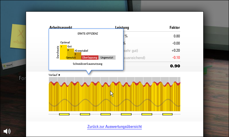
Hovering over the yellow/red parts shows the harvest efficiency tooltip.
The tooltip for the harvest efficiency shows what the colors mean, and specifically how the shades of yellow — exactly those you see in the core game play — translates to the grades of the throughput optimization. The baseline of the throughput is “3, acceptable” (roughly American C or D), adding 0.0 to the quality factor, so no real punishment for not optimizing. Supposedly this is how most farmer do usually without machine support. It’s actually hard to keep up the optimization if you need to drive precisely yourself. So this is where John Deere enabled an important improvement with AutoTrac, their auto-pilot system, and it needs to be reflected in the game.
Similar to the harvest efficiency, the tooltip for the stress handling line shows how the y-coordinate of the line translates to the grades. The farmer portrait is used as a backdrop of the tooltip to give additional connection to the core gameplay mode.

Hovering over the blue line shows the stress handling tooltip.
Last but definitely not least, the AutoTrac line.

Tooltip for the AutoTrac usage.
If everything in the gameplay works out, you should be achieving better throughput and less stress while AutoTrac is engaged. In the graph, that would translate to brighter yellows and higher blue lines whenever the AutoTrac bar is active. This is supposed to show, not tell that AutoTrac improves your work (which stress is an often overlooked part of).
Conclusion
So, looking back at the problems identified at the beginning, I have:
- Clarified the layout thanks to a more understandable score calculation that…
- …is more balanced and at least eliminates one exploit…
- …and is explained in steps with increasing details, in order to ease in the player.
Now I need to look at the core gameplay again and make sure those score aspects are sufficiently visible, either in the game world or in the HUD.


