Some time ago I wrote about Red Faction: Guerrilla and how it’s competitive gameplay shaped the feel of it’s on-line community. Today I would like to talk about pretty much the opposite. A game that focuses on creativity, cooperation and sharing – Little Big Planet.
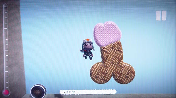
Turns out the reason why you never got around to create anything of value in LBP is not because you are lazy moron… well, not necessarily at least.
As with Red Faction, I decided to spend some time on-line with this game. I expected an experience quite contrary to Red Faction. In many ways I did. I many ways I didn’t. As it turns out, cooperative gameplay and user-generated content alone does not a healthy community make. It seems like a common mistake. A mistake that even yours truly once did.
The 3 Little Big Planets
The logic behind creating a game like Litte Big Planet is simple, yet powerful. When developing a game you need to develop tools in order to create content for your game. It’s a tempting idea to put some more effort into the tools to make them availible for your audience as well. You can save that extra effort on the other end of the development because you will have quite luxurious tools at your disposal which will make content creation so much easier for your team. Also, you can get away with creating less content because your players will do it for you afterwards anyway. You can focus more on development, less on content and create overall a more flexible and useful product in the process.
However, the fallacy is that you won’t actually save any work doing this. Instead, you pretty much triple the amount of work you do. Instead of creating a game, you need to create three games. And all three need to succeed for the overall package to be successful – increasing the number of parts increases the probability of failure.
Planet 1: The Game
The first part you need to get right is the core game itself. Without a good game underneath, players won’t be motivated to invest much time into consuming or creating additional content.
That’s where the first weakness of Little Big Planet shows. Many reviewers have mentioned this before: as a jump & run game, Little Big Planet has mediocre controls at best. The game is full of instances where characters behave according to realistic physics but in a way that is often difficult to predict and difficult to control. Jumping on trampolines, the timing in which you need to press jump in order to gain additional height is unforgiving and quite different from what you may be used to from other games.
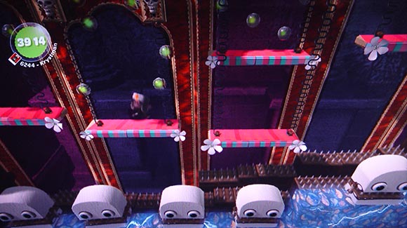
Unforgiving timing on trampolines can get annoying. But you know you are in for a treat when a passage in a level consists ENTIRELY of trampolines.
In some levels you need grab rotating objects and let go in the right moment to hurl yourself across the level. Again, in these situation it can get quite frustrating to get the timing right. The game doesn’t provide any systems to take the edge off from such challenges.
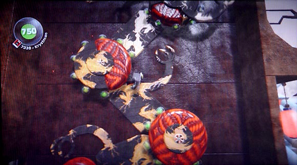
You need to hold on to rotating cylinders and let go in the perfect moment to propel yourself upwards and grab on to a next cylinder. Some cylinders have non-grabable sections.. you know, for lulz. When you fall down you need to repeat everything. The challenge is not to eat your controller.
In fact, it can’t because Little Big Planet is made to work with whatever crazy contraptions players create. Adding exceptions would limit the possibilities of the level editor and make creating levels more complicated. So Little Big Planet instead opts to use universal physics which work just OK most of the time. But they certainly feel sub-par when compared to other, more directed games.
The game part also lacks flavor. I’m not talking about the graphics. Little Big Planet certainly comes with an amazingly unique and distinct visual style. I’m talking about the game mechanics. The two verbs – grabbing onto objects and switching planes of depth – feel disappointingly bland. There is nothing special about them that would justify having them as the core verbs in Little Big Planet. They could just as well come up in just about any jump & run game. But as with the lackluster game physics this is again the result of the game’s ambition to work with any kind of content.
The overall result is sadly just a mediocre jump & run game. If Little Big Planet didn’t have the other features, it would have a hard time competing with most downloadable titles out there. Of course, this begs the question if it wouldn’t be easier to simply focus on creating a good game instead of improving a weak game by adding complicated features on to it. But if you are reaching for greatness, that’s sometimes the route you need to go. So let’s at least take a look at those other features.
Planet 2: The Editor
The level editor is yet another monumental challenge for the development team. It comes with it’s own unique set of problems. For example, you might think that making an editor as easy-to-use as possible should be the most important goal. However, all this achieves is just inviting a larger portion of the players to create levels. Among those players there will be a significant amount of players that simply don’t have the patience to create a good level. So ironically, an easy-to-use level editor will lower the quality standard of user-generated content because every moron will be able to get out SOMETHING and it won’t be pretty most of the time.
But don’t be fooled to go the opposite route. Having a complicated and powerful level editor won’t make levels any better. In such a scenario even dedicated players will struggle to master the tools. They will spend a lot of energy simply to get ANY level done and won’t be able to concentrate on the quality.
The sad truth behind all this is that creating good content is difficult. You can make the process a little bit easier by designing the tools properly. But tools are just tools, they won’t do the job themselves. In the end, it will always take a lot of time, effort and competence to get good content done.
The Little Big Planet editor has it’s flaws. All of it’s functions are locked away behind annoying tutorials. The other day, I wanted to demonstrate the editor to Cologne Game Lab employees. We had to wade through said tutorials and after half an hour, we still had just a limited number of tools.
The functionality of the editor is also limited due to it’s ambition to provide cooperative editing capabilities. For example, all of it’s functions, stickers, materials and objects need to be accessed through a tiny strip of icons called “The Poppit”. This poor piece of interface is clearly completely ill-suited for the wealth of functions that are shoehorned into it. I reckon the reason for using such a small menu is because it allows 4 players to navigate each their own menu without cluttering the screen for others. A burdening compromise that players need to endure even if they chose to work alone.
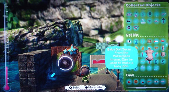
The LBP editor gives you access to hundreds of stickers, objects, materials objects tools all accessible through a laughably narrow menu and represented by illegibly small icons. Note that you can scroll this menu in all 4 directions. It goes on for a couple of pages. It’s like searching for a needle in a haystack… while wearing a welding mask
But to be fair, it is close to being as good as it could be. It is a magic technology only somewhat handicapped by a bunch of compromises. Luckily you can get used to all it’s irks. When you do, you discover an overwhelming world of possibilities. In fact almost too overwhelming. You can spend days working on the same level, tweaking it to perfection. You soon come to realize that creating games is much, much harder than playing them. And in the end, the game provides little reward for that kind of investment…
Planet 3: The Content Browser
Creating a good game and a good editor is tough but it’s something game developers can deal with. It’s software development. It has been done before. So the game and editor of Little Big Planet both have their flaws, but they do their job in the end.
However, there is a third aspect to a game like Little Big Planet that game developers aren’t necessarily well prepared for. You see, once the players create all the wonderful levels, you need to provide tools for other players to access this content. You need to provide the tools to navigate through it, search through it, filter it, categorize it, rate it, comment on it, etc. Like with the other two parts of the game, this alone can be the challenge of a lifetime. In the case of Little Big Planet it turned out to be the weakest part.
The entire UI for accessing content is flawed and incomplete on a conceptual level. In single-player the levels appear as buttons on a cute toy globe. The individual levels represent different cultures. So it makes sense that the player would visit different countries on a globe and play levels created by fictional level creators living in different parts of the world.
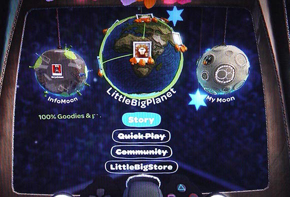
The levels in LBP are selectable from a globe. Friends and the level editor are located on moons orbiting that globe. Makes sense until you get on-line…
However, the game’s designers also attempted to use the same globe-metaphor for the on-line content. I guess it seemed good on paper. Buttons for user-generated levels could also appear at the positions where the actual level creators come from. The globe would reflect the international aspect of the Little Big Planet community, right? In reality, the vast majority of level creators come from the USA and Europe. So due to lack of space, buttons appear all over the planet, rendering the entire globe-metaphor misleading and useless.
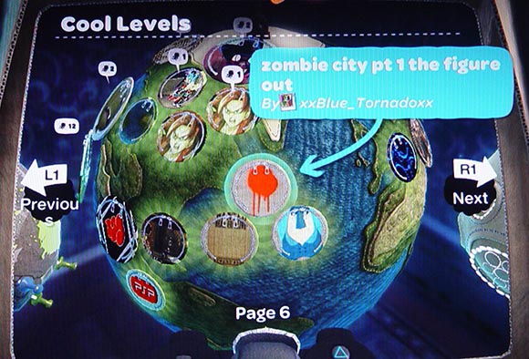
I see. So these levels were created on a transatlantic flight? Also I can go left and right to other identical planets but with different levels… which aren’t the moons the arrows are pointing to? And why does it say “Page” when it’s clearly a globe? And why is the “s” in “Previous” in the second line? And what are the criteria for “cool levels” anyway? What is going on?!
But there is more. As you can imagine, there are actually A LOT levels out there. Far, far more than fit on a tiny globe. So in order to browse through all the levels, the UI uses an additional page-metaphor. Using corresponding buttons, players can flip to the next page, which of course is not a page but yet another planet. How can there be more than one earth? It is especially confusing considering that the entire menu structure is also about switching between planets. The earth is for browsing content, the moon is for creating content and then there is yet another moon (huh!?) for managing friends and profiles.
The UI of Little Big Planet is the result of shoehorning content into a metaphor that is simply not suited to communicate it properly and then using a different, conflicting metaphor to patch in the missing functionality. The consequent solution would have been to use a more traditional structure. One that works with the large amount of content and doesn’t emphasize useless aspects of it (geographical location).
So it is no surprise that interface is actually extremely poor at providing you ways to navigate trough content. The first time you open up the globe the game throws just a bunch of levels at you. It doesn’t actually tell you how the levels were selected. The levels aren’t categorized. So if you are looking for certain types of levels there is no way to simply browse though them. You can search for a keyword but keywords often end up being too specific. As a newcomer it’s difficult to even come up with a meaningful keyword anyway. So it boils down to randomly wading through a bunch of weak levels and hoping you will eventually stumble across something good. If you eventually find a level you like, there is no way to access more levels of the same type – an experience-defining functionality on sites like Amazon or YouTube. The only thing you can do is to browse through the levels of the same creator. But it’s rare for anybody to make more than 4 levels or so. And what do you do after you are through with all of them? You are back to randomly trying levels. So effectively the entire UI collapses to one single function “play a random level”.
Do You Heart Grinding?
The real weakness of the content browser shows when you look at it from the perceptive of the game creator. The game offers quite a few achievements associated with crating popular levels. The most prestigious achievements are for creating a level that is played and “hearted” by a certain amount of players. How do you make a successful level?
Most beginners think that they simply need to invest a lot of effort into creating a large, beautiful and creative level – not unlike the ones that ship with the game. Sadly, such a noble attitude is not rewarded by the system in any way.
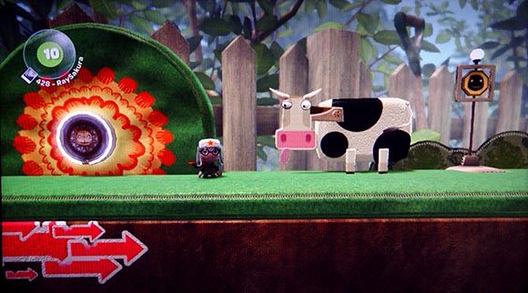
Back in the day I did what many LBP newcomers do. I’ve spent 4 days glued to the TV to create the most elaborate, polished and simply awesome platformer level I could think of. It even has a cow. It’s called “Platformer with Cow”. It turned out to be the least successful approach to creating levels. And it wasn’t because of the cows.
Here is what happens: You will invest many, many days in creating and perfecting your level. You release the level to the public. For a short period, maybe 20 minutes. it will be registered as a “new” level and appear randomly on some player’s globes. Some people will play it and will probably rate it highly. However, this will have no impact on the level’s future. It will quickly lose it’s “new” status and cease to appear on player’s globes. At this point the game provides NO pathways for players to accidentally stumble across your level unless they happen to specifically search for a keyword associated with it – which never happens. In order to get more players to play your level, you must rely on laboriously inviting friends or strangers by posting the level name in comment sections and on the Internet. In fact, this is what you mostly see if you care to read any comment section in the game – an endless stream of “please play my level” posts.
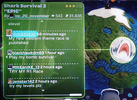
You have just read pretty much every comment section on LBP ever.
In order to crate a successful level you NEED to exploit the rules of the system. The system won’t get other players to play your level otherwise. It took me a while to figure it out but I eventually stumbled over a clever level that had the recipe for getting traffic to your levels:
- 1. The most important trick is to frequently re-release your level, at least a couple of times a day. Re-releasing a level makes your level appear as “new” again and brings new players to play it.
- 2. Long, content-rich levels are by default handicapped. The system privileges levels that have been played more often. This means played by more people but it also means played by the same person many times. It pays off to create a short, difficult level – especially a high score challenge. In such levels players will lose quickly and restart the level many times in an attempt to reach a high score. The level will register as being played more often than it would otherwise.
- 3. Once your level reaches a certain threshold of plays it starts showing up on player’s globes even if it isn’t “new”. It starts out several pages in and will rise to the front as it receives more plays.
- 4. However, your level will stay on the player’s globes for one week after initial release only. After that first week, your level’s ability to get serious exposure on the globe is gone forever.
- 5. That’s where you release a quick new level. You can use the level editor’s key system to include links to other levels you have created. Once a player picks up a key in you level, the level associated with that key will show up on the player’s globe after the current level is over. There is a good chance that the player will try it. That way, players of one of your levels will increase the number of plays for all of your levels.
As you can see, this procedure doesn’t have anything to do with high quality content. On the contrary, it rewards flooding the system with short, difficult and quite trivial high-score challenges. For the short period of time that I played the game, so-called “shark survival challenges” were popular. The level creators usually simply re-used the same shark object from other levels and swamped everybody’s globe with identical copies of the original shark survival.
And this isn’t even the worst strategy. A far more crude one is the called “H4H” which stands for “Heart for Heart”. The idea is that players will post almost empty levels and encourage other players to heart their levels. In exchange, they will heart them back. Sadly, the Little Big Planet community is full of such levels. It’s a solution aimed at quickly satisfying the requirements for achievements without actually doing any creative work.
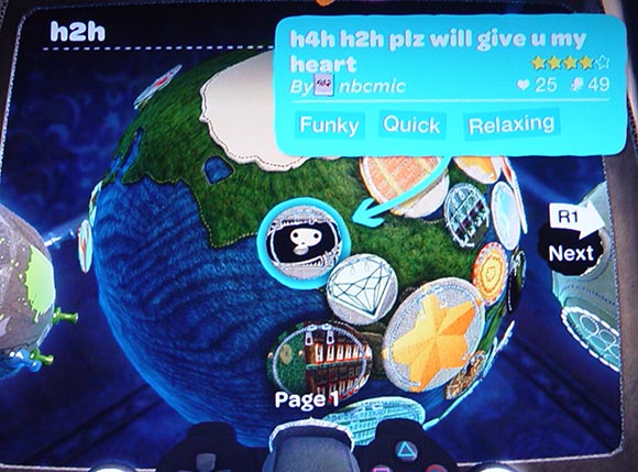
Even though I accidentally searched for H2H, I still got a flood of H4H levels. This is one of them. It contains a basketball and a level exit. Hey, it’s more than most H4H levels.
But this is actually what happens when you try to use extrinsic motivation to encourage people to be creative. In order to do that, you need to somehow measure the quality of what people do. Once you start doing this, people will start optimizing their work to satisfy the measured criteria. You end up rewarding people who are most successful at exploiting and cheating the system. The ones who get left behind are creators and consumers, who genuinely care about quality.
There are two solutions. The first one is to invest a lot of care and work into making sure the system can’t be cheated easily. It means creating multiple ways on how quality content can reach players who are looking for it. It means creating multiple ways to rate and categorize content. It means creating ways on how players can easily exchange information on content they enjoyed so content can spread virally. It also means not only creating the system but actually staying with it and constantly modifying it, so new loopholes can be quickly closed and quality content that falls trough can be identified and recovered. All of this just didn’t happen after the release of Little Big Planet.
The other solution is to simply refrain from giving extrinsic motivation for content creation. Content creation should be fun by itself. If people are doing it for the achievements, they are clearly doing it wrong. They don’t only spoil the fun for themselves, they also spoil it for others. If your game need achievements to make people create content for it, it’s simply not a good implementation of user-generated content. The bottom line is: Multi-player achievements are bad game design. Amazingly, this is true for every form multi-player – competitive or cooperative.
Idea vs. Reality
I once programmed a complex JRPG editor. It was an elaborate program complete with a custom scripting system. I thought I could get this done first, release it and then use it to create a cool JRPG. While I did complete the editor, I never got anything done with it. The work and effort that went into maintaining the community, teaching the editor to newcomers, patching and improving the software was overwhelming. The resulting games were fascinating but not of the quality I was thinking of in the first place. I soon learned that I have completely underestimated the work that goes into a user-generated approach, especially the importance of maintenance after the release.
Little Big Planet seems to repeat many of those mistakes on a much larger scale. It is a game built partly on false promises and fallacies. It promises the access to quality content but simply fails to provide the appropriate tools to do so. It promises quick and effortless creation. In reality good content always requires hard work and there is not much the game can do about it. It promises the ability to share your creations with others. But the system is not designed to promote, distribute and reward quality.
This doesn’t mean that the game is completely broken, of course. It has some remarkable qualities such as the breathtaking audiovisual style or features like the Sackboy’s puppeteering controls. And even if it doesn’t succeed in all areas, every now and then a tiny sliver of the promised vision does shine trough after all.
So with Little Big Planet 2 on the horizon, I really hope Media Molecule will use this opportunity to finally complete the 3 games that Little Big Planet should be. I would heart them.


[...] with user created content. It also ties in with where i am going with all this. Very Interesting Little Big Planet: Browsing Content sorry if it makes you blush Media molecule was a tiny developer that got backing from Sony, to [...]
Fun little anecdote that came to mind when seeing the title image for this blog post:
A friend of mine who worked at EA/Maxis told me of a coined term over there when working on spore:
Time to Penis, or TTP for short. This basically is the amount of time it takes from release of your product before a player is able to create and distribute a representation of a penis inside your game/editor.
Clearly in games like Spore/LBP this time is nearly instant. I guess the rule is.. if you can give them something to build with, its only a matter of time until they’ll make a dick with it.
love the article, especially this bit:
“But this is actually what happens when you try to use extrinsic motivation to encourage people to be creative. In order to do that, you need to somehow measure the quality of what people do. Once you start doing this, people will start optimizing their work to satisfy the measured criteria. You end up rewarding people who are most successful at exploiting and cheating the system. The ones who get left behind are creators and consumers, who genuinely care about quality.”
something i’ve been feeling with all these job applications forms i’ve been doing!