
The last time I was talking about Hotel Dusk, I complained how it uses invisible causality to link the player’s actions to the story dramatically instead of relying on logic. This causes a lot of problems and it is a major design fault. However, the game redeems itself by showing how it’s designers clearly identified their goals and developed the game play accordingly.
(if you have problems with the player, here are the direct links for YouTube and Sevenload)
I did a small experiment inspired by design researcher Gesche Joost, whom I met in my second semester at KISD. She developed a system for analysis of audiovisual rhetoric. Basically, what she did was taking a video and tracking along a timelime every relevant element of that video. Cuts, color, sounds, music, composition, etc. Having this chart as a basis, she could easily expose the rhetorical figures and tricks used in the video. Back then we theorized about how this system might be also applied on interactive media.
Danc from Lost Garden later also suggested a similar approach with his system of game play notation. However, his method differs from Gesche’s in a significant way. It involves tracking the player’s reward on the timeline – something which is inherently unmeasurable and has to be assumed. By doing that, we would not measure what really happens when players play the game. Instead, we would measure what the game designer THINKS happens when players play the game. It replaces facts with expectations. Gesche’s method doesn’t rely so heavily on assumptions but simply sticks to the facts. As a result in can be used as a tool for any kind of scientific argument. Of course, the problem with Gesche’s method is is only a step in a much bigger process – it doesn’t deliver answers by itself.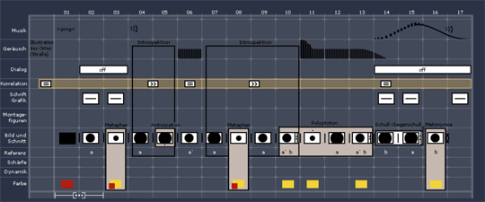
Gesche Joost’s notation system for audio-visual rhethorics. See here for more information. Unfortunately mostly German.
So what I did was trying to adopt Gesche’s approach for in interactive medium like a game. Hotel Dusk is a perfect candidate because it is very linear. There has been already some success in analyzing linear games – one great example being Averaging Gradius. On top of that, Hotel Dusk consists of clearly distinct game modes which define it’s rhythm. My analysis is quite superficial as it only consists of tracking those game modes to expose the rhythm. Already this very simple analysis reveals some intriguing data.
The Experiment
I let my girlfriend (the poor thing) play the first chapter of the game and recorded the session spontaneously with a camera. It took about 94 minutes. Then, I went on and analyzed what she was doing and how long it took her. Additionally, I tracked every audible response like questions, outcries and loud thinking.
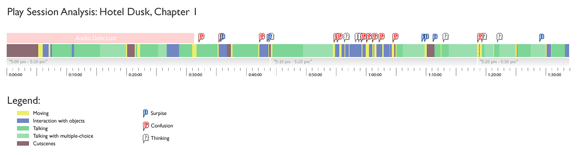
The first chapter of Hotel Dusk played by my girlfriend. Click to enlarge.
You can see the result in this chart and in the time-lapse video above. The green patches are sequences where she is interacting with the characters in the game. Every conversation in the game is divided into a introducing dialogue (dark green) followed by a multiple-choice sequence where the player can select which questions he would like to ask (bright green). Sequences where she is interacting with objects (examining things, solving puzzles) are marked blue. Sequences, where she moves through the hotel are marked yellow. Clearly non-interactive sequences like cutscenes are marked brown.
Using little speech-bubble icons, I also mapped the audible responses I’ve recorded. Unfortunately, I lost around 30 minutes of audio data in the beginning. I categorized what I got into 3 different kinds of responses. The red “!?” bubble marks a response which generally expresses confusion or even frustration. The grey “?” marks a response which accompanies puzzle-solving like a “Hmmm…” or thinking aloud. The blue “!” marks some kind of positive surprise or even delight: the “Aha!” effect.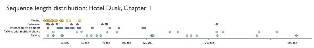
The distribution of the lengths of the sequences. Note that I divided each dialogue sequence into a normal part and a multiple choice part. Without this distinction, dialogue sequences would appear even longer. Click to enlarge.
You can see immediately how most of game is spent talking to people. A massive 65% of the time, around 60 minutes is taken up by conversations with NPCs. This is followed by roughly 16% (15 minutes) of interaction with objects, 10% (9 minutes) non-interactive sequences and 9% moving around. Not only does talking take the major part of the game, the talk sequences come also in exceptionally large chunks. Interaction with objects and moving happens more frequently but is mostly very brief in comparison. Take that Chris Crawford! ![]()
Before we go further and discuss the implications of this observation, let me first quickly write down other interesting findings (caution, small spoiler in this paragraph). One particularly fascinating period occurs between minute 44 and 65. This is a small sequence where the player is supposed to open a briefcase using a key. Unfortunately, a key breaks and the player needs to find another way to open it. At this point of the game, this is yet impossible and the game fails to communicate this clearly to the player. The game introduces some events which are supposed to distract the player from the puzzle (dialoge between minute 44 and 55). Interestingly, those were completely and utterly ignored by my girlfriend as they seemed to have no relevance to her – she wanted to solve the puzzle first. As a result, my she got stuck running around in the room searching a solution for a puzzle she wasn’t able to solve yet. This little period of being stuck is clearly characterized in my chart as an unusual series of brief interactions with objects and quick movements within the room (minute 55 – 65). It would be very easy to implement a pattern recognition system in the game to scan for those tell-tale signs of being stuck and to help the players. I already talked about that in a recent Scrapbook entry.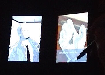
The suitcase key broke! Listen to the reaction.
Another, related detail is that the biggest audible response I recorded during the session was exactly at that moment where she broke the key (minute 44). You can Listen to it here. It seems that this particular event had the biggest emotional impact. It was quite surprising for me seeing that much emotions created by a dumb suitcase and not from the hour talking with people. One explanation would be that when interacting with people, the player’s avatar is talking and the player only occasionally directs the conversation. As a result, the player feels less responsible for what is happening. When interacting with objects, the player is acting on his own so the feeling of responsibility is much greater. I have already mentioned how responsibility might be the key to understand emotions in games.
Another explanation, of course would be that in conversations, my girlfriend was too busy reading the text to give any audible responses. In fact almost every audible response falls together with a heavily interactive part. Interactive parts also might create more audible responses because they are more challenging to solve. Many of the recorded responses were caused by problems with the interface.
Of course some characters also triggered some positive responses. Around minute 70, she met Mila, the girl from the intro movie and from the cover. Mila is accompanied by Rosa, a lovable mother-like character. My girlfriend reacted very positively to those characters. I guess the possibility of a love story intrigued her. She is not the kind of person interested in thrillers and detective stories.
As a final note, the game is divided into chapters which, in turn, are further divided into smaller sub-chapters. Each chapter represents 30 minutes of in-game time and each sub-chapter represents 10 minutes of in-game time. Both are clearly marked by a recurring appearance of a clock, somewhat reminiscent of the TV series 24. The chart shows the discrepancy between play time and and event time like Jesper Juul described it. The first sub-chapter takes about 45 minutes to play: 4 times longer then the in-game time. The other two chapters are much shorter, the last one being almost real-time. My impression is that there is something wrong with the pacing created by the chapters and sub-chapters. The sub-chapters are not evenly spread-out and the whole chapter is too way too long. At minute 79, my girlfriend asked me how long until the chapter is finished – a clear indication that she was getting impatient. In the last seconds, I even ran out of tape. I don’t know if the chapter is so long because every character is introduced. It would be interesting to see if the other 8 chapters are of similar length.
Designing Character Interaction
But let us go back to the redeeming quality of Hotel Dusk. As we clearly saw, a major part of the game is spent talking to people. It is obvious that the designers of Hotel Dusk were not only aware of it, they also adjusted the game play accordingly. You can see it clearly in the way the dialogue mode works.
Normally, the player would see one or two people and read the dialogue underneath line by line. Occasionally, the player would be given a multiple choice menu to decide how the dialogue should proceed. Hotel Dusk widens this old formula by introducing a new token and a new verb.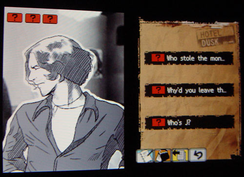
The question tokens are collected in the upper left corner of the screen. They can be then used to ask the coresponding questions. The red color indicates that this is an imortant and sensitive issue.
The new token is the question token. These tokens are collected as the player learns some interesting clue during a conversation. They can be later used to ask questions to characters in the latter part of a conversation. They are introduced by a brief animation at the top of the screen and by a short line of thought from the main character. They are also prominently displayed as icons above the portrait of the main character so the player can clearly see how many tokens he has collected. They are even different kinds of questions. Some apply to a specific person only, others can be used on any character in the game. Some special questions are very important and can lead to a game over if incorrectly handled. The icons of the question tokens are color coded to reflect that variety.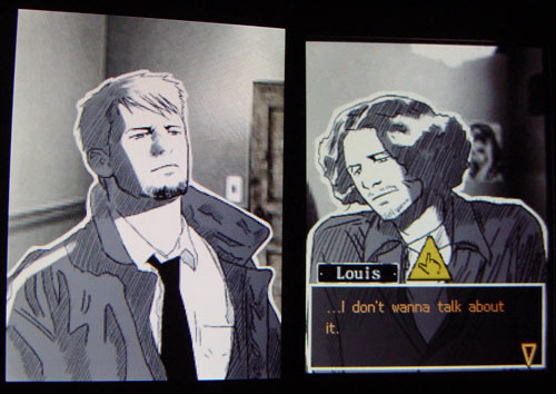
The follow up verb can be used here to try get the other character to speak.
Another improvement is the new “follow up” verb. Sometimes during a conversation, a yellow icon pops up. The player can press it to follow up on what the person he’s speaking to just said. It is something like a weaker version of the “Hold It!”/”Press” verb from Phoenix Wright. It interrupts the other character and allows the player to investigate a clue.
Both features have been there already. Question tokes appeared in Final Fantasy II and Sam & Max, for example. The follow up verb has been extensively used in Phoenix Wright. This does not mean they are bad ideas, on the contrary. The effect of those two new features is that the player is much more involved in the conversation. There is just much more to do then just listening and the occasional decision. The player has much more tools to affect the discussion. Or at least it feels so.
Until now, a lot of effort has been spent creating believable characters. Smart programmers and artists put a lot of effort into making characters look as real as possible. Rebells like Chris Crawford object and believe the way to create believable characters is to develop an engine to generate realistic behavior of those characters. In the end, what we all seem to forget is that we are working in an interactive medium. The way to believable characters is to develop engaging interactions with those characters. Realistic graphics and storytelling algorithms are useless if all you get in the end is your dumb multiple choice menu. We are game designers for god’s sake, we should be able to do better then that. This is exactly what The Sims did – it introduced semi-intelligent characters but made an effort of delivering many possibilities of interaction with those characters. Even if the Sims are not exactly deep and multifaceted characters, simply being able to interact with them so fluently is what makes them so interesting.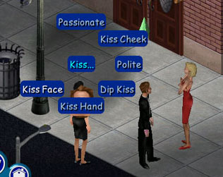
Sims features character interaction far beyond conventional dialogue with the occasional multiple choice menu.
Hotel Dusk takes the old dumb multiple choice menu and introduces new elements. It is not much but it is an important step. Strategically it is also a very smart step as conversations are such a big part of the game. Just a slight improvement there pays off manifold.
The conversation mode is generally very polished. Each character is shown on a separate screen. The DS is held like a book so every screen is in portrait format. This layout allows showing the upper body. The characters are animated so gestures and body talk can be part of the conversation. The text appears directly underneath the character speaking so there is no confusion about who says what (as it is the case in various other titles). Showing both characters simultaneously allows the player to observe the reaction of one character while the other is speaking. The characters are hand-drawn and rather sketchy. The analogue look creates convincing characters by avoiding the uncanny valley problem. At the same time, the solution is very cost-efficient to deal with the huge amounts of dialogue.. and it is stylish too!
Of course, not everything is perfect. The follow-up verb is context sensitive which means you can use it only if it makes sense. As a result, there is almost no reason not to use it. The definition of the follow-up verb is also a bit fuzzy, it is not always clear what that icon would do exactly, you just learn to press it every time it appears. Phoenix Wright uses that kind of verb much better.
The question tokens are nice but most of them can be used only on the person you are talking to anyway. Tokens, which can be used on other persons are rather rare. Also, like with the follow-up verb, there are almost no situations where using a question token has a negative effect so you just use them all up as soon as you can. It would be a bit more exciting if both, the follow-up verb and the question tokens were more meaningful – if the decision of whether to use them or not was not as straightforward.
To sum it up, the designers of Hotel Dusk put the effort exactly where it was needed – a sign of good game design. Generally, it also shows the right direction to develop games with meaningful stories and emotions. After all, this seems to be the holy grail of game design right now and it was a discussion topic among us three already.
I also believe the method I used to analyze Hotel Dusk is quite helpful. There is a lot of talk about how game design is an iterative process and how we must do player testing etc. However, rarely anybody seems to get their hands dirty. The number of papers available from sources like Gamasutra is heavily biased against empirical analysis. The irony is that it is so simple – you just need a recording device and some time. I am convinced that developing tools and models to analyze player behavior should be our top priority. Only from those observations we can develop a working theory of game design. This is basically also the idea behind this blog: Inductive Game Design Research.


Hi Kristian
This is a very impressive batch of work. I particularly like the association with observed emotion with the various classified sections of the design. This is a great shorthand for describing an observed period of gameplay.
I suspect you’ve also gotten a hint about why this technique is used sparingly. It is quite labor intensive, especially when you are in an evironment when design changes are occuring quite rapidly.
The common solutions for the sake of efficiency are three fold
- Make the studies less rigorous. Instead of detailed observation and analysis, many teams substitute more informal playtesting. These still yield an immense amount of useful feedback.
- Focus detailed testing on isolated areas. Traditional usability tests take this approach. They’ll test a set of tasks that cover the functionality of one section of the UI.
- Automated tests. This one is less common though I’ve seen more effort put into it recently. The goal here is to automate most of the game so that unpleasant points are highlighted automatically. This allows users to go in with more detailed usability or playtesting to analyze what the problem might be. An example are recent games by Valve, which logged when people were dying a lot. They went back in and tweaked that level to be more friendly. These can also benefit from aggregate statistics.
Great to see this sort of detail in a post.
take care
Danc.
It would be a bit more exciting if both, the follow-up verb and the question tokens were more meaningful – if the decision of whether to use them or not was not as straightforward.
This happens a bit more later in the game. I can recall times when picking certain dialogue options led to a game over. This tends to happen at least once near the end of most chapters, although it would certainly be nice if there were more ways to mess up by being careless with your conversation options in the rest of the game. Otherwise, it’s not really gameplay, just reading where you pick the order you read things in.
Thanks you so much for your feedback!
Danc: I agree that this kind of testing might be over the top if you just want to check if a recent tweak in the sourcecode works better or not. On the other hand, I do not believe that we should give up so easily. Just because it is laborious doesn’t mean it should be. The reason I quoted Gesche Joost is because she already went a step further and suggested developing software tools to streamline this kind of method, so it can become a fundamental part of the design process. At least – like your models – the very existence of such methods encourages different, more detailed thinking about the game. Just how long will the player stare at that particular screen? We already identified quite negative examples.
Impossible: Yes, it’s true. For example you can instantly loose by asking Dunning about the date you find encircled on the calender in his office (Oops! Spoiler?). As you correctly suggested, it is not really gameplay yet: you just pick the order in which you read stuff, sometimes you might fall into a trap, sometimes you can get some nice additional info but otherwise it makes no real difference. The interesting thing is that it doesn’t have to have impact on the story in order to feel like you are doing something. You do not necessarily need branching and alternative endings and stuff like that. I think Phoenix Wright shows very well how you can use clever interaction design to present a liniar story and still make the player feel he’s in charge. I might write some more about it soon. Stay tuned.