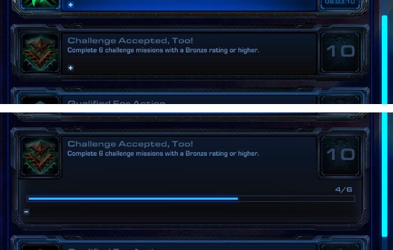
Regardless whether you think achievements are harmful or not, there is a lot one can learn from how the user interface for achievements was solved in StarCraft II. For example, there is one little bit of UI was quite surprising to me and shows quite well how much polish was invested in the game.

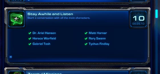
Clicking on the small [+] reveals more detailed information.
If you click on the little + button on an achievement you can see review your progress. This is already a nice touch but I’ve seen that being done before. The surprising bit is that the way the progress is tracked is DIFFERENTLY depending on what kind of achievements it is. So for example, if the goal is to kill a certain amount of enemy units, you get a progress bar. However, when the goal is to complete all missions, you get a to-do list where completed missions are checked-off. This way you can tell which missions are still missing.

Now I know what they have spent 12 years on.
I touched upon a similar thing in my Massive Interface Fail trilogy and the more recent Collectibles Review of Red Faction. Games have the tendency to re-use UI elements even for tasks where those elements aren’t the best choice. The reason is probably because it’s easier – especially since UI is so tedious to code. Also, it will never crop up as a bug or criticism in a review so there is no reason to do more than just the bare minimum. So players are served sub-par interfaces on a regular basis. At this point, having a developer like Blizzard putting just a tiny bit of effort into those parts of the interface is mind-blowingly refreshing. I think critics and players should start demanding and rewarding quality UI in games. I gave up on mature topics or innovative gameplay in the AAA industry. But can we at least have high standards in UI craftsmanship?
There is an even better example for outstanding interface design in StarCraft II but I think I will leave that to game design review. It got awfully quiet over there recently.
But on the other hand, even Blizzard makes mistakes. Apparently, the achievement system is a little buggy at this point. Many players complain about various achievements not tracking the progress correctly. For example, one achievement tracks just the number of single-player missions you have completed on hard difficulty. Another achievements unlocks when you completed ALL the missions of hard difficulty. If that redundancy wasn’t weird enough, the two achievements don’t actually match up in my game. The second achievement tracks the missions correctly but the first one seems to be oblivious to some of my progress. Because the first achievement uses a progress bar instead of a check list, I can’t tell which missions weren’t registered by the game. By experimenting a bit I figured out that the first achievement only updates when you play a mission you haven’t played before. It seems like a problem that occurred due to some significant changes in the game’s structure. It created that odd redundancy and apparently some asymmetry in how different achievements track progress.
So it’s hit and miss at the moment. I would say it’s more hit than miss. After all, as they say: bugs can be fixed, bad design is forever.


Any idea how to determine progress toward portraits? I have almost 1100 wins with Protoss 1v1, but have not unlocked Tassadar’s 1000 win portrait.
Portraits unlock with the associated achievement. If you got the achievement but not the portrait, perhaps you should contact Blizzard Support.