New Super Mario Bros. U is a game easy to be cynical about. It represents much of what is wrong with Nintendo today – a company relying heavily on the same, decade old brands. The New Super Mario Bros. series being a particular offender – delivering Mario branded products by re-packaging 30 years old gameplay on a low budget.
But hey, I bought a Wii U and thought I needed a game other than Nintendoland. It was either Mario or Zombies. Hard to tell which ones of the two is more over-used these days. Imagine my surprise when I realized that I was genuinely enjoying Mario.
Bros. or World?
I have only played the first game from the New Super Mario Bros. series. Compared to that NSMBU is much more closer to the Super Mario World instead of the Super Mario Bros. formula. I think a confession is due. I really didn’t like Super Mario Bros. 3.
I get why it is revolutionary. I completely understand why people latch on to it. Yet for some reason, it never really worked for me. Perhaps it’s the NES aesthetics. Perhaps it’s due to the fact that I played Super Mario World before Super Mario Bros. 3. In any case, I prefer what NSW brought to the series. The beautiful colors. The organic world map. Discovering crazy short-cuts and hidden areas. Yoshi.
NSMBU is a throw-back to many of those. You explore a huge coherent map instead of going from one isolated area to another. There are a lot of short-cuts. There is even a Star Road. There are baby Yoshis and adult Yoshis. Baby Yoshis even come in different colors with pretty cool new abilities. I immediately felt comfortable with New Super Mario Bros. U.
Granted, the HD graphics make it very easy. The characters and environments finally looks like the lush hi-res graphics on the cover. I was sold as soon I saw the first time how fireballs illuminate the ground underneath. There is also an incredibly amount of polish and creativity in the level design. You would think the team would run out of ideas after all those iterations. But they still manage to make each level feel as fresh and new as if it was the first game they ever made.
However, as I progressed through the game, it dawned on me that the game never fully committed to the Super Mario World formula.
-
Themed Areas One thing that Super Mario World did better than Super Mario Bros. 3 was the world design. The world felt very organic in SMW. In SMB3, each area had a specific theme: Ice, Desert, Water, etc. In SMW, areas didn’t have clear themes. For example, you wouldn’t have a “Water Area”. Instead, you would have a water level in a more ambiguously themed area like “Plains” or “Valley” or “Forrest”. NSMBU does present one, big SMW-esque map. But that map is separated into clearly themed areas. After you defeat the boss of the desert area, you can decide if you want to go to the ice area or to the water area. For me, it lessens the impact of the world design. The world becomes formulaic and predictable. There is less sense of discovery.
-
Nerfed Yoshis We have Yoshis now, but for some reason, they have been nerfed. Baby Yoshis never grow up to adult Yoshis, no matter how well you feed them. You can’t take Yoshis with you. They stay behind at the end of a level. Well, that’s not entirely true. Some baby Yoshis follow you around. It’s really quite confusing. Either way, Yoshi is actually very rare in the game. Subjectively, there were maybe 3 levels where he was used.
-
Formulaic Secrets The game does have a lot of cool secrets. At one point, you are even required to find a secret exit to progress. However, almost all of the secrets turn to be just short-cuts to skip entire areas. In SMW, the secrets were more sophisticated.

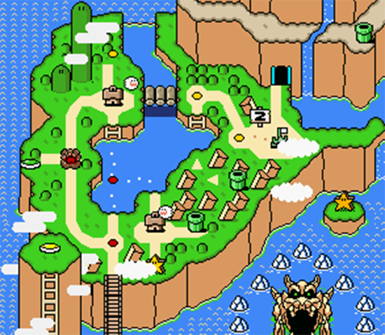
Donut Plains show the sophitication of the secret areas in Super Mario World.
For example, Donut Plains had the Water level Donut Secret 1 which wasn’t actually a short-cut, just an alternative route to Donut Secret House. But Donut Secret 1 also had a secret exit to Donut Secret House. That level, in turn, had also two exits – either to an actual short-cut or to the Star Lane. NSMBU feels like a dumbed-down version of that.
-
Weak New Suit The game features a new suit, the flying squirrel suit. The aesthetics seem like a mixture of the Racoon Suit from SMB3 and the cape from SMW. But the new suit is actually less exciting than either of those. For once, it doesn’t actually allow you to fly. Both the Racoon suit and the Cape allowed for continuous flight, given you had enough space to get to the required speed. Squirrel Suit doesn’t have that. But the Squirrel Suit also lacks a way of dispatching enemies. Both the Racoon Suit and the Cape allowed Mario to hit enemies (or blocks) next to him by spinning around. The Squirrel lacks this ability and any other kind of equivalent. As a result, it just doesn’t feel that empowering to get it. Meh.
-
Missing Movement What really disappointed me was the lack of some subtle ways of movement. For example, SMW allowed you to throw shells vertically. It was actually the mechanic that would be used prominently in the game’s final boss. NSMBU doesn’t have that ability.
Overall, the game feels like a Super Mario Word homage at first, but turns out to have been toned down in subtle but significant ways. I wonder what the reason for this was. It’s obviously not am issue of technology. I reckon the omissions must have been by design. Is this the result of an experienced development team honing the game mechanics to the absolute necessary ones? Or is it an attempt to reduce complexity for the sake of a wider appeal?
Gamepad
This being a Wii U title, I was curious on how the pad implementation worked. I already heard that the pad allowed for a second, supporting player to spawn weird, temporary platforms in mid-air. When I saw this ability for the first time at a Nintendo conference, it felt very tacked-on. That feeling never went away in the finished product. It’s not an elegant implementation. But it’s surprisingly effective and quite polished.
NSMBU uses a bit of a Demon’s Souls approach here. The difficulty for a lot of the levels is actually quite saucy. There are some exceptionally tricky passages, especially if you want to get the star-coins. But then the game also delivers a lot of workarounds to “cheat” your way through those challenges. The pad is one of them. Even in the hardest Star Lane levels I never felt overwhelmed because I knew I could always ask my GF to help me out in a particularly hard level. She did so on occasion and we always had a good time.

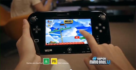
Nintendo has a particularly authentic commercial on this.
Working together with asymmetric controls requires a lot of more communication. It tends to feel more like actually working together instead of just playing next to each other. I was initially worried that my GF would get bored because she had less to do. She would only occasionally have to build platforms while I was constantly in control of Mario. But in fact, it turned out to be a huge advantage. I already wrote how the difference in our gaming-skills prevented us to enjoy co-op games in the past. The asymmetric Wii U controls are an excellent solution. It turns out the laid-back and occasional interaction on the Wii U pad was a preferred way for my GF to participate. In contrast, the Rayman demo is more engaging for the pad player and while we had fun with that too, my GF seemed to enjoy the less taxing Mario implementation for now.
I was also surprised to see how many interactions the Wii U pad provided. Not only could you spawn platforms. You could also paralyze enemies, extinguish fireballs, light up dark areas. Each level seems to add a new idea. It’s fun simply to discover those and experiment with them.
Super Mario Miiverse
One feature I found really interesting was the Miiverse integration. Miiverse is Wii Us new Twitter-like system. Players can post short messages, pictures or screenshots. They can comment or “Yeah” each other’s posts. Everything is organized into channels of the individual games. You can friend and follow people. It feels very Twitter/Facebook-like.
NSMBU is one of the first games where Miiverse functionality is built into the game. Every now and then, the game asks you to comment on a level. This can be because you finished it, because you got all 3 coins, because you died a lot, because you’ve beaten the game, etc. It is a bit arbitrary. Sometimes the system offers a prompt in the form of adding “TWO WORDS:” or “DEAR BOWSER:” to the beginning of the message. The messages then appear on the official Miiverse channel. But more importantly, they also appear in the actual game.
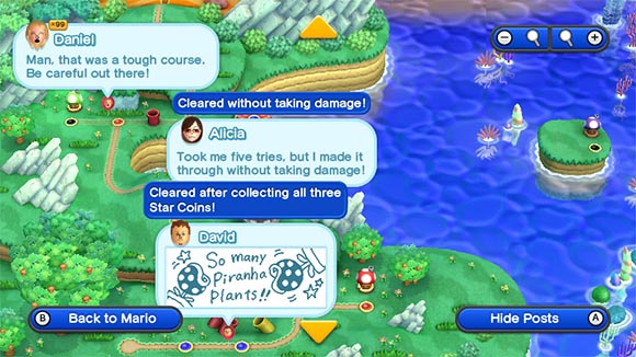
The messages appear next to the actual levels in the map. There are small balloons hovering next to the levels. If put the map display into a special mode, the balloons will pop out a random message about that particular level. You can even set the whole thing to sample messages from all of the community or just your friends. It may be interesting to follow the train of thought of your friends as they progressed through the game.

Players can comment on levels which will show op on the map of other players randomly.
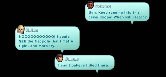
Another occasion where messages pop up is when you die. The game will briefly show a sample of other people’s messages as they died on the same level. Most of them are variations of “I hate this level”. But they do a good job at making you feel slightly less of an idiot should you get stuck.

Before you die you see… people complaining about how hard the level is. Keep in mind that the above is a PR Image. Posts tend to be much less coherent IRL.
Generaly, the Miiverse messages bring a surprising amount of community into the experience. Much like with Demon’s Souls, you feel as if you are playing through the game together with a group of people. Unlike in Demon’s Souls, it creates a much brighter, more relaxed atmosphere. You see people getting frustrated with levels you already mastered. You see people celebrating achievements you still have ahead of you.
The system has still some weaknesses. For example, the quality of the messages can get on your nerves. There is just so many ways to say “I hate this level” before it turns from comforting to obnoxious. Not to mention all the creative ways kids come up with to get offensive content into the system while they are raging out over the game’s difficulty. There is also no way to directly respond or interact with the messages from within the game. So if you see somebody struggling with a level, there is no way you can help them. Also, I would have loved to set the game in “messages from friends only”-mode. But I just don’t have too many Wii U friends, who played that game yet. There is also a lack of permanency. I posted a few screenshots that show secret exits. But they soon disappeared into the no-man’s land of old messages. No way to bring them up again or even search for them.
Closing Thoughts
It would have been easy to dismiss New Super Mario Bros. U as a derivative cash-in on an old franchise. That’s certainly a valid perspective. But actually playing the game, I found it very hard to maintain this cynicism. Mario still works after all those years and Nintendo seems to cultivate the values that made Mario successful in the first place.
On closer inspection, they carefully picked which elements to adopt from previous installments and fine-tuned them. Personally, I think they should have used more from SMW. But it’s hard to deny that their plan works.
Finally, I’m surprised how much the Wii U pad and the Miiverse integration brings to the table. Neither of those feel very elegant yet. There seems to be still room for improvement. But for a launch title, they show that the Wii U works perhaps better in practice than it may appear on paper. I’m interested to see if Sony and Microsoft are aware of this and how they want to respond.


Agreed on all accounts. What NSMBU showed me:
1) a Nintendo console with HD graphics is pretty darn nice
2) Miiverse integration is something all Wii U game developers should look to try to learn on as much as possible, as it brings an exciting social element to the table
3) even without many new tricks up its sleeve, a refined Mario platformer can still be super fun
I feel that there are to ways to look at the game 1 being the next installment in a long running series, and 2 as an introduction to a new very different console.
Looking at it from the first perspective yes it is Mario there is no denying that and the graphics do look better then they ever have before. Some people like myself might want more, but there is nothing you can really complain about with the game.
Looking at the game from perspective of, this is our new console the future of Nintendo, and then have it be exactly the same as past, doesn’t really work for me. The use of the game pad to create blocks just seems unnecessary and doesn’t really add anything to the game play. If Nintendo is all about innovation then why are they sticking to the same formula. This is the game that everyone picked up with there wii and expect to show them what the new console is about and when all you show them is what they’ve been seeing with there wii. What incentive does that give for picking up the new console.
Yes it does have MiiVerse integration but your using in a game that doesn’t really need it. Mario with its basic formula is a game that doesn’t require much communication. If they would have taken the mario rpg route, that would have been a much better example of the miiverse and why its good. Take sticker star for example that would have been great for incorporating miiverse, people communicating about what stickers work with what monster and where to find certain stickers.
I feel that Zombie U is much better introduction to the new console and its potential then NSMBU.
But despite all that I still can’t say that its a bad game because what it does it does well and it is a fun game, I just wish there was a little bit more to show me how this generation will be different.