Continuing the theme of games I’ve played a long time ago but only now came around to write about – let’s talk Need For Speed: Shift for a second. Like for so many people, Shift came out of nowhere for me and won my heart by injecting fresh ideas into the dry genre of simulation racers. Of course new ideas means also new mistakes but that’s precisely the kind of game I love to write about here on Game Design Reviews.
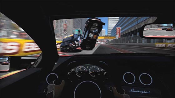
NFS: Shift overtakes as its two over-powered opponents battle it out. See what I did there?
The beauty of Shift is not only that it is an excellent product for the kind of climate it has come out it. Because it dares to make mistakes, it also created a start-off point to further evolve this particular franchise and possibly the entire genre. Gentlemen, start your engines:
What’s wrong with your interFACE!?
So yeah the interface is horrible at times. It seems like a typical interface that has been done by a “graphic designer”. The kind that only “reads” books by TASCHEN. Or at least the kind that never really played a lot of games. Yes, at first sight most in-game menus look bold and cool. But then you start using them.
Here is one thing that never gets old in racing games: when you browse trough your garage or the selection of cars in a shop, you don’t get an instant preview of the car in question. Instead, you need to endure loading times or even have to select the car in order to see it. In Shift, the cars are represented by a list of icons. But they aren’t icons of – say, cars for example – they are icons of the car’s manufacturer’s logo. These logos are incredibly useless in distinguishing between the cars. You see, most car manufacturers like to make more than one car. And I can tell you: there is a profound difference between a Mercedes SLK and a Mercedes SLR.
But even when you highlight a car in that list, after you wait for the car’s 3D model to load you will be surprised at how little that helps. Somebody thought it was a very cool idea to show the car model from stylish angles, focus on details, put the camera way on the ground or tilt it, etc… As a result playing the game you learn the art of recognizing the cars by the shape of their wheel arches.
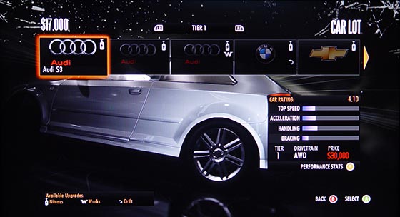
It’s not in the menu, that’s just a bunch of logos. It’s not in the 3D view either, that’s just part of it. DUDE, WHERE IS MY CAR?!?!
I know, it can be technically challenging make an interface that would show a detailed car model instantly when browsing trough a list. You need to do some tricky pre-rendering thumbnail magic. This is why the interface designer needs to work closely with the interface programmer to pull it off. Forza 3 does this perfectly. You browse through a list of little car thumbnails which facilitate visual recognition. You can select the car to see the entire gorgeous 3D model and there is even room for showing off details.
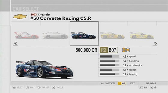
Unlike Shift, Forza 3 revolutionizes the interface of racing games by introducing actual cars into the car selection menu. What will they think of next?
Another little interface nitpick in Shift I found hilarious: see that big ass condensed all caps typography in the menu? When you pause the game, you are greeted with an in-game menu in this style. Now try to find “Quit”.
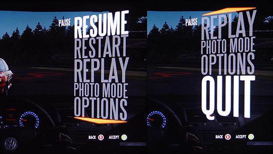
Ah, there it is! You need to actually scroll down to find the quit option. Sheer incompetence… or maybe clever subtext? Yeah right.
Turns out the letters are so huge that they weren’t able to fit the mind-boggling number of 6 items at the screen at the same time. The larger-than-life typography concept is just too big for this kind simplistic thinking. So you actually have to scroll down to even see that there indeed is a “Quit” option at the bottom of this amazingly long list of items.
And as a kicker, I love how they weren’t able to put everything in all caps after all. In the main menu “Xbox LIVE” breaks the rule. I bet it is a restriction put up by Microsoft. Good research interface design guy.
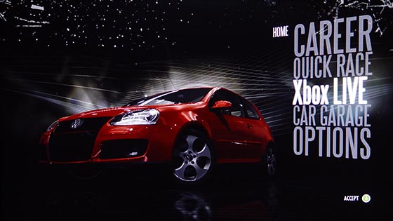
What’s the matter? Didn’t Microsoft allow you to put “Xbox” in ALLCAPS, well boo-hoo!
Establishing Product Identity
So why is the game good after all? Because it is the solution to a tough problem: how to make a successful racing sim game today? You see, by now the entire genre is pretty much dominated by Forza and Gran Turismo. Each comes with stunning and realistic graphics, an incredible selection of crazy detailed car models and convincing car physics. Gran Turismo is so successful they can afford to basically sell demo versions of it and people will still buy them. So whatever you come up with, your game will compared to Gran Turismo or Forza and your game WILL fail unless you hire a bazillion talented developers and spend years in development like they did.
But like always in such a David vs. Goliath scenario, the trick is just to find the behemoth’s weakness. And in racing sims the weakness turned out to be… identity. Both Forza and Gran Turismo focus so much at delivering this comprehensive, realistic car experience that they can be hardly distinguished from each other.
They are both a complete package but as a result they are bland and uninspired. They are sleek but devoid of conflict. Both of them are just deserts of breathtakingly polished but meaningless content. And they are in fact so huge that many players who can’t actually tell a SLK from am SLR will feel intimidated and go for something like Burnout instead.
This is the gap where Shift came in and overtook the champions Cole Trickle style. Instead of fighting the loosing game of graphics they delivered acceptable ones and focused on one area where the big ones didn’t deliver so far. The cockpit view became the one iconic, identifying feature of Shift. And yes, it is an amazing way to play the game. It is unusual at first due to a severely decreased FOV. The game feels like you play trough a sniper scope. But after being thrown about in the cockpit as you perform your first few drifts, the cockpit view BECOMES the whole point of the Shift experience. Turning on the typical chase car cam suddenly comes with a sting of disappointment. Yeah, you could play like this. But why would you? You’ve been there already. The whole point of Shift is that it is different. And yes, if you switch to the cockpit view in a game like Forza 3, you will learn to appreciate Shift even more.
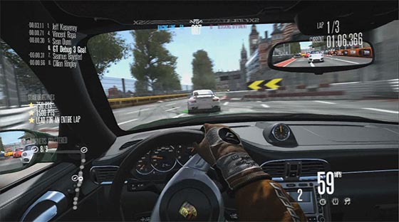
The Shift cockpit view feels every bit as awesome in-game as it looks in the trailers.
I’ve been playing racing games for a long time but when I got to drive the racing version of the Pagani Zonda at the Nordschleife in Shift for the first time, I finally understood what insane machine these high-performance cars probably are IRL. It is challenging, exhilarating, exciting but mostly flat out scary. Going from a roadster to a racing car never felt so significant in a game before.
And funny enough, this is all the game needed to succeed. There are the two almost identical big racing sim games. And then there is that one with the cool cockpit view. So Shift can actually get away with a very limited car selection. But that’s OK because all the sweet cars are here. Even after watching all those Top Gear episodes you will be pleased to find most of your favorites here. Same goes for racing tracks. To be honest, I found the track selection even a tiny bit more exciting than Forza’s or Gran Turismo’s. May have to do with the presentation. And finally, the game can get away with being shorter than Forza or Gran Turismo as well. It’s an advantage if you are addressing an audience that would be intimidated by the big sims. On the other hand it’s also an advantage if you want to provide a short break for the big sim fanatics to play in-between.
So the lesson here is that when creating a game, one of the most important things to do is to define something unique which your game can offer that none other game can. In marketing terms this is called “Unique Selling Proposition” but I prefer the less capitalistic term “identity”. Marketing is something game designers may regard as a post-production thing. This is a mistake. Marketing-type questions are very valuable to deal with at the very inception of a project. In this phase, USP becomes a question about your game’s very soul. This is not only about how to sell the game. This is about how the game will present itself to the players. This is also about following a vision so you don’t waste your team’s time and ideas. In the case of Shift, thinking in terms of identity can be a great source of creativity and innovation.
Putting the RPG in the RPM
Shift can afford not to be perfect because it has an identity and identities can be flawed. So Shift can also go for a joyride and experiment with game-play mechanics. And Shift did. Thank god it did.
So one of the things you will immediately notice is that you are basically showered with points of all sorts. You get experience points, precision points, aggression points, stars (and it is always stars) and of course money. And at the same time you collect various badges, the usual achievements and master corners. And of course the botched up interface here is to make sure you have no clue what’s going on.

Points everywhere. I have no clue what all this stuff means. Apparently it’s meaningless since I finished the game and still have no idea.
But that’s OK because some (not all) of the experiments turn out to be clever attempts at RPGish mechanics. For example you can get stars out of each race. Some stars are associated with getting 1st. But you get others by fulfilling some secondary objectives. This can be quite dull like getting a certain lap time. But this can be also quite exciting (and difficult) like eliminating a certain number of opponents or doing a lap without hitting anything. You don’t have to get all stars in one go so you can replay old races and focus on individual stars. This turns the races into something more of a Super Mario 64 level. Depending on which stars you go for, you get a different perspective on the same mission.
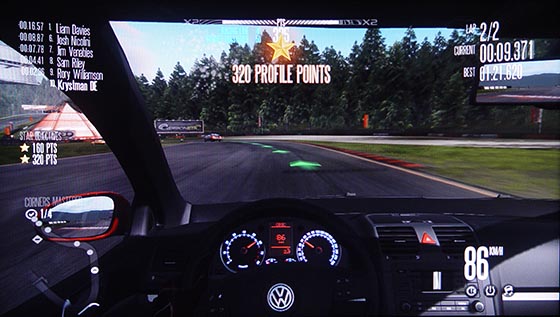
Stars introduce a sub-quest mechanic into the sim racing genre.
The most downplayed mechanic is the corner mastering one. Each corner of each track can be “mastered”. You master a corner by going through it at an optimum speed and following the optimum racing line. You need to master a corner only once during the game. So if you’ve masted the corkscrew at Laguna Seca during one race, it will stay mastered when you race there the next time. Mastering the corners is also quite optional. There are badges associated with mastering all corners on one track but that’s pretty much it. Again like the secondary objectives, mastering corners is a good way to spice up the tired racing dogma. They communicate to the player which parts of the tracks need more attention. They encourage players to perfect their racing lines and really get familiar with the tracks. They basically turn every track into a side-quest or a dungeon and each corner into a battle. But if you want to just floor that Veyron, they won’t get in the way.
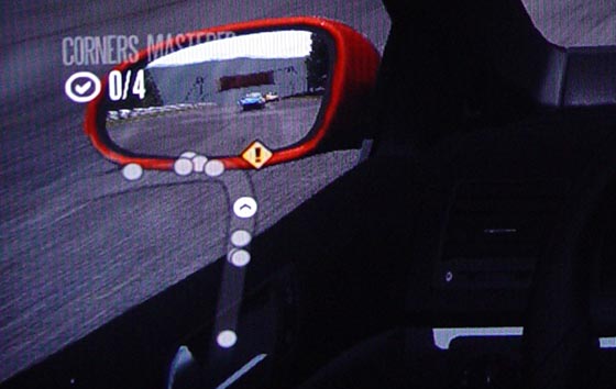
Inconspicuous but powerful: I’m in the process of attempting to master a corner as indicated by the yellow icon.
Finally there is a faint whiff of (*gasp*) a story in Shift. Throughout the game you get voice-overs from a nice English bloke. At the start of the game, he tells you that you borrowed a BMW M3 and can race it once on Brands Hatch. During the test runs he suggests what kind of driving assists to turn on depending on your performance (smart!). After the first race you have to return the M3 away but depending on your placement, you have cash to get your first car. Sadly apart from the occasional track / league introduction the english bloke steps aways later in the game but in a heartwarming way, the final race of the entire game is at sundown at Brands Hatch again. This time you are behind the wheel of a mad Zonda and by now you know every nook of and cranny of the track. It’s a very simple story arc but almost brought a tear to my eye.
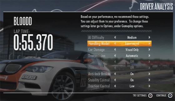
The game suggest a difficulty setup based on a first practice lap. The game’s final race is also at this very same track. Both are excellent ideas.
So this game is an excellent staring point for sequels and spin-offs. There are various ways in which you can proceed from here. I would vamp up the secondary race objectives and corner mastering. I would tie those mechanics to a more prominent, fleshed-out storyline. Imagine if you could make choices in the storyline by fulfilling different secondary race objectives.
But that’s just daydreaming. The bottom-line is that Shift successfully avoided the overwhelming competition by focusing on establishing a very distinct identity. It dared to be different and while not perfect, it opened up new perspectives for an otherwise stale genre. Shift is not the Citizen Kane of sim racing. But I would argue that it is the Wii of sim racing, just probably not quite as successful.
PS: Yes, there is a demo out. But amazingly, if seems to fail at communicating the experience. I wasn’t impressed by the demo at first. The game only got to me when I played the full version. I can’t put my finger on why that is.


> NFS: Shift overtakes as it’s two over-powered opponents battle it out. See what I did there?
You spelled “its” with an apostrophe?
Indeed I did. A common mistake. Thanks for pointing it out.
I must say that I enjoyed NFS Shift more than Forza 2. Granted, the former is an arcade/sim while the other plain sim. Shift is immensely addictive and I’m glad EA no longer churns out games which were ussually toped by smaller companies who lacked the same marketing campaigns.
Possibly the most addictive game in my collection. Must say I hope NFS stays the course instead of doing the rice boy thing again.
Great game, and kudos to David Braben / Blimey games.! The sense of immersion and feedback in Shift is just phenomenal, and feels just awesome like GPL or Richard Burns Rally but with a different emphasis on track racing. And the sound! You just can’t beat how well this game embodies the emotion and excitement of acceleration or tearing your tires to shreds around corners. I usually play in cockpit view with the interface on minimal and really enjoy it that way.
Paradoxically, I think one of the problems with most contemporary driving games [ especially when you're always oriented towards a vanishing point ] is the tactile sensation of speed and danger. This is where Shift comes up trumps and is able to communicate this to the player in quite subtle but effective ways. I found the game feel in Forza 3 to be quite “off” in this regard even playing the demo with the wheel and typically as with GT Prologue the emphasis is in the turns more than anything else when simply driving fast should somehow feel exciting as well ..
– Chuan
I completely forgot the audio part but it’s definitely one of those areas where Gran Turismo simply dropped the ball. They were supposed to be “realistic” but the game ends up not communicating the sense of speed and power properly. I totally agree, NFS Shift does have an advantage also in this regard.