Lunar Flight – A Benchmark for Oculus Rift

Partly inspired by my previous experience woth the Oculus Rift, I decided to get the Development Kit to do more experiments with the system. I am still very excited about the hardware. I think it’s safe to say that this might be the singe most important gaming peripheral since the Wiimote. Before developing anything I went on a binge of demos and games with Oculus support in order to understand the capabilities of the device. One of my favorites so far turned out to be Lunar Flight.

Lunar Flight is the flight simulator of a lunar lander not unlike the Apollo-era LEM. However, instead of landing on the Moon from orbit you fly around on the Moon from location to location. The game features realistic physics and controls. For example, if you start turning your spacecraft, it will continue turning due to the lack of air resistance. You will have to stop any rotation by applying counter-thrust. I noticed the game some time ago on Scott Manley’s channel but I was somewhat put off by it due to it’s rough aesthetics. The game changed quite a bit since then and it was the Oculus Rift implementation that completely won me over eventually.

The game received a major overhaul to work with the Rift. Most of the menu system was re-mapped to an Oculus-friendly 3D menu. The 2D cockpit was replaced with a 3D model. The combination of the right kind of experience and a great deal polish resulted in what I think is a benchmark for Oculus Rift implementations.

Nausea-Free

One of the biggest stumbling blocks for the success of the Oculus Rift will be the nausea. Most current games induce a surprising amount of motion-sickness. When what your eyes see doesn’t match up with what your sense of balance is telling you, your brain starts suspecting you are drunk or poisoned and decides to evacuate the contents of your stomach just to be sure. This is exactly what happens when people get sea sick. Some people already reported having similar problems playing FPS games in 2D monitors. The Rift exacerbates this minority issue to a platform-defining criteria. Everybody gets sick on the Rift eventually. Game designers need to learn how to avoid it. Lunar Flight shows one solution. It lets you fly a rather slow-moving vehicle. There are no sudden accelerations. You can pitch and roll the lander, but you don’t have to. There are actually different strategies you can apply to fly it. You can decide for yourself how adventurous you want the flight to be. The result is a very smooth, nausea-free experience. With most games, I cannot play more than 20 minutes or so before feeling sick. Lunar Flight I was able to comfortably play for over 4 hours at a time – my longest continuous Rift experience so far. And I could have easily continued playing.

Taking Advantage of the Cockpit – Information
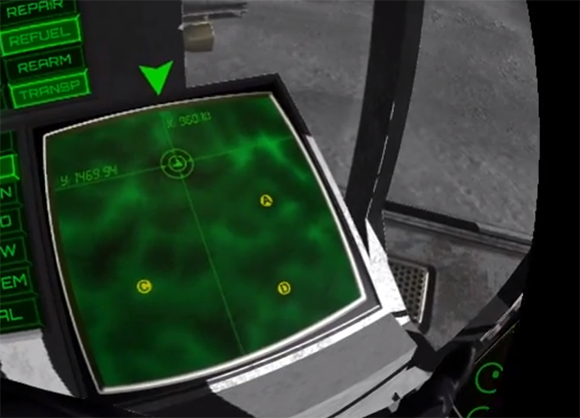
Lunar Flight - Map

Straight-forward and natural: The map is right there.

The cockpit demonstrates a very effective interface design principle when using the Rift: Additional information can be placed in space around the player instead of hiding it in a menu. So for example, instead of having a map that you would bring up by pushing a button, you can just display a map on a virtual screen in the cockpit to the left. When you want to look at the map, you just turn his head to the left to look at the screen. You never leave the context of the game. More importantly, it feels straight-forward and natural. The map is right there. You don’t have to learn buttons or anything. A similar system was already employed in the game Far Cry 2. But it’s really the head-tracking of the Rift that knocks this out of the park.

Taking Advantage of the Cockpit – Interaction

Lunar Flight - Buttons

PUSH ALL THE BUTTONS!

Another interesting feature of the cockpit in Lunar Flight the inteactivity. The cockpit features buttons you can actually press. You highlight them by looking at them. You press them by pushing a catch-all “interact” button on the gamepad. This is a good way of mapping a large amount of functions on a limited input device like a controller. The reason why this is important in the case of the Rift is because wearing the headset, you just can’t see a keyboard. It is therefore impractical to map all those functions on different keyboard keys like most simulators tend to. You could hide those functions in a menu structure, but this would pull players out of the context of the game. Using the cockpit as a “virtual controller” is a smart solution that ends up feeling as if you are actually in the cockpit PUSHING ALL THE BUTTONS. The concept does have some limitations, though. Turning your head to look straight at a tiny button takes a moment – a moment where you won’t be looking ahead. So this solution won’t work for very time-dependent functions. Using this to refuel your spacecraft or selecting the next mission while on the landing pad is perfect. Activating a scanning device while desperately trying to maintain a hovering position just a couple of meters over the surface can be a bit awkward.

Menu
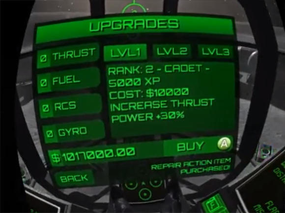
Lunar Flight - Menu

It won’t win visual design awards, but at least it actually exists and it works.

Finally, it wanted to stress out the importance of a menu designed for use with the Rift. Most games I’ve seen have been retro-fitted for use with the Rift. They usually end up projecting their previous 2D menu on a plane in front of the player’s eyes. This hardly ever works. The menus have been often designed for much higher resolutions. Fonts are rarely legible. A workaround some developers use is to move the plane closer to the face of the player. This makes fonts more legible but players end up seeing just a part of the menu at a time – like operating a GUI trough a telescope. The developer of Lunar Lander actually went the extra mile and re-designed the most important menus to work with the resolution of the Rift. They are somewhat an eye-sore but they actually work.

One might think that it should be no problem just to take off the Rift for a second to click on a button from time to time. However, this is impractical for multiple reasons. Putting the Rift on takes a couple of seconds. The lenses have a sweet spot that you have to find. You need to pull on the straps for a short while until you’re all set. It is certainly more complicated that donning a pair of headphones. Additionally, I’m quite short-sighted and I’m using the Rift without glasses. After removing the Rift I still need to put on my glasses before I can see anything. Finally, a lot of games actually require you to use the Rift in “Extended Mode”. This means that the Rift works as an extension of the desktop rather than a copy of what you see on your monitor. So the menu won’t be even visible on the monitor while you are using the Rift.

The lack of a Rift-friendly menu ends up spoiling a surprising amount of games for me, including high-profile titles like Hawken or War Thunder. In this context, Lunar Flight sets yet another benchmark.

Overall, I thunk Lunar Flight is an obligatory experience for anybody interested in developing games for the Rift. It is by no means a perfect game. But it plays to the strengths of the peripheral while avoiding it’s most serious pitfalls. It shows though-provoking ideas that I hope will be explored further in upcoming Rift games. Finally, it also goes beyond a quick tech demo – it is also an engrossing and enjoyable. It’s a proof of concept not only for the technology but for the first time also for the complete experience.

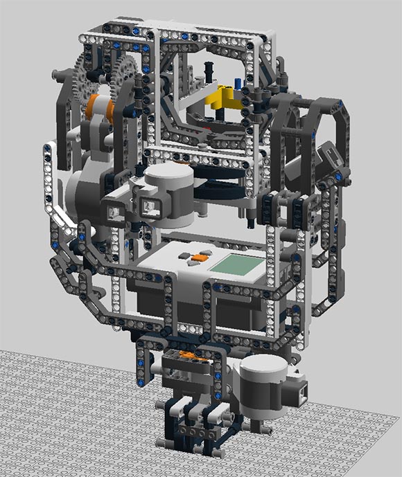
TRAUMA LEGO Panobot

During the development of TRAUMA I build a robotic photo tripod out of LEGO. I ended up not using it for production but I always wanted to document it before disassembling it. It ended up lying around for years. Recently I finally did it. Here is the result:

Perhaps I should explain why I built it. During pre-production time for TRAUMA, I wasn’t exactly sure how how I would use photos in that game. For a time I considered shooting spherical panoramas. I would shoot a collection of carefully overlapping photos from one specific location and then use Image stitching software to construct the panoramas.

However, the process was laborious. I would have to shoot dozens of the panoramas and it was very easy to make a mistake and miss a spot. I was experimenting with LEGO Mindstorms at the time and I ended up building the Panobot.

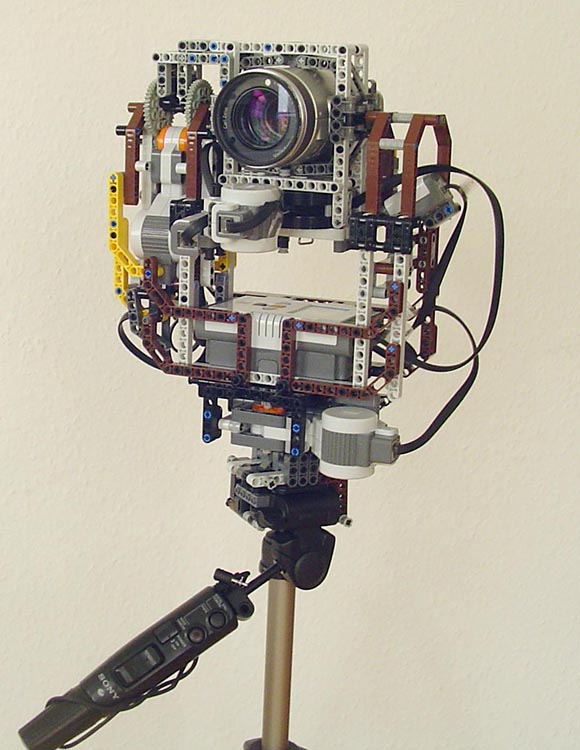
I already made some attempts previously and collected the right parts to pull it off. It still took me over a week of full-time building. I had to re-design the thing multiple times due to structural integrity issues. It was custom-built for my Sony F-717 Camera and a small Sony camera tripod I had. The robot clamped on top of the tripod. The camera would be inserted into the robot itself. The weight of the camera pushed the plastic of the pieces to their limits. The biggest problem turned out to be at the base of the tripod. The whole thing needed to turn at the base. Sadly, the only available LEGO piece for this job is just the flimsy turntable. I ended up fusing two of those together in a quite complicated fashion. It was barely enough. But for some time I developed an obsession to improve upon the design even further. The turntable-problem is a well-known issue in the LEGO community and there are some rather surprising solutions for it.

Panobot Photo

The original Panobot with the camera inserted and attached to the tripod.

But for the time being my preliminary version sufficed and I was able to shoot some interesting test-panoramas. The Panobot worked quite well. I did run into some battery issues. The battery lasted only for a handful of panoramas. Also, the lack of structural integrity made the whole thing shake horribly whenever there was a gust of wind. But it was usable. The only thing that really stopped me from fully taking advantage of it was my decision not to use panoramas in TRAUMA after all.

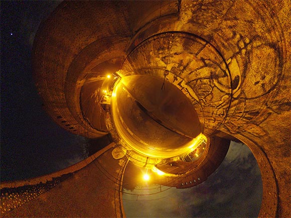
Panorama

One of the many panoramas I shot with it. This is from a location that ended up being in the actual game. If you look closely you can even see the shadow of the tripod.

I don’t think I will be improving upon the design, since today there are much cheaper and more reliable commercial solutions available. However, it is a cool memento and an interesting build to experiment with. So if you want to check it out, you can download the digital model of it here. It can be opened with the LEGO Digital Designer.

Occulus Rift Impressions

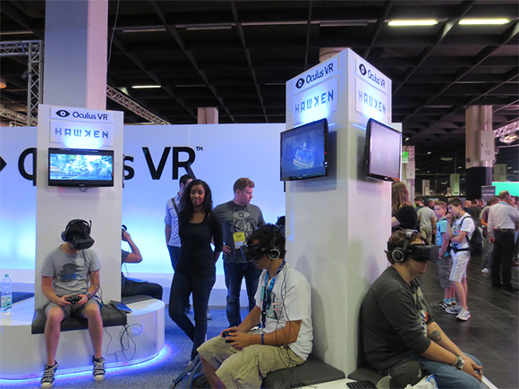
Recently at GamesCom I was able to try the VR headset Occulus Rift for the first time. I was lucky enough to try the new HD Prototype. From what I understand, this is very close to the final product that should release in 2014. I played a couple of minutes of Hawken. Here are some of my impressions.

Occulus VR booth at GamesCom

Occulus VR Booth at GamesCom

In some respects it was a sobering experience that de-mystified a lot of my preconceptions of Virtual Reality. In other ways I was still blown away by it. In any case, I think it is a fascinating and important device. So far, most of us have learned about Virtual Reality almost exclusively from Hollywood movies. The Occulus Rift represents a pallet cleanser and establishes a precedence to productively discuss the technology.

Does it feal like actually being there?

No. Which was the sobering part. There are multiple effects that will ensure that the user will never think that they are doing anything else than having a small LCD screen strapped to their face.

  • Lack of optical focus – While the Rift does show the world in stereoscopic 3D, one of the things that we should be slowly learning from the recent hype for 3D movies is that depth perception seems to be a phenomenon that goes beyond mere stereoscopy. One important aspect of how humans judge scale and distance is by using the focus of their eyes. Put your finger close to your eye and focus on it. The everything further away will become blurry. Focus on something further away and the finger will become blurry. This is one of the reasons why we can usually judge very well how close things are in the immediate vicinity – close enough so we can touch it. The effect becomes less pronounced with distance. But in our everyday life we constantly re-focus on various things around us.

    The Rift lacks this. The image is projected by a special lens in a particular way so that all the light rays come in parallel as if they came from far away. Your eye focuses in the distance. So putting it on, instead of the 3D image wrapping snugly around you, to some extent it remains removed and not immersive at all. This is not a design error, it is just a natural limitation of the system.

  • Low resolution and a screen door effect – I was shocked by how low the resolution is, even though this was the HD version. The problem here is that while the display is pretty highly resolved, it covers your entire field of view for both eyes. So you end up staring on just a tiny portion of the available resolution at a time. The result puts you back into old VGA times. If you have a realistically-sized speedometer in a car sim, you will probably not be able to read the numbers on it. Do add insult to injury, the LCD screen is optically magnified. So you end up seeing the gaps between the individual LCD pixels. The good news is that unlike the focus issue, this aspect will likely get better with future iterations of the hardware.

    Screen Door Effect

    The Screen Door effect

  • Low dynamic range – Because you are looking at a standard RGB screen, you will only see light from a fairly low dynamic range of intensity. For example, if you look at the sun in the virtual world, it will not blind you. This seems like a petty issue but I think this lack of fidelity does put a huge damper on how real the image appears. Especially in a cockpit situation, you are usually sitting in a dark environment while looking on a very bright world outside of your windshield. The Rift dulls out this contrast and it ends up reminding you that you are actually just looking at a screen.

  • Restricted field of view – Finally, the image doesn’t cover the entire field of view. There is a small but noticeable border. Supposedly, the coverage is pretty good compared to other systems and it is not a show stopper. However, it is one additional reminder that erodes the illusion.

The good news is that it is very easily to get lost in the image. After a few minutes you get used to the artifacts and get lost in the game. Then again, that’s kinda what happens with video games in general.

How immersive is it?

It is hard to say if the Rift feels more immersive than a regular screen simply because there is no way to measure immersiveness. However, there is one effect I and the two guys with me experienced which is certainly something a regular screen doesn’t produce. Walking around in Hawken didn’t feel exceptional. But then we engaged the jet pack. Holy smokes! Flying with the Rift is an incredible experience. It feels truly astonishing! There is a real feeling of actually lifting yourself into the sky, a real sense of height and depth. Even though there are no acceleration forces, some part of my brain was just completely fooled. So every time I turned off the jet pack and started falling, my stomach started to churn like in a roller coaster. I had serious inhibitions of letting myself fall all the way to the surface. I eventually did fall to the ground at a speed that would kill me in real life. It felt unsettling. Despite of all the technical imperfections, that feeling alone made all 3 of us walk away ecstatic.

Flying Lawnmower

How it feels like when using the Rift.

So what is it good for?

This is the question I found most intriguing. Most people seem to want to use it for 3D shooters. That will do in the short term. However, there is an important thing that I realized: in order to make the Rift REALLY shine the game must reward you for being able to look around. You see, a regular shooter couples your walking direction with your viewing direction. So you always walk and shoot in the direction you look. This is not practical for the Rift as you would have troubles turning around 180°. Besides, in real life, you head and your body can rotate independently. The obvious solution is to uncouple the looking direction and the walking/shooting direction. You use the controller (or mouse) to move the cross-hair as regular. But additionally, you can move the camera away from the cross hair by turning your head. This works but it causes other problems. In practice, it is just so much easier to flick the analogue stick to look around rather than turn your entire head. So playing and FPS you will just end up staring straight ahead and moving the field of view with the controller as you are used to. This renders the whole head tracking functionality of the Rift completely useless and lessens the immersion. You just don’t get the opportunity to experience how you head is embedded in the virtual world if you end up never moving it.

The Rift shines in games where the thing you control turns SLOWER than you can turn you head. These are basically any kinds of simulation games: flight simulators, spaceship simulators, racing games, truck simulators, etc. Any game, where you control some kind of vehicle that has some inertia to it. Hawken may be a Mech simulator, but it is just too fast for the Rift to be of use. You need something where there is an advantage in looking around.

The fact that simulation games often simulate an activity that is performed while sitting in a seat also helps reducing the dissonance. From our short experience with the Rift, games where you fly around have an additional advantage. I haven’t witnessed any high-speed movements yet. They may also be impressive.

All in all, this and what I wrote yesterday suggests a very bright future for simulation games. Will we all be trucking with our Rifts? I guess we find out next year.

Zen and the Art of Euro Truck Simulator 2

Simulation games were big in the 80ies and early 90ies. They went away together with adventure games and real-time strategy games. But now they seem to be on the rise again. The first mainstream gaming reaction to games like Farming Simulator was ironic in nature. 360 NO PLOW has turned into it’s own meme. But more recently, titles like Euro Truck Simulator 2 seem to genuinely strike a chord outside of their niche.

“It may sound like a joke that so many people are piling glowing praise on a trucking sim, but Euro Truck Simulator 2 is the real deal.”
- Jim Sterling

It certainly stroke a chord with me and with some of my podcast colleagues. For a brief period of time this summer we found ourselves completely immersed in virtual trucking. Here are some results:

The fascination of Euro Truck Simulator 2 is difficult to explain. Nevertheless, here are some of the pieces of the puzzle:

  • Failure is fun – In most games, being successful is usually the part where the game is enjoyable while failing is usually undesirable. When looking back at the parts of Euro Truck Simulator 2 that I wanted to preserve for posterity, it was usually some sort of mishap, accident or bug. Failing in a game can be funny, but failing in a simulator is often hilarious. The reason for this may be the contrast between a simulator’s serious, dry setting and a potentially spectacular accident portrayed in it. Mayhem in Farming Simulator is simply astounding while Mayhem in Saint’s Row is just par for the course. However, this seems not to be the whole story. Some simulation games like Kerbal Space Program use a cartoony setting. Yet, accidents in that game can still have an exceptionally comedic effect. Perhaps this humor is also somehow fueled by the open-ended, exploratory nature of those games.

    In any case, as a player the result is a win-win situation. No matter if you succeed or not, the game is always enjoyable.

  • It is relaxing – One thing that is difficult to convey to people, who haven’t tried Trucking Simulator is how relaxing it can be. Driving a racing car around a track as fast as possible is exhilarating. I have been doing my 4-hour GT5 marathons. Afterwards I had to peel my cramped hands from the driving wheel. Trucking Simulator, on the other hand, is something I could be (and have been) playing for hours on end. Steering a truck down the autobahn usually requires a much lower level of attention and interaction. There is a timer like in a racing game, but it is presented in a far less pressing fashion. There are stretches of time where you can look around to enjoy the scenery.

    Of course, from a conservative gamer’s perspective, this would be seen as a sign of design failure. But let us consider recent developments in gaming culture. In a world dominated by commented YouTube videos and live game streams with audience interaction, a game that leaves players with some attention surplus actually makes a lot of sense. When recording some of the above videos, I had just enough time to occasionally check out the stream chat or to verbally comment on what is going on without immediately crashing into a wall. So as Let’s Play videos become more relevant for games marketing, we might actually see more games as relaxing as Euro Truck Simulator 2.

  • It is life-relevant – A term I tend to harp on is “Life-relevance”. With that, I mean a situation when elements from the game refer to something outside of the game and/or when ideas and skills from the game can be applied outside of it. Most games have little actual Life-relevance. Aligning yourself with established genres, settings and brands can be seen as a substitute for Life-relevance. For an audience constantly immersed in those escapist settings, it can be enough. Simulators are different. Life-relevance is at the core of what they offer. They depict something that actually exists. This has tremendous consequences for the experience. Each in-game element taps into a wealth of real-life knowledge. It is like making a game with the largest lore repository we will ever know – real life. Trucking through virtual Europe I recognized and remembered the different countries and cities I visited along the way. I was also able to discover and experience parts of Europe I haven’t been to yet. I now instinctively identify the various truck brands I see on the streets. And the next time a truck blocks a lane on the autobahn, I will be probably more relaxed about it. After all, I have been practically in that guy’s position myself.

  • There is a traditional game underneath – Finally, the game offers a lot of the trappings of traditional games. There is an RPG leveling system to upgrade your driver and access more challenging hauls. You additionally earn money which you can invest in upgrades for your truck so you can truck harder. There are cities, roads and various special buildings waiting to be discovered. It is here where Euro Truck Simulator 2 made me consider: driving a truck may seem like a queer choice for a game, but why is that so? Why do we have such an easy time to see the value of playing a soldier, yet such a hard time to see the value of playing a trucker? If driving go-karts or stacking blocks can be worthwhile, why not also hauling some trailers across Europe? To some extent, the themes we consider established and unusual are just arbitrary choices defined by precedence. Call of Duty may not seem so weird as a topic for a videogame, but that is only because of all the military shooters that came before it. In a parallel dimension, we have been doing nothing but trucking all this time.

There is a lot to learn from Euro Truck Simulator 2. And I have a lot more I have to say about it. There are other reasons why simulation games may become more important in the future. But I will be discussing this a different time. Meanwhile, don’t let the unusual setting distract you from what is an exceptional gaming experience.

XCOM Classic Ironman

I recently got into XCOM. I saw Day9 playing it and it made me catch the XCOM virus again. It was a good thing too. The game came out around when my dad passed away. I bought it when it on release, played a map or two and forgot about it. I was glad to re-discover it now. I attempted a Classic Ironman and recorded it. The result is a YouTube series. Here is the first episode:

I’m really enjoying the game. It is very different from the original and it misses out on a lot of things that made the original great. But its game design is also a lot tighter, the experience a lot more controlled and dramatic. It is a good attempt a remake. One that brings in its own flavor rather than just copying the original.

So for example, one thing that it constantly does is to put players in front of these very clearly defined decision. The very first thing you do is to select between multiple regions to put your base in. Each region comes with it’s own advantages. Throughout the game, you get those so-called abduction missions. Multiple cities are being attacked by aliens simultaneously. The game forces you to decide which city to help. Each city has a different difficulty level and different rewards. Also, helping a city will lower it’s panic level while the cities that you leave behind will freak out more. Compared to the original this feels forced and artificial. The original allowed you to maintain multiple teams, so you could be attempting multiple missions simultaneously. Cases like this used to be rare anyway. This new approach feels less natural. It is clearly a setup by the game’s designers to put players into this difficult choice. But it is also a clear execution of modern-day Firaxis philosophy: Games as a series of interesting choices. I have my problems with that philosophy. But I appreciate that they actually have one and stick to it.

One thing I really dislike so far is the way UFO/Alien lore is treated. The original drew upon a lot of real-life UFO folklore. The team seems to have thrown a lot of that out of the window by making some pretty peculiar artistic choices. The grey aliens scour on the ground and move on all fours like monkeys. They don’t look like the mystical, enigmatic beings we know form the X-Files. Equally troublesome are the obnoxious, cartoonish characters in the base. Dr. Vahlen doesn’t seem to be able to decide on which european accent she wants to speak. Audio transmissions are unskipable. The cut-scenes are generally ham-fisted and cringe-worthy. The game fails to convey the kind of atmosphere and setting the original was famous for.

On the other hand, it feels refreshing to have a modern game that will actually allow players to live out their mistakes. Playing on Ironman, the game might put you back to square one even if you are already 8 hours in. At least in this regard, it is an entertaining remake. I might write more about it soon. Stay tuned!

Trauma Making of

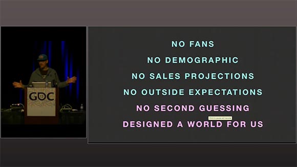
A really short post today. I wanted to share with you a GDCE talk I gave a year ago about how I made my game TRAUMA. It has been just released on GDC Vault for free!

Click here to watch the video.

I basically go over some of the influences and assumptions I had going into TRAUMA. I also talk a little about how the project evolved over time and how TRAUMA became what it is. Enjoy! And let me know what you think.

The Polarization of Pacific Rim

There is something interesting about Pacific Rim. It has spawned a lot of very divergent reactions among critics. Take this merciless takedown by The Jeff and Casey Show for example:

And then compare it to this commentary by Mythbuster Adam Savage

While Jeff and Casey call it the worst Blockbuster Movie ever (even worse than Transformers), Adam seems to have enjoyed it a great deal. I’ve seen a similar divide between me and the friends I’ve seen the movie with. Most of my friends thought it was rather forgettable while I had a blast.

The thing that I find perplexing in here is that I actually completely emphasize with all of Jeff and Casey’s arguments. The premise of this movie is incredibly stupid and threadbare. It is full of baroque details that represent gross misunderstandings of physics and technology. I would be usually arguing in a similar vein, picking apart the lack of realism and common sense. For example, I had a longer discussion with my podcast friends on how the world of Game of Thrones fails to reflect the dramatic changes of seasons. How come time is still measured in years if a season cycle can last multiple years? How did the people of Westeros arrive at the concept of what a year is in the first place?

How come there are bears in Westeros? How do they even hibernate if winters are arbitrary in length and last for years?

A convenient way out of this dissonance for me would be to argue to consider consistency. Pacific Rim is a modern re-imagining of the old Godzilla movies. A hokey story barely holding together to set up the gratuitous monster fights is par for the course. On the other hand, Game of Thrones is a hyper-realistic take on the Fantasy genre and the result of meticulous research and word-crafting. So oversights like these appear more substantial because they are uncharacteristic.

But on closer inspection this way out doesn’t hold up to scrutiny. I would probably use the same kinds of arguments to take down Transformers. Arguably, Transformers doesn’t take itself any more seriously than Pacific Rim. Yet the same kind of stupidity that I think is sinful in Transformers, appears as endearing in Pacific Rim.

There is a certain way in which we formulate criticism that I noticed at some point when doing user testing. As long as a certain works connects and speaks to us in some way or form, we are able to accept it’s flaws, even embrace them – the way we may love a cute kitten even if it constantly shits on our carpet. But if a work fails to establish this connection or if the flaws accumulate beyond a certain threshold, we tend to flip our way of thinking. What was previously glossed over or even embraced then becomes an aggravating factor. Once the initial glow wears off and the kitten grows up to be a big and fat cat, that spoiled bastard better learns to stay off the goddamn carpet.

Yes, this is an analogy to Pacific Rim.

This may be an explanation. But I think the reactions to Pacific Rim show that the rabbit hole is even deeper. Some people tout Mako, the female protagonist as a new benchmark for writing strong female characters. Jeff and Casey offer solid arguments why it’s blatantly sexist. Those vast differences in opinion even when looking at details of the film aren’t that well explainable by an infatuation with the film’s overall themes. It’s not like Mako is a sexist character and that sexism is just glossed over by people because they really enjoy old Godzilla movies. Rather, there is an ambivalence present at a molecular level as well.

There is one aspect of Pacific Rim that for me still trumps Transformers or other Blockbuster movies similar to it. The entire movie conveys a message of inter-cultural cooperation on multiple levels. Not only are the giant robots manufactured in different countries. The actual act of piloting them requires two humans to cooperate. The two protagonists originate from America and Japan respectively and it is their mutual cooperation that makes victory possible. In one of the sideline plots, two arguing scientists also lay down their quarrels to conduct a risky experiment that reveals a vital clue on how to overcome the impending doom. There are probably even more details that echo this theme. To me, this is still a quantum leap ahead of the militaristic machismo veiled with thin humanistic platitudes in Transformers.

I will be monitoring the response to this particular movie. So if you have any interesting analysis or just your own opinions, feel free to drop a line.

Re-discovering Muramasa

The recent re-release of the Wii game Muramasa on the Vita is a good opportunity to re-discover this hidden gem.

I bought the game back when it came out on the Wii. After a cursory glance, it has been sitting in my backlog ever since. So I used the pretext of the recent release to double-dip on it and risk a second attempt. And so the game’s charm finally captured me.

The game is a mash-the-button-to-win brawler with silky smooth, rewarding sword fighting animations. It set in an kinda-open-world 2D platformer world not unlike Metroid or the latter Castlevania games. To be perfectly honest, the actual gameplay is not that appealing to me personally. The sword slashery grows tiresome and repetitive quickly. The thing that keeps me going is the overwhelming visual style and some interesting structural choices.

Same World, Multiple Campaigns

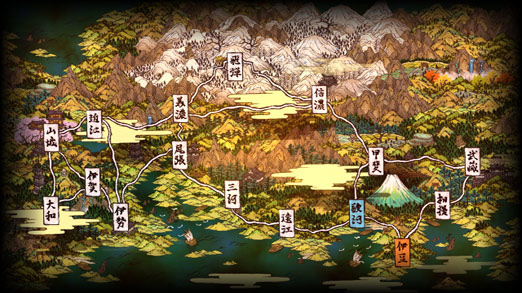
Muramasa Wolrd Map

Muramasa’s world serves as the backdrop for two different stories starting at different locations.

Let start if off with the structure. The player is being offered two independent campaigns. Each campaign has it’s own protagonist. Interestingly, both campaigns play in the same world but you start in a different place. Imagine Metroid offering a second game mode where you play as a different bounty hunter starting in Mother Brain’s lair. You job is get out instead of getting in. It is an interesting way of getting more mileage out of an established word. It does require a slightly different approach to world building. The world becomes less an obstacle course designed for a specific set of player abilities but a more of a broad space filled with unspecific challenges that work for differently equipped players. Many sections of the levels are just empty which takes getting used to from a traditional gamer’s perspective. They turn out to be an excellent opportunity to simply let players enjoy the gorgeous game art. One side-effect of this approach is that it can be tricky to keep players contained.

Lazy Gating

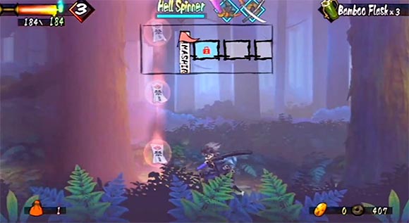
Muramasa Red Gate

“Oh! It’s a RED magical gate in the middle of the forest. Man, I’m glad I got that RED anti-magical-gate-sword from the last boss fight.”

Gating is the way in which games prevent players from accessing certain areas in open-world game design. Without it, a player might just go straight to the final boss or experience a story event out of sequence. In my old World Design article, I described a certain type of gating which I’d call “Lazy Gating”. It is when the different gates present themselves as actual gates or magical obstacles. In the worst-case scenarios, the different tiers of gates are color coded. “You can’t open this blue magic door, you need to get the blue key first”. The actual keys to open the gates often have no other purpose than actually opening the doors. It is “Lazy Gating” because it can be applied quickly to EVERY type of game, it is repetitive, obvious and tends to stand out as a sore thumb. Muramasa suffers from Lazy Gating a great deal. Players are often stopped by color-coded magical barriers which can be only broken if certain, color-coded swords have been acquired. Considering the attention to detail the worlds of Muramasa were created with, the magical gates are awkward and simplistic. They may have been created as a concession to the multiple campaigns. Depending on which campaign you chose, the world is re-gated to accommodate for the different sequence of events. I keep wondering if a more integrated approach would have been possible. I also wonder if the gating is even necessary at all.

Games and Ethnicity

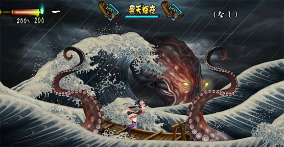
Muramasa Octopus Monster

Western Fantasy may be inspired by Medevial History, but how many Fantasy games are actually quoting Medevial Art?

Muramasa represents the kind of embrace of the developer’s ethnicity which I find way to rare in games nowadays. With a heavy focus on US-western mainstream taste, most AAA game developers seem to be keen to erase traces of cultural or historical origins from their games. The only exception there seems to be the Japanese culture, which found it’s way into pop culture trough tropes like Ninjas and Samurais. Of course, one could argue that the western Fantasy genre is a treatment of western medieval heritage. To some extent that’s true. But quite often, it seems fantasy is more concerned with repeating it’s self-established tropes rather then going back to it’s source material. Like Okami before, Muramasa draws heavily from source material – both visually and thematically. Of course there are samurai swords and ninjas. But there are also Kitsune, Inugami, Kuzuryū, Fudo-Myoou, Macaque Onsen all beautifully illustrated in a style strongly referencing Japanese watercolor art every step of the way. And there is food. Good lord! Let me tell you about the food.

The Food

Why is it that it’s only the Japanese developers that actually care about the food? From the top of my head, probably the most detailed western treatment of food is the GTA Series where you can chose between different fast food chains to order meals from. Comparing GTA to Muramasa in this context is like comparing the treatment of inter-personal relationships “Dick and Jane” to Patrick Marber’s “Closer”.

Superficially it’s similar. You go to different restaurants. You can eat food there. Food restores life energy. However, each restaurant in Muramasa presents you a whole menu of meals to choose from. Each restaurant has it’s own special set of dishes typical to the region the restaurant is situated in. The game actually offers a brief description of each dish. And when you actually pick a one, you are being presented with the most delicious, vivid, animated illustration of the chosen meal. Pressing a button and the food gets gradually consumed by the invisible hand (and mouth) of the protagonist. This process is also vividly animated. Gelatin balls bounce and jiggle as they are being split into halves and quarters. Rice balls reveal their meaty, steaming fillings. Glistering fresh sushi is being shown soaking up dark soy sauce sauce before it too disappears. It’s food porn in every way – completely superfluous in richness and attention to detail.

It’s the Mortal Combat x-ray finishing move of Japanese cuisine. (more here)

It is also entirely the whole point of the feature. The game actually offers enough opportunities to heal your characters in different ways – there are healing Onsen and various healing items. Your energy also replenishes every time you level up. Watching the food being consumed in the restaurants is a reward in it’s own. To top it off, you don’t just eat food at restaurants. There is also an extensive cooking system which allows you to prepare delicious stews and snacks from found ingredients. And yes, this process is also illustrated in a obscenely appetizing way.

So there are many takeaways from Muramasa. For the above and more reasons it’s a game I would recommend having a look at. With around 9 hours per campaign it’s fairly lightweight and it is available on the PS Vita and the Wii / Wii U. Better check the location of your next Japanese restaurant before playing. Sudden cravings for oriental cuisine are to be expected.

UFO Postmortem Observations

I wrote yesterday about some of my observations on the Myst Classic Game Postmortem. I wanted to follow-up today with the UFO Classic Game Postmortem.

Full disclosure: I never actually played that much of UFO. I played a couple of missions. But most of my UFO experience comes from the sequel X-Com: Terror from the Deep which I played for well over 100 hours over the course of my life. With the two games being almost identical, I tend to project what I know about TFTD to fill my knowledge gaps of UFO. Both had been a very influential game for me and so I the video was fascinating to me.

  • Accidental UFO Theme – One of the major surprises of the presentation was the reveal that it wasn’t the developer Julian Gollop, who came up with the UFO setting. The publisher Microprose suggested it. Julian apparently only wanted to make a bigger version of his previous game Laser Squad, which seems to have been only the tactical combat part of what later became UFO. Microprose pushed him to add a global meta management layer and suggested the UFO theme to make it more recognizable. They made an attempt at making the game more similar to the Civilization series. This is also where the term “Ufopedia” came from.

    Of course, this was just a starting point. Julian Gollop then went on and actually made those suggestions a reality. The theme was inspired in particular by the British TV Series UFO which I had no clue about. He also drew upon UFO conspiracy folklore by UFO hoaxter Timothy Good. The latter was a particularly serendipitous move as the same UFO folklore became the basis for the TV show X-Files, which in turn became a major cultural touchstone of 90ies pop culture. And that’s something I always suspected: one of the reasons for the incredible success of UFO was X-Files. The game came out at EXACTLY the right time to ride the wave of UFO enthusiasm spawned by X-Files. With grey aliens and autopsies it delivered exactly the kind of supernatural fix the X-Philes were craving for.

  • Dissonant Aesthetics – Which brings be to the point of aesthetics. One thing I personally never liked was the dissonance in aesthetics in the original UFO. The game features a loud, fast, action-packed, gun-toting comicbook intro. The actual game is about slowly creeping with your soldiers through silent, murky urban environments and taking out hidden aliens one by one with precision shots.

    The presentation revealed that this was apparently the result of the lack of a coherent aesthetic vision. The art was done by two artist from Microprose. One of them was simply a fan of Marvel comic books and designed the characters as well as the intro. Julian Gollop himself didn’t seem to have a firm opinion on this so he let them do what they suggested. One thing he often underlines in the presentation is that nobody really understood how the game is going to play. So the basically ended up with an “everything but the kitchen sink”-approach: UFO folklore, UFO TV series, Laser Squad and Marvel Comics.

    I suppose the reason why it did work is because X-Files prepared the audience to gloss over the awkwardness of it all. Perhaps the different contradicting directions created a Rorschach test where everybody saw something different: a comic book or an X-Files spin-off. Be it as it may, the lack of aesthetic direction seems to have became a huge stumbling block in creating follow-ups.

  • Failed Sequels – I was fascinated to hear the story of the sequels to UFO. In particular, I was stunned to hear that Terror From the Deep was an in-house production by Microprose created entirely without Julian Gollop. I had no idea. It explains why Julian never built upon what TFTD done right. What I personally love about TFTD is that it’s the only sequel that managed to create a really coherent, effective aesthetic – an aesthetic Julian himself apparently never managed to conjure. TFTD drew on the Cthulhu mythology of H.P. Lovecraft and added some iconic B-Movie favourites like the Gill Man or floating brains. It dropped the comicbook cutscenes for more neutral CG ones. The aliens, the color palette, the sound, the overall atmosphere all suited the setting perfectly.

    Meanwhile, Julian worked on UFO: Apocalypse which became officially the game where UFO dropped the ball. It’s really heart-breaking Julian talk about it. During the Q&A he admits that it was one of the biggest mistakes of his career. It sounds like there is an amazing history behind it. Apparently, a lot of things went wrong with that game

    From what I can tell it seems like instead of consolidating what they had and creating a coherent aesthetic identity to center the UFO franchise around, the visuals were completely outsourced to Microprose again. Meanwhile the team around Julian just tried to just make a bigger, even more complex game. More destructible terrain. More sophisticated political simulations. With no guidance and no firm grasp of what the game was supposed to be, the art team made some really poor aesthetic choices. Both teams failed. The visuals didn’t work. The more complex game mechanics didn’t either.

  • Late-game Pacing – And this is really an interesting way of looking at how many early strategy games were made. The game design of them was often just a matter of creating a complex enough system and letting players play around in it – something that struck me as I was re-playing Populous as well. This was both – a strength and and weakness. The strength was that those games were able to create incredibly interactive, dynamic and engrossing experiences. Julian himself appreciates in hindsight how they never had to design levels and missions for UFO. They just made a bunch of prefabricated elements, some AI and the game would automatically assemble and re-combine everything to keep creating new, fresh scenarios. The weakness was that this approach makes it difficult to control the experience. Julian admits that the late-game of UFO often felt mis-balanced. Advanced weapons like the Blaster Launchers and Psionics delivered some really erratic results. The game tended to get quite lengthy too.

    More importantly, this game design approach also made follow-ups very difficult because it doesn’t necessarily scale. Aftermath demonstrated that adding more complex systems didn’t lead to the superior game they were hoping for.

Overall, I think it is telling that Julian always outsourced art and narrative to separate teams while he focused on the mechanics. I think this demonstrates quite well how you can’t treat those two aspects of a game separably. Both need to serve an overriding design vision – an fundamental understanding of what the game is about. I suspect nobody ever had that vision with UFO. It was a stroke of chance. But they never saw the necessity of taking charge of what they discovered there. They just continued developing games like he used to – make a convoluted system and let the art team slap some art on it. Or at least so it seems.

I would be really interested in a postmortem of TFTD now. That team had it’s own share of difficulties as it seems. But I still think they ended up with a more consistent overall game design. More insight into Apocalypse would be interesting too. I would love to hear the art team’s perspective on this.

As always, I strongly suggest you to check out the video. Feel free to leave you own thoughts on this below.

Myst Postmortem Observations

One of my favorite GDC sessions are the Classic Game Postmortems. These are presentations where the creators of famous old-schools games tell the story of how those games were created. The postmortems are great because they tend to reveal surprising facts about those often pivotal games. They also great because they often show a historical, type of game development which isn’t really all that relevant for modern big game production. The teams were small, often just one person. They made games by following a hunch rather than trying to maximize their revenue. Really, the Classic Game Postmortems actually have much more to do with indie games than with AAA games.

I saw two of those postmortems recently and wanted to share some observations:

The first one is Robyn Miller talking about Myst. This one is ESPECIALLY interesting for me because my game TRAUMA and the underlying final thesis was heavily inspired by Myst. There wasn’t too much information about the creation on Myst around but I did make some assumptions based on my study of the history of Adventure games. Watching the video now, I was pleased to realize how spot-on my analysis seemed to be.

  • In-Persona – One of the things the presentation really stresses out is how playing In-Persona was a major design philosophy for Myst and the previous games by Cyan. In-Persona means that the players don’t assume a character role. Instead they play as whoever they are as they interact with the game. It’s the silent protagonist taken to the extreme. The game isn’t a stage play where the player slips into a costume. It becomes a window into a different world.

    One of my thesis points was that this subtle difference may have been a major reason for the game’s appeal. A lot of so-called “casual” games are played as in-persona. Even games which have nothing to do with Myst, like Brain Age or Wii Sports. Interestingly, In-Persona style gameplay isn’t that popular among modern hardcore AAA titles. This may hint at a different mindset of approaching games for different types of players. More casual players want to just interact with a game and use them transport themselves into a different world. More dedicated players use games to play out roles, change who they are. This, of course, is just a hypothesis. But it was good to see it being supported by the Myst developers themselves.

  • Puzzles are not important – Myst is often seen as a game of puzzles. It was interesting to see how the developers talk about them. It turns out they don’t really like puzzles themselves and they never really made a big deal about them. They used the puzzles only as a means to stall progress for players or to give them something to do. The point of the game was the environment and the atmosphere, not the puzzles. Again, an idea I realized myself working on TRAUMA and attempted to develop further. It’s odd that the puzzles in Myst became so dominant after all. I wonder if this is a case of not getting the balance right. Or perhaps it seemed like a game that doesn’t emphasize puzzles for them at the time?

  • Zork – Which brings me to another fascinating observation. Myst appeared while Lucasarts was the dominant Point & Click adventure company. Interestingly, none of the Myst developers ever played a Lucasarts game before working on Myst. Their original inspiration were text adventures like Zork. In fact, this was the only adventure game they played before they developed Myst. Indeed, if you look closely, Myst is much closer to Zork than the Lucasarts games. Like Myst, Zork is played In-Persona. The games are dominated by a surreal atmosphere of mystery rather than the wacky comedy that fueled the Lucasarts games.

  • Proto-Zinesters – Generally, it seems like the developers of Myst weren’t that big gamers. They were able to develop games because of Hypercard, a very user-friendly programming tool for early Macs. This allowed them to experiment with different narrative experiences without worrying whether the result would fit into the category of what a game is. Myst was a phenomenal success because they were able to reach the same kind of audience – adult people, who weren’t experienced gamers. In this regard, Myst is an incredible example of Videogame Zinesters as described by Anna Anthropy.

    To be fair, this is to be taken with a grain of salt. While the developers didn’t consider themselves big gamers, they did mention playing a lot of Dungeons & Dragons and being inspired by that world. While not exactly a videogame, D&D certainly belongs to the Nerd culture videogames are embedded in.

I wholeheartedly recommend you to check out the video. And let me know if you found interesting points yourself.

About

The Game Design Scrapbook is a second blog of group of three game designers from Germany. On our first blog, Game Design Reviews we describe some games we played and point out various interesting details. Unfortunately, we found out that we also need some place to collect quick and dirty ideas that pop into our minds. Hence, welcome to Game Design Scrapbook. You will encounter wild, random rantings. Many of then incoherent. Some of them maybe even in German. If you don't like it, you might enjoy Game Design Reviews more.

Twitter

follow Krystian on Twitter
follow Yu-Chung on Twitter
follow Daniel on Twitter