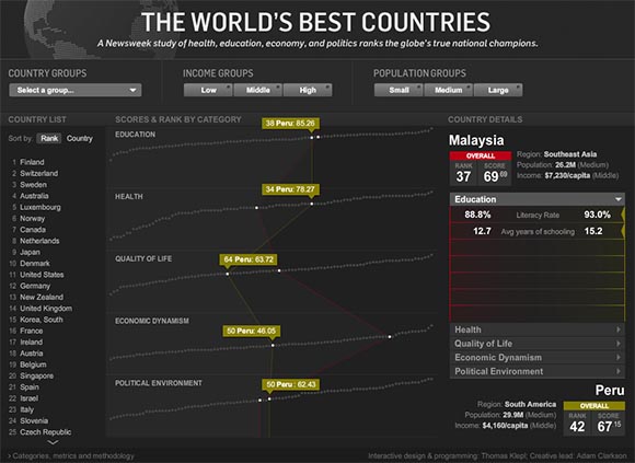
Many people found this site due to my epic ramblings about UI and Information Design faux-pas. I haven’t been saying NICE things about UIs often enough. Here is an attempt to make up for it. It’s an interactive info-graphic that compares countries with each other

Click Here to visit the Site. It’s Flash so it might not work with devices like your mum’s microwave, stopwatches and the iPad.
It’s a gloriously detailed and highly multi-faceted database of all countries in the world. In the middle you see 5 rows of dots. Each dot is a country. Each row represents a different category of evaluation. The vertical position of a dot represents the score a particular country received. Each of the rows is sorted individually by value. If you hover with your mouse over the dots, lines will connect all the dots in all rows that represent the same country. The shape of the line illustrates this country’s “profile”.
On the left there is a simple list of all the countries. Clicking or hovering over the names will highlight that country in the graphic. You can chose to sort that list by overall rank or alphabetically.
No matter where you click, you can select a country. Clicking once more will select a second country. The two selected countries are color-coded throughout the application. Pop-up labels will highlight the specific score of the most recent selected country. On the right you can compare the two selected countries to each other. There are tabs for each category of evaluation. Each category has different values that contribute to the overall score. There are even pop-up labels that explain each value.
Finally you can narrow down the selection at the top. For example, you can highlight only the EU countries or only the high-income countries etc…
Of course I couldn’t let this one go without poking at it:
-
No Geography: There is no visual representation of where all those countries are. Including that could have helped identifying geographic trends. We all can’t have enough geography anyway. On the other hand, it would have introduced a lot more complexity and the app works surprisingly well without it.
-
Diminishing Identity: Boiling down everything to a score has a tendency to compare apple to oranges. For example, Germany is right below United States on this chart while France is 4 places below Germany. However, if you look at the profile you will see that the United States has a fundamentally different profile from Germany while France’s profile is almost identical to Germany’s. It’s just a pure accident that the United States has a score so close to Germany. It achieved the score by very different means.
-
Insufficient Sources?: Some scores are derived from few values. The score for Health is derived only from life expectancy. I’m just wondering if this is really the only way to measure the health-care system. I’m not an expert in this area though.
But all in all it’s a great example of very competent UI. It shows a lot of data in an effective way. There are plenty of different ways you can get information from it. You can use it to gain some pretty cool insights. And on top if it: it looks and feels awesome! Imagine an RPG that uses this kind of interface to let you data-mine your stats.


