I did a silly thing today. I got an HD version of Sunshine and actually went trough the movie taking screen shots of the interface. My relationship with the movie is … difficult. I don’t think it is a very good movie. But I’m deeply in love with what the movie could have been. It seems like the filmmakers somehow lost track of the initial idea during the process. They made a couple of bad turns. They dropped the ball. But they are still artifacts of greatness to be found. It’s like an ancient ruin. Watching it feels like excavating all the little details, grabbing onto them and putting them back together.
Luckily, the production design is consistently awesome. Watching the movie and paying attention to the set design really makes me appreciate the work that was put into the move. The engineering, the controls, the interior design. Everything is incredibly detailed and completely believable.
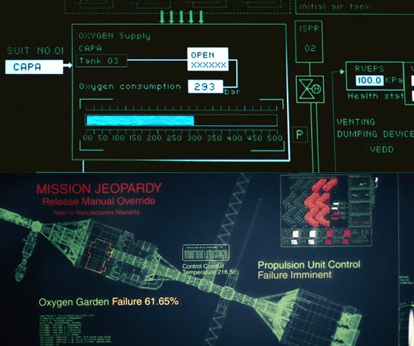
I’m mentioning the interface because I picked up an interesting detail on the commentary track. All the fake interface displays have been very carefully designed. The idea was to convey that the movie takes place on a very practical, technical mission. So the interface actually doesn’t look very “pretty”. The screens are green on black, almost exclusively monochrome. They resemble older industrial DOS-based displays. There are no fancy decorations, or animations. The fonts are often pixellated.

Sunshine takes place 50 years in the future. The computers look like 30 years in the past.
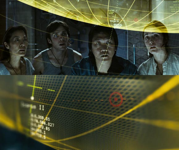
But then not all of them are. There is one scene where the crew is speculating about changing the course. They gather around a impractical but cinematographically convenient transparent screen and watch 3D animations of their flight trajectory. That animation has a more polished 3D look to it. It also uses a yellow tint unlike the rest of the movie. I’m guessing that it was designed by a different team (Special Effects as opposed to Production Design) or that they needed to make sure that the audience would be able to read it and understand it.

Sci-Fi Movie Making Trope: Transparent computer screens. So you can show information graphics AND the character’s response to it at the same time.
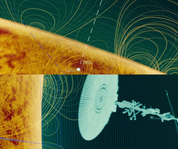
Another remarkable scene follows. The protagonist Cappa is reviewing a simulation of the final stage of the flight. The ship seperates from the bomb and the bomb flies into the sun. The simulation takes place in a holodeck-like room. It is a 3D animation with some interesting stylistic choices. There are some details that evoke lo-fi wire-frame aesthetics. It’s still very different from the rest of the computer screens in the movie.

“The Grid. A Digital Frontier…” ooops, wrong movie.
I’m doing this to have a collection of reference material and inspiration for future projects. Sunshine is an interesting start because the visual style seems to run so much against the grain. Except of the two examples, it’s not there as eye-candy. It makes a point about the idea behind the ship and it’s mission.
I’m looking for other movies to harvest them this way. I want to try this with Apollo 13. It doesn’t show any computer displays (apart from a couple of green digits) but it does recreate authentic NASA hardware quite realistically. Do you guys have any suggestions? Any computer interfaces in movies that stuck in your mind?


Any computer interfaces in movies that stuck in your mind? Definitely War Games:
http://www.youtube.com/watch?v=lUTt_rafiyQ
Minority report!
http://www.youtube.com/watch?v=NwVBzx0LMNQ
It was actually designed by a group at the MIT Media Lab:
http://www.ted.com/talks/lang/eng/john_underkoffler_drive_3d_data_with_a_gesture.html
Yes! I actually did it once very briefly. I shall take a closer look, good call. Perhaps I will finally understand that bit with the wooden ball.
This is similar to Chris Zukowski’s mention but check out Defcon
http://www.introversion.co.uk/defcon/about/screenshots.html
B
Yeah. I’m not so sure about War Games for two reasons.
1. It’s old so it’s appearance is not necessarily the result of aesthetic choice but simply the only thing their technology would have allowed.
2. Defcon already did it.
But I agree that it is a well-known classic so perhaps I should consider it away.
The reason the displays look like that are the journey is the earths last good hope and as they say they have a very large lack of resources; which are used to make things oddly enough. So they were forced to use what displays they already had as rocket and sat displays now days look pretty much identical to that of the Icarus and so not looking 30 years in the past. plus the other two interfaces you mentioned there are actually products like it available in the aerospace industry
That’s an interesting interpretation. But I believe the lack of resources you are referring to meant the lack of “fissionable material”. They used earth’s supply of plutonium to make the bomb. As already mentioned, some of the display technology on the ship is quite luxurious. So the Ship is not designed to imply them running out of resources.
The DVD commentary sates explicitly that the idea was simply to convey an realistic, professional, industrial look and feel.