Work on TRAUMA continues. Still doing rather administrative stuff. This time I finally came around to redesign some of the main menu UI. I kept postponing this part until I warmed up with programming again. That’s because surprisingly, UI design and programming can get incredibly tedious.
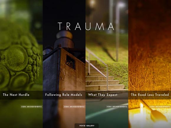
TRAUMA’s main menu was conceived quite a long time ago. I really wanted to use the photos already at this point. They should become the key aesthetic of the game. I tried different versions and realized that the photos work best when enlarged as much as possible. So the ended up simply dividing the entire screen in 4 photo stripes so the entire menu is made up of photos. It nailed my intentions pretty much and I noticed that users reacted quite positively to that solution

This was the menu screen for most of the development. The Movie Gallery tab at the bottom would slide up and reveal a menu of cut-scenes.
That worked well but with time, more requirements crept in. I needed to somehow display the progress in the four levels. I was able to implement that quite nicely with an Apple-like flip animation of the stripes. But then I also needed to provide a way to re-watch important cut-scenes. I added a small Movie Gallery menu at the bottom. That wasn’t quite as elegant anymore.
Recently I realized I also need some way to control the visibility and language of subtitles, reset the save game data and display some general game credits. The existing layout wouldn’t be able to take in these functions anymore. So I decided I would need a modal interface where additional controls would appear ON TOP of the main menu. It would give me the space I need to implement these functions as well as possible.

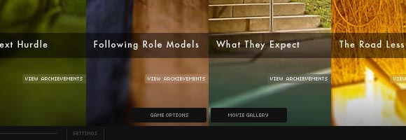
This is a mock-up of the next step. The gallery is now a button leading to a separate screen. I also introduced a game options button. Also note the new volume slider at the bottom.
But with UI, things are never that simple. I start out creating a few mock-ups in Photoshop. While doing the mock-ups I often realize that some things may not work or require more space than anticipated. I sometimes even remember some functions I forgot, etc. Building the interface in Photoshop is often even quite tedious since you have to keep track of a lot of elements with lots of details. It sometimes seems like simply programming them would be easier. But the mock-ups are excellent at making you realize how deep the rabbit hole really is. Otherwise you might abandon the right solution in favor of an easy one.

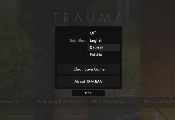
The game option screens allows to configure the subtitles, clear the save data and show credits.
And surprisingly, programming the UI is also quite difficult. Again, there are a lot of objects that need to cooperate with each other. It gets especially complicated if you want to include animations. Buttons need to have mouse-over effects, screens don’t just disappear but transition into each other. Those effects aren’t just fluff. They can make the navigation trough menus better understandable and less jarring. But the effects do increase complexity a lot. Programming them takes a lot of time and is prone to create bugs.

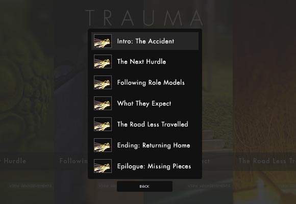
Putting the movie gallery into a separate screen allowed me to add thumbnail images and longer descriptions.
But I’m getting there. I’m quite satisfied with the mock-ups and I already implemented the first few buttons. There are still some details I’m not so sure about but I confident I will be able to figure them out as I go. I should be able to finish that big milestone this weekend. I will let you know how that worked out. If you have any suggestions, fire away. I can do changes easily at this point.


Have you thought about making a hover-button at the bottom? That could slide open and provide the menus, like “options” etc. In addition I’ll have to ask why the buttons for achievements are separated for the single parts instead of a combined menu where, for example, there is one line of achievements per chapter.
I agree with you that 4 buttons for achievements may be a bit complicated. A single button would be more effective. However, with this solution I re-use the navigation structure for displaying additional information. This is more straight-forward to understand than a separate menu that re-creates the level structure and that the user has to mentally re-map of the four levels.
I’m not sure I understood what you mean with a “hover-button”. Could you elaborate on that?
At first it’s only a symbol but when you touch it with the mouse it shows all the available menu options, like “options” and the sequences.
Another option to display the achievements would be to use a fullscreen transparent overlay and display the achievements in 4 columns. vertically just above the matching chapter.
I see. From what I understand a “hover” button is one additional step. There is not really a reason to hide the two buttons under a third one. It would be a good solution if there were many buttons, though.
As for the overlay for achievements – that’s basically what I have right now, only that you need to turn around each column individually instead of displaying all achievements at once.