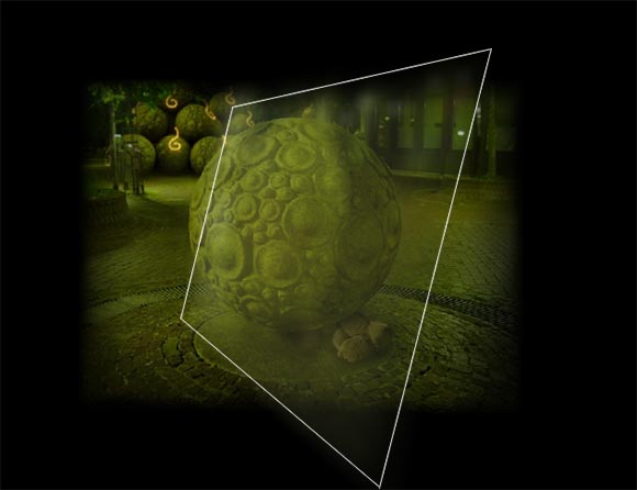
TRAUMA is at a point where I’m wading trough a bunch of very small tweaks and additions. It’s pretty much pure polish at this point. So for example there is this specific place in one level where the navigation causes some problems. It’s a sphere and I have constructed the level in such a way that the player is able to walk around the sphere. In fact, this was the oldest piece of level architecture that made it to the final product. Because I was inexperienced when I have built this, it’s doesn’t work quite right. The individual photos are placed in such a way that the players sometimes need to click on the left side of the screen to go right. It’s consistent and logical but very confusing and unintuitive. During play-tests I watched many players struggle at this point. The problem is severely enhanced because this is the place the entire game starts when players chose to go to level 1 first. It leaves a very bad first impression to say the least

You need to click on the right portion of the screen to make the camera go left. Not exactly intuitive. (white box is just for reference)
So I have implemented a hard-coded fix just for this location. Just in this place, the navigation is controlled by the overall position on the mouse on the screen rather than the real mouse-over on the individual photos. I really hope this will solve the problems people had with the game. After all I was used to the “old” way, but the tweak feels more intuitive even for me.
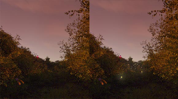
Another tweak is more visual. I noticed that players were struggling to find an important place in one level. Watching them play I have identified a specific screen where they would stray off the correct path. I think it’s because the photo didn’t look like there was something interesting in that direction. I have decided to add some visual hints to lure the players in.

Players wouldn’t consider going along the dark path. Added visual clues to remedy this. On the other hand, finding path in the dark is the point of the level. At what point am I undermining my own intentions?
It is a very subtle tweak and I’m a bit torn on this one. Streamlining the level too much could undermine the intention. On the other hand, getting stuck is worse than some mild ludo-narrative dissonance.
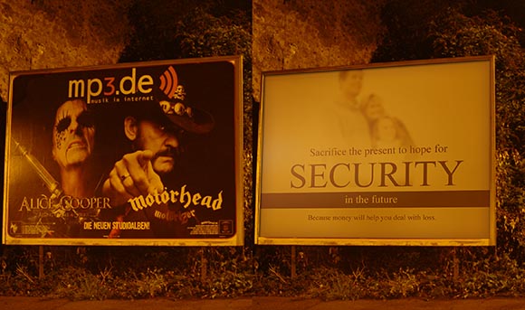
A third example is purely aesthetic. Some of the levels included elements that didn’t quite fit into the narrative. Sometimes you can see too much of the buildings surrounding the locations. At one point there are even billboards with real commercials. So I am photoshopping some of the unwanted structures.

To underscore the indie-ness of the game, I have the urge to remove all ads from the photos… also I don’t want to be sued… and also it makes no have ads for German mp3 websites in your dreams. Oh wait, did I just miss a monetizing opportunity?!
I use this opportunity to add some more narrative elements. For example, I replace the billboards with fake ads that add some more substance to the theme of the level.
I’m trying to increase the amount of work I do. At this point there is not much left so I can afford to crunch for a while. Of course now is exactly when I’m needed at my job because of the upcoming GamesCom. Now where did I put that cloning device..-


Rather than adding lights to the forest path, I wonder if you could darken that area and light the rest. I’m wondering what a darker but higher-contrast center looks like if you saturate/wash out the rest a bit.
Good idea! I won’t do it in this case because I wouldn’t be able to produce enough contrast, the image is very dark already. I can’t make it much brighter. It was pitch dark when I took the photo and it is already quite enhanced. There is a lot of noise that comes out when you crank up the brightness even more. Also using lights makes sense as there are indeed lights at the end of the path.
What if the lights aren’t there when you initially visit the scene, but subsequently appear if the player has returned a few times without investigating?
An intriguingly contrived solution. This would only work if players were returning to the specific image. Why would they if it looked unremarkable in the first place?
You said that some players “were struggling to find an important place in one level.”
I took that to mean they would wander around the level for a while looking for the way forward, and would doubtless return to that screen again at some stage during their search.
I may misunderstand the nature of the exploration, however.
Getting stuck is a fascinating topic. I have been observing people, who got stuck in games to understand how it works and how to prevent it. I don’t have any concrete results yet but one thing I noticed is that when they get stuck, people DON’T try everything out, event though they think they do. Instead, they focus one the same two or three ideas and try them over and over again, ignoring the rest. So in this case, when they failed to find the way, they would return to the same few, interesting places and would examine those very carefully.