There are a few things that games often do “wrong” on a regular basis. One of them being fonts. Fonts have always been treated badly by computer technology. Many programmers underestimate the complexity and importance of typography. In fact, one of the things Steve Jobs mentioned as a reason for the success of the Mac was it’s early adaptation of correct Typography principles like proportionally spaced fonts. And it came to be only because Steve apparently coincidentally picked up a Calligraphy class in college.
Games are especially problematic when it comes to fonts. They sometimes must convey a lot of information in a short amount of time, they mix animated images and text, they have to deal with a lot of dynamic content, they often have to convey the same text in different languages and above of all, they are supposed to always look aesthetically pleasing. Non-game applications can get away with things games can’t.
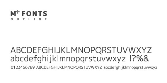
So it’s super-important to have a good collection of fonts at hand. Here is something to add to that collection. The M+ Outline Fonts.
Why is the font awesome?
- It’s a simple, legible sans-serif font that is NOT Helvetica.
- It comes in 7 weights which is a blessing if you want to use it for information design.
- There is a condensed variant for extra flexibility.
- It comes with a full set of international roman characters.
- It comes with a full set on Japanese characters. I like that there is a special variant to make the roman and Japanese characters look extra-similar. A lot of attention has been put into this.
- It’s free.
In general it’s an elegant, highly readable, flexible font. I highly recommend it!


