Speaking of space and asteroids. Here is one image I see over and over again. It’s driving me insane.

Splash!
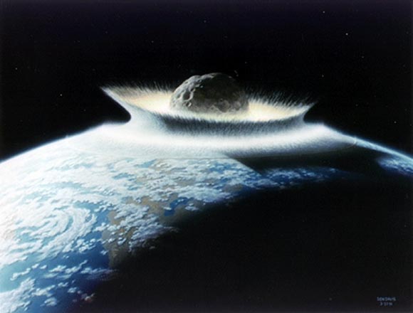
You will see it in every second science article on the extinction of dinosaurs or meteorites. Like this Wired article for example. It’s one of the so-called “Artist’s Impressions”. They often accompany scientific articles to illustrate a certain point. This particular one turned out to be especially virulent as it’s been used over and over again. It seems to have been made by Don Davis who has been painting similar motifs for some time. It’s attractiveness is obvious. Especially the scale is awe-inspiring. You can see the asteroid towering miles above the atmosphere as it embedding itself in the soft crust of planet.
… but wait. ABOVE the atmosphere? That sounded suspiciously large to me. So I began to crunch some numbers. Follow me on this one.

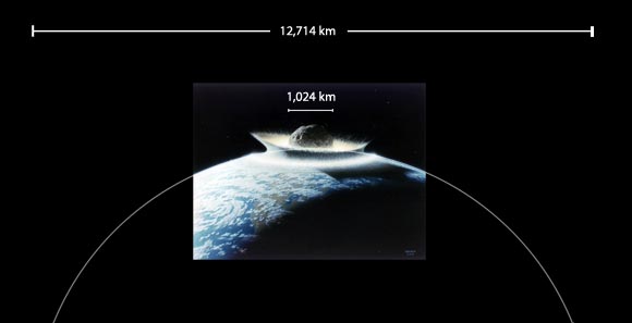
Estimate of the size of the depicted asteroid.
Judging by the curvature of the earth the depicted asteroid should be around 1000km in diameter. This is just a rough estimate since the perspective on the painting can’t be accounted for due to lack of reference points. It’s still way larger than the 300 miles mentioned in the Wired article. In fact 1000km is ridiculously huge. Let’s get some context.

Comparission of the depicted asteroid, the second-largest object in the asteroid belt and an asteroid roughly the size of the one that could have caused the extinction of the dinosaurs.
1000km diameter is even slightly larger than the size of Ceres, the largest asteroid in the Solar System. And Ceres itself is so large that in fact, it’s classified as a “Dwarf Planet” instead of an asteroid. The above image shows Vesta in comparison, which I was talking about previously. It’s the second largest object in the asteroid belt and only about half the diameter of the depicted asteroid.
So the depicted asteroid is actually larger than the largest asteroids that exist today. This sounds a bit dubious already. But how does the depicted impact compare to the one that wiped out the dinosaurs. Well on the far right of the image, you might see a tiny dot. That’s how big Gaspra a 12km diameter asteroid would look like. This is around the size of the object that caused the Chicxulub crater which is a good match for the impact that might have caused the extinction of the Dinosaurs.
But there is more. Another thing that rubs me the wrong way is how calm and serene the scene looks like. It’s like trowing a pebble in a pond. What would you REALLY see if you were to observe an impact so large from space. Well, we have observed quite large impacts already. Here is what an impact of an object on Jupiter looked like.
We observed a lot of object impacts on Jupiter. The above here is from 2010. It’s remarkable because it shows the actual impact flash. And that’s pretty much all you can see in an asteroid impact. A flash. The tiny dot on the left of Jupiter is a bright explosion the magnitude of up to 1 Megaton. An average-sized H-Bomb. It appears as such a tiny dot because Jupiter is many times larger than Earth. It’s quite remarkable that you can see it at all from that far away. Trust me, it’s a huge, bright explosion that would easily wipe out any major city on Earth.
The thing is, asteroid impacts are incredibly powerful not only because of the mass of the asteroids, but also because of their speed. An average meteor impacts Earth with the speed of 10-70 km/second. That between 30 and 200 times the speed of sound. At these speeds, even relatively small objects pack a huge amount of energy. And sure enough, that H-Bomb on Jupiter was caused by an asteroid around just 10m across! That’s 1000 times smaller than the dinosaur asteroid. 100,000 times smaller than the depicted one. The impact of an asteroid 1000km across would cause a flash so bright it would out-shine anything you see. Instead of the impact causing a tidal wave like on the painting, the light of flash itself would probably bright enough to vaporize seawater. Imagine a small, blinding bright sun burning on surface of planet Earth. Indeed, you would need to use a dark eye filter – similar to the ones used to watch solar eclipses – in order to even look at the impact and not hurt your eyes.
Needless to say, the painting is laughable. It’s an exaggeration and underestimation at the same time. It exaggerates the size of the actual impact body while hopelessly underestimating the power of such impacts. An artist’s impressions should fuel the audience’s imagination, it shouldn’t lead it astray. It’s a pretty illustration for a Sci-Fi story. But every time I see this particular painting in a scientific article, I want to trow an asteroid on the author myself.


Interesting analysis,
but i dont share the disliking,
so, art helps to make an idea
of a subject hardly viewable,
the people get connected
not because the accuracy of the image
but for the clear attractive of the icon,
it works as a metaphore,
science fails when dont recognice
the utility and opportunity
of using art for a better
communication,
anyway,
different styles appeal
to different ranges of
population,
is question of choosing,
salutes.
I am well aware that connecting with the audience is the goal here. I wrote so in the article myself. But there are two assumptions your comment is making that I cannot agree with.
1. You can perhaps go balls-out in a Sci-Fi short story. But a SCIENTIFIC article must adhere to certain standards of plausibility. When talking about science, a breach of accuracy of this magnitude completely undermines the message.
2. You assume that accuracy and emotional response are mutually exclusive. A skilled artist would find a way.
As I mentioned, in some aspects the depicted impact appears less powerful than it really would be. It’s the biggest impact in the geological history of Earth. I’m absolutely sure there would be more than enough opportunities to generate striking images without sacrificing plausibility to this extent.
Accuracy is not mutually exclusive with emotion,
but it is not his goal,
so, much often, fails to represent enough the subject,
a pure scientific image is mostly a diagram or something like that,
human mind is much more than cold facts,
so, memory keeps alive farly better emotional inputs,
if we make some kind of test about persistence,
clearly this image wins over other more accurated,
then i recognize the artist’s value instead of the
subjectiveness, or maybe precisely of it,
anyway,
if there is a mistake it is in the editor’s choice,
and in the reader’s sense of idoneity,
so, flexibility in the evaluation of the whole
is recommended,
salutes.
That was a fascinating read. I’m sure most people didn’t even stop to think twice about the actual scale of that picture and what it represented. You really boggled my mind with this one. I really like how you even provided a great visual comparisons to give us a grasp of just how big of a scale the picture was depicting.
Then you blew my mind again showing the dreaded dinosaur-killer was such a dinky size in comparison yet still caused enough mayhem in after effects to trash around life’s ecosystems. Your articles have been very interesting and entertaining.
I am greatly enjoying these writings. Keep up the good work!